108 million web users are color blind. Tips for designing keeping them in mind
One of my friends from college is color blind and every time someone finds out about this, the prompt question is — “Do you know which color this is?” It’s not like he misses out on any color! He sees them all but the difficulty is in naming them apart when the contrast is not good enough or so..

As designers, you pick up the best colors for the canvas and the most engaging content for your users, but often miss out on the color blind ones. Repeating the ever-repeated stats — 8% of the males and 0.5% of the females are color blind. Now that is a HUUUGE number if your user base is big. Ignoring these 8% and 0.5% of the society is no way acceptable. Here are few tip and tricks to help you design aligned with their needs as well-
1. Mention colors
So should you name every color on the website? No. Name it where it matters. While buying a cool blazer or a Tshirt they usually have to take a second opinion from a friend about the color. And if the friend isn’t as good as me , then things might just go wrong for the person..

- Mention in the specification what color is the product. Also keep in mind, terms such as grape color or so mind sound fancy for us as we do not have to necessarily depend on the color description but it might be pretty confusing for the other 5% of the users. So be clear clear with these color names.
- Do not have color names appear on hovering because that does not really solve the problem while using it from a mobile device
- The best way of representation is as below :

This maintains a fine balance between giving only colors for selecting AND not leaving the users to take a minute to relate to the color by giving only the name.
2. Get the contrasts right
Light and dark contrast
They do not require a white and black canvas, all they need is a good contrast website! Playing with colors in the light and dark combination is one of the best ways to maintain the contrast ratio. When two colors are of the same temperature or lightness, its kind of difficult to list them apart for them.
Complementary contrast
There is this color wheel that all designers know off. Choosing colors in the shades of opposite colors on the color wheel is an easy way to make things easier for your color blind audience.

Cool and warm color contrasts
The formula is pretty simple — Dark shade of the cool color and light shade of the warm color. And you are good to go now!

Use patterns and textures
Distinguishing between colors is difficult for the color blind users but not between patterns. So here is a good option for you! To differentiate between two graphs or symbols you could use different set of patterns of contrast colors rather than playing with various color combinations.
3. Make it look good in the grayscale
No, you do not have to create a black and white website. Just view your website in grayscale mode. If all elements are distinctly visible there is a pretty good chance that it will be good for the color blind users as well.
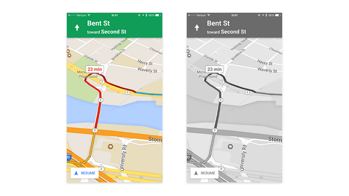
A successful example :
There are some apps who have done it amazingly — And Google maps being one of the best examples. Despite using red and green for busy and no traffic, use colors of pretty different hues, allowing color blind people to see the differences pretty well.
4. Avoid the complete no-no color combos
You should be color-smart when picking your color combinations. Since color blindness affects people in different ways, it’s difficult to determine which colors are ‘safe’ to use in web design. Here are few color combinations that should be a complete no-no while choosing the pallete
- Green & Red
- Green & Brown
- Blue & Purple
- Green & Blue
- Light Green & Yellow
- Blue & Grey
- Green & Grey
- Green & Black
5. Text Overlaid On Background Images
Text overlaid on imagery is tricky because some or all of the image may not have sufficient contrast in relation to the text.
Reducing the background opacity increases the contrast, making the text easier to read.
Alternatively, you can style the text itself to have a solid color or a drop shadow, or anything else that matches your brand guidelines.
Final Words:
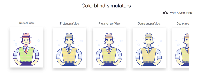
We have built a colorblind simulator at CanvasFlip that helps designer understand how a colorblind person would see the same image or webpage. I really hope this helps you as design colorblind-friendly interfaces. :) Check it out HERE.
Even if a relatively small portion of the population is color blind (5% of the total is still a number though), there is still a need to design with them in mind. Keeping this section of users in mind when making your color choices, you could be happy and content that the final designs will please everyone, resulting in a MUCH better app and user experience.