Member-only story
10 Best Practices for Designing Drop-Down Menu
Published in
8 min readAug 26, 2024
A drop-down menu is a standard UI control that provides a clean and intuitive way to present a list of options to users.
However, they can be confusing for users if not designed properly. This article will discuss a few best practices that help you create drop-down menus to enhance your product’s usability.
Learn how to design an interactive Drop-down menu animation in Figma:
Drop-down Menu Design Guidelines and Best Practices
- Don’t use long menus
- Don’t use a drop-down for 2 options
- Disable options that are not valid at the moment
- Don’t use a drop-down where options are too obvious
- Don’t use a drop-down for more than 2 levels
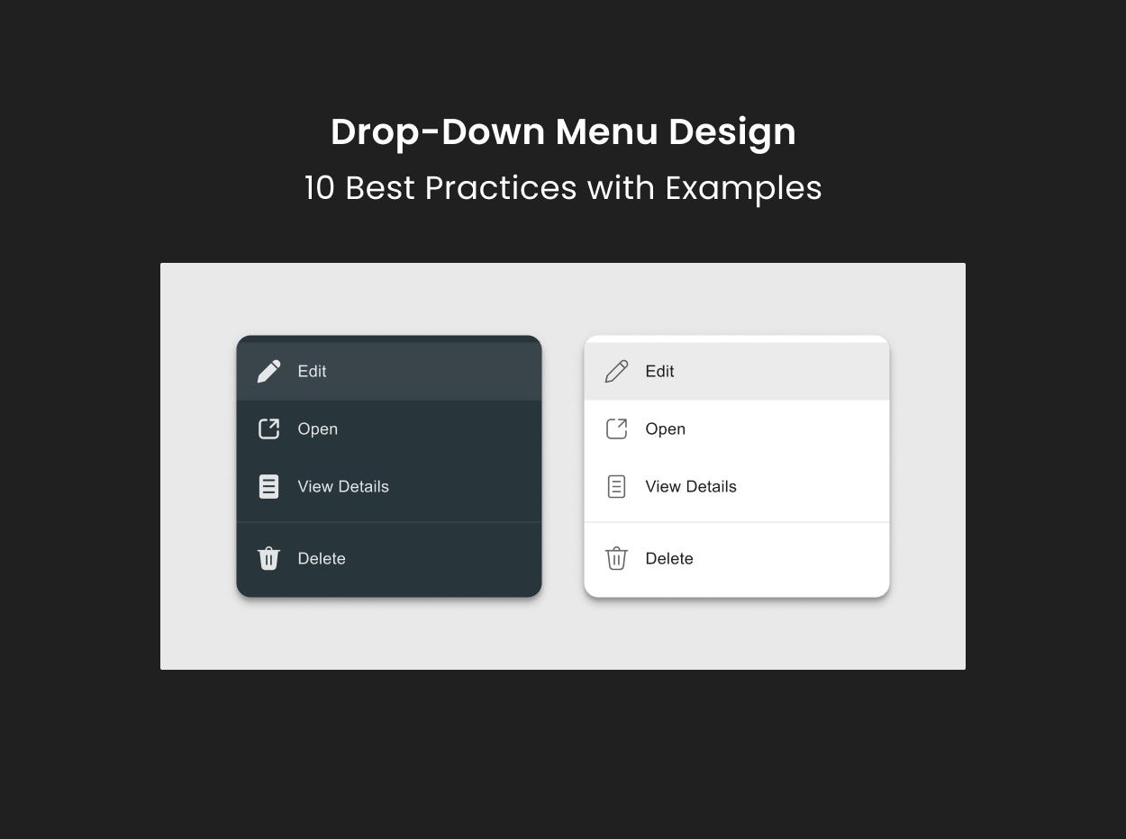
- Make a clear visual design
- Consider mobile devices
- Organize options in a logical order
- Provide a search feature
- Make a default selection
1. Don’t use long menus
Using drop-down menus with too many options often leads to poor user experience.
- It increases the cognitive load for users to process and compare a long list of options. Users will spend more time on a simple selection.
- Users will be required to scroll the list to see all the options. This can be more annoying on small screens.
- It takes more loading time to load all the options quickly when the user scrolls through the list to find the required option.

What if you need a long drop-down menu?
In such cases, certain best practices help you manage long drop-down menus.

