Member-only story
10 color meanings to help you choose the best colors for your next design
Tips for using color to make better design decisions

Color theory is the art and science of creating harmonious color combinations. But every color has its own meaning and emotions attached to it. In this article, we’ll dive into the psychology and meaning of color.
Knowing what color combinations to use in design is an art. Should you stick to a monochromatic color palette? Or maybe 2–3 complementary colors paired with an accent color? There are so many ways to use color to communicate, to make your design stand out, and to convey a certain mood and emotion.
What is color theory?
Color theory is a set of principles for creating harmonious color combinations. It’s a mixture of science and art. Understanding the fundamentals of color theory and where color comes from is important to know as a designer. Once you master it, you’ll know how to create the best color combinations for your graphic and web design projects.
Key terminology for color
When referring to color, there are a few concepts that are key to understanding.
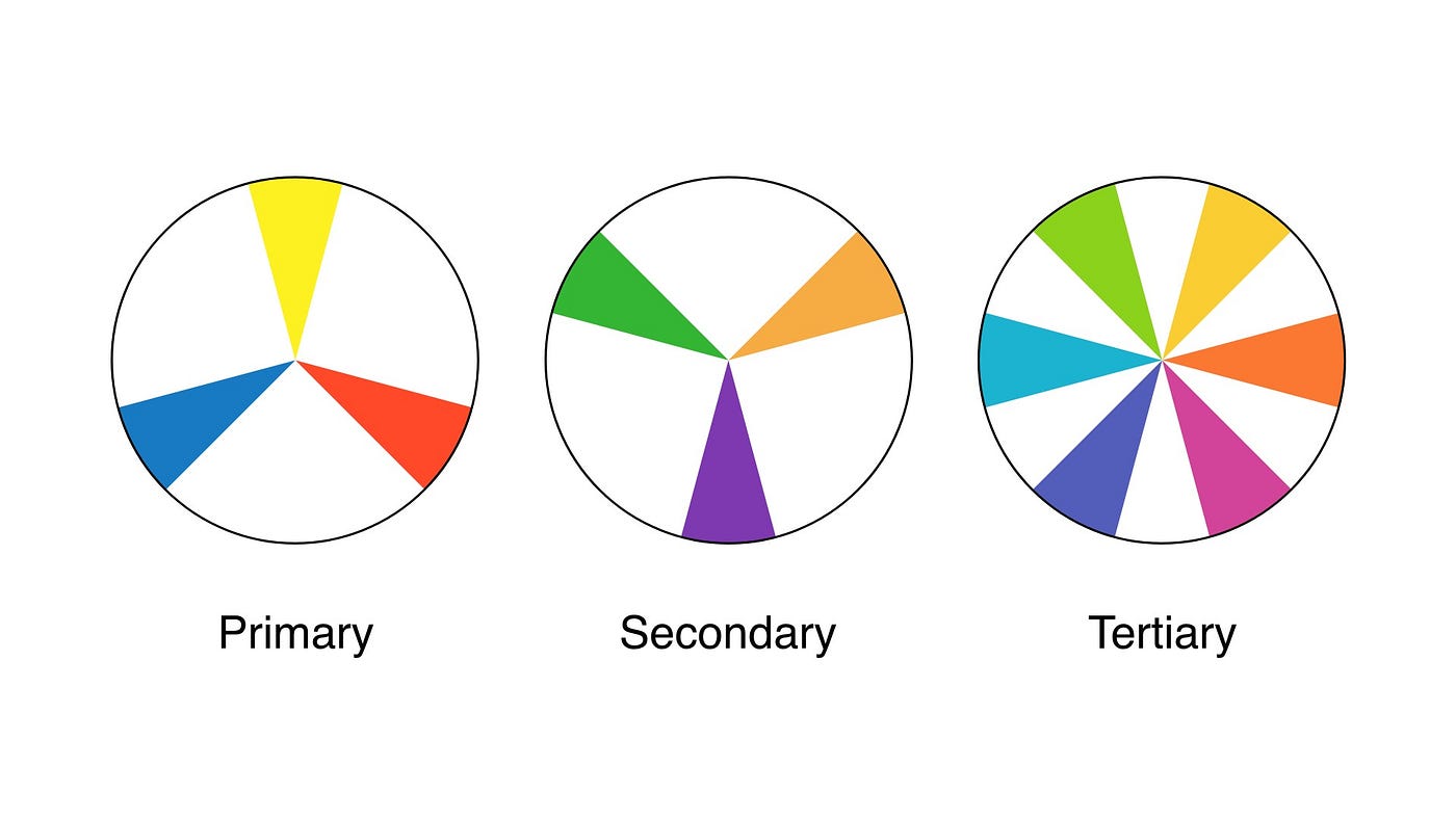
Primary, secondary, and tertiary colors
Primary colors are red, blue, and yellow. These are the three main colors you use to mix and create other colors. If you’ve even dabbled in painting, you know first hand how to mix just enough blue with yellow to make green.
When you mix two primary colors you get secondary colors which are green, orange, and purple.
Taking it one level further, when you mix a primary with a secondary color, you get tertiary colors. These colors are named after their parent, yellow-orange, red-orange, red-purple, blue-purple, blue-green, and yellow-green.
Check out this color wheel tool created by Canva. You can start with one color, choose options to create monochromatic, complementary, analogous, triadic, and tetradic combinations.