
10 principles for great GIF design
Designing a great GIF isn’t as easy as it seems! Check out how to create GIFs users will love on this article.
GIFs have spread around the internet like the flu during winter — and users love them. These animated images are so easy to consume and to understand, and yet can convey quite impactful messages within a few seconds.
Brands like Starbucks have been known to use GIFs on their social media just because people tend to interact with them more — it’s content that increases user engagement across all platforms on the internet. They are great tools for keeping users entertained and can offer a great deal of margin for you to show off your brand identity. What’s not to love, right?
But like all good things, great GIF design is not without its tricks. Getting a GIF right involves a lot of thinking about the composition and design, but also careful implementation in the making process. How do you ensure your GIF is eye-catching and not overloading the user’s eyes? How can you create something beautiful while keeping the file weight to the bare minimum?
Fear not! Just read these 15 basic principles for designing great GIFs and get ready to impress those users.
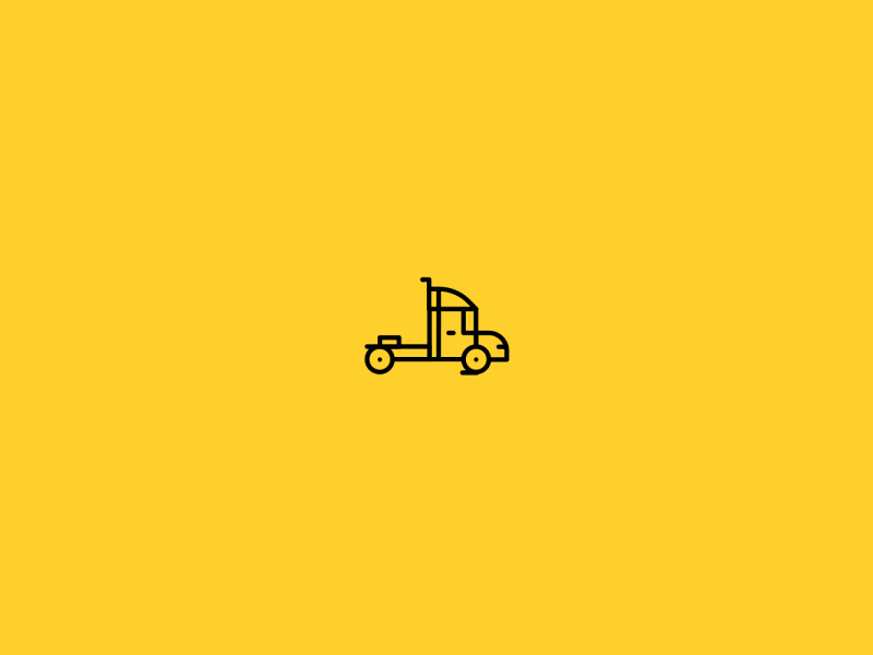
Don’t bite off more than you can chew
It’s perfectly normal for designers to get carried away in the creative process, specially in projects they are really passionate about. But GIF design can be a confusing and complex endeavor. We recommend keeping your design as simple as possible while still getting the message across. In general terms, less stuff in your design gives you more freedom on the animation part of the process!
Select a few elements you want to include in your GIF, and strongly resist the urge to add on as you progress. The reason why this is a good practice is that people can be overwhelmed quite easily — both the designer making the GIF and the user seeing it on any screen. You want movement that inspires certain emotions or communicates your meaning — but those feelings and meaning can get lost in a sea of dancing elements and changing colors.
Don’t overthink your design. Choose a few central elements and a color palette — then work with those resources to create something unique and enticing. You don’t need 20 moving things and the entire rainbow to create a GIF users will love.
Try to establish a consistent visual identity on all GIF design
GIFs are such a good way to get your brand identity out in the open for users. In creating the world’s shortest film in which the plot surrounds your brand, your brand can become an ideal that people can relate to.
While the sky’s the limit when it comes to GIF design , you definitely want to establish certain guidelines about the general look and feel of your GIFs. You can use your brand logo as a background source of colors, or go all-out and create a character that represents the brand — one you can bring back with every new GIF you make.
Show your users who your brand is, what you do and how you do it through your design. If you think that’s a tough task, you won’t be wrong. It isn’t, however, impossible.
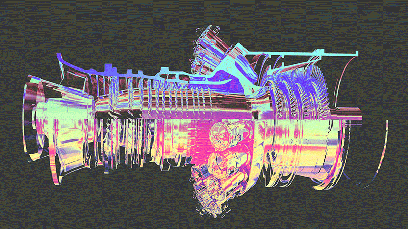
GE has successfully created a whole vibe that users can expect in their GIF design. In their highly inspirational and educational Tumblr, GE shares GIFs that show off some great machinery and science at work. Tags like #badassmachines are a fun way to get people familiarized with what they do — not to mention, to make engineers everywhere feel things with all those big machines at work.
Drop all those extra frames in your GIF design
Regardless of what type of animation you have in your GIF design, chances are that the movement pauses at some point or another. When creating your animated GIF, look for those breaks in motion and find the frames of the GIf that don’t actually do anything.
There should be quite a few on any given break. This is a bad thing, because they do nothing more than weigh your file down, on a type of content that is already heavy by nature. Here is what you want to do: delete all those extra frames save one, then stretch the duration of that one frame for as long as you need the break to last for.
The overall quality of the GIF design should remain intact, while you cut down on those unnecessary megabytes!
Think of accessibility when uploading GIFs
As a designer, you’re well and familiar with the fact that users can get distracted by different types of visual content — and when you design your GIF, you’re designing for all internet users.
This includes people who use screen readers or people who suffer from epilepsy. These things can be mitigated by describing your GIF in alt text or keeping the frantic blinking and flashing to a minimum.
Much like videos, the constant movement of GIFs can break user’s concentration and cause some frustration if they can’t get it to stop. This is worth bearing in mind when adding several GIFs into the same page. If you tend to have lots of written content, limiting the colors and movement of your GIF designs might be a good idea so your text don’t lose their potency and user’s attention.

An issue connected to the use of GIFs is autoplay. Generally, users can feel annoyed or ambushed when they come into a page and videos and GIFs start to play automatically. Instead, try to use a click to play system — so you give the user total power over what gets played and when.
Use storyboards to keep things straight
GIF design seems like a simple enough task at first, but that assumption leads many designers to make a fatal mistake when making a GIF. For a GIF to be truly cool by internet user’s standards, it needs a background story. People mistakenly assume that because GIFs are so short in duration, any simple animation will do.
The underlying story and elements you will use — those are the building bricks of your GIF design. And as such, they should come first in terms of implementation and thinking. That’s why we recommend you use a storyboard to keep things in their place. Like we’ve mentioned, it’s very easy to lose track of where each thing should go, or exactly what needs to move in what direction.
Spend some time placing a careful illustration of each part of your GIF design to you save yourself the time and effort many other designers spend trying to get their animation right. A plus side of using storyboards is that if you work with a larger team of people like illustrators and animators, the storyboard can vastly improve communication between team members to speed up the creative process.

In case you’re wondering about how you can have some awesome visual storytelling in your user experience, feel free to check out our guide on it! It can come in very handy when designing GIFs or other types of visual content for your platforms.
If you use Photoshop for GIF design — keep it neat, for the love of God
All designers are aware that layers can build up pretty quickly when using Photoshop. As a tool that is widely used for GIF design and other types of animation, many people still fall prey to the potential the tool has for chaos.
Layers and layers of elements are tricky to manage, and they only get trickier the more you add on to them. And the real danger is their utmost importance in your design process — move the wrong layer at the wrong time, and the whole GIF design might be ruined.
A separate issue is just how quickly they all blend into each other without proper labeling. Don’t worry about remembering which of those many layers is the tiny circle that will move to the left on the finished GIF — you just won’t. It’s impossible to keep track of them all and trying to do so is not a good use of your time.
So save yourself all that headache, and make sure you label all your layers as you add them to the design. It’s tedious and quite repetitive in some cases, but there’s no knowing just how much time you will be saving yourself in the near future.
Be extra creative and aim for loops
GIF design that allows for the animation to play endlessly on a loop is no easy task. The cool thing about your GIF being a loop is that people can appreciate it for longer, due to the smooth transition from loop to loop.
If you want to have a loop in your GIF, we recommend you start out with a simple design — try to aim for something with geometrical shapes. This will make it easier to match the elements in their position for the end and beginning of the GIF.
The reason why creating loop in GIF design is challenging is because everything needs to go so smoothly, that any small mistakes will jump to the eye of the user. This leaves no wiggle room for elements that aren’t positioned perfectly, which means you’ll need to pay close attention to each individual frame of your GIF.
The end result is worth it, however. You’ll end up with a GIF that just keeps GIFing!
Include motion blur where possible
Motion blur in GIF design started out as a way to imitate older cameras in which images would blur slightly with quick movement. That’s no longer the case today, in which cameras have gotten so advanced we don’t get that blur anymore, just like our eyes don’t blur the movements we see.
In GIF design, you still want to use because if you don’t the GIF will literally be the result of a bunch of still frames put together. This can result in the GIF feeling like it’s staggering and doesn’t run smoothly like users would expect. The motion blur has the power to make your GIF feel natural, almost like with as an actual video taken with a camera.
Even with illustration work, you still want your GIF to be believable and feel normal to users. F you want to know more about motion blur, go ahead and check out this awesome blog post about it.

Keep file size as low as you can
As you know, you can use your GIF design on just about anything on the internet. Social media platforms, blogs and websites or email providers. That’s part of why they are so much fun — just about anyone can find them on their screens on any given day.
But it’s surprisingly complex to design a GIF that you can insert into any platform, due to their strict size requirements which can change dramatically between platforms. Here are a few useful ways you can keep the file of your GIF down:
- Try to keep the total number of frames in your file below 150 — otherwise, your GIF design will have a hard time being uploaded on any of the most commonly used platforms for being too heavy.
- When exporting your GIF, set lossy to between 5–10. This will increase the compression of your file, as GIFs can afford to lose pixels in the compression that images or other data can’t. Try to play around and find a setting that decreases the file size without damaging the final GIF design.
- Keep use of color to minimum. This is a good idea not just for design reasons, but adding more color increases the file size considerably. Less color means more room to play with animation and duration of your GIF.
- Avoid gradients altogether. Transparency is either on or off, which mean you´ll end up with a grubby image or a huge file that can’t be uploaded anywhere.
Have mobile-oriented GIF design
This may seem like a silly principle, given that mobile users can see all sorts of GIFs in the virtual wild. But it does have some merit to the idea — people’s experience changes dramatically from a large screen to a small one.
When thinking of your GIF design, try to go for smaller elements so that smartphone users aren’t overloaded. Another sound practice is to use bold colors when you want to draw attention to a certain element, so that the animation works well no matter what device your users prefer.
Another trick you can have on your sleeve is to always design GIFs as square shapes. This means that your GIF design will work well when users are scrolling through their social media, without making the whole thing look smaller because the file had dimensions that needed adapting. You can crop the GIF later on, should need be.
The wrap up
GIFs are so much fun to design and create. Sure, they do come with their own set of rules and issues, but luckily none of them are beyond the skills of a dedicated designer. With these wonderful principles for GIF design, you can put your creativity to work on a type of content your user’s won’t take their eyes away from.

