11 Ways To Add More Visual Weight to UI Object
User attention is a precious resource. When it comes to web design, every second counts. How to ensure that the visitors will see what you want them to see? How to draw attention to a particular element? The answer is simple — play with visual weight.
What is visual weight?
Visual weight is a force that attracts the eye of a viewer. Every object on the page has its’ weight. The more weight an object has, the more eye is attracted to it. Visual weight allows us to create focal points (also known as points of attractions or visual magnets) — such objects have more visual weight than others.
How to measure visual weight?
Visual weight is a measure of how much something attracts the viewer’s eye, and unlike physical weight that can be measured, visual weight can only be perceived. However, it’s possible to use a simple test to understand which object on a page has more visual weight than others. Take a look at a page/screen for a few seconds. Close your eyes. Try to remember what object (or objects) from the page stay in your memory. Those objects will have more visual weight than others.
11 characteristics that determine the visual weight of an object
Here are a few basic characteristics that determine the weight of a particular object:
1. Size
Larger objects attract the eye more than smaller ones. In the physical world, when we have two objects of the same type, a bigger object will naturally be heavier.

2. Shape
Objects with a regular shape appear heavier than objects with an irregular shape. It happens because irregular shapes create an impression that some parts of an object were removed.

3. Orientation
Vertical objects appear heavier than horizontal objects.

Diagonal orientation creates more visual weight than horizontal or vertical.

4. Color
Color is one of the most powerful tools in a designer’s toolbox. And this tool can help us play with visual weight. Here are a few essential things to remember when working with color:
- Some colors are heavier than others. Here are some colors from heaviest to lightest: red, blue, green, orange, yellow.
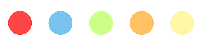
- More saturated colors will garner more attention than unsaturated colors.
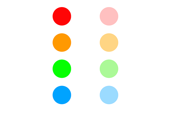
- A pop of color in an otherwise neutral tone can help you bring more visual weight to a particular object.

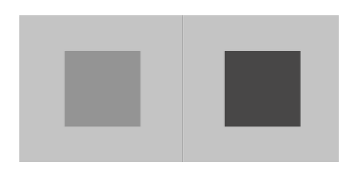
5. Contrast
Contrast naturally draws attention to an element. When an element contrasts with its surroundings will appear visually heavier.
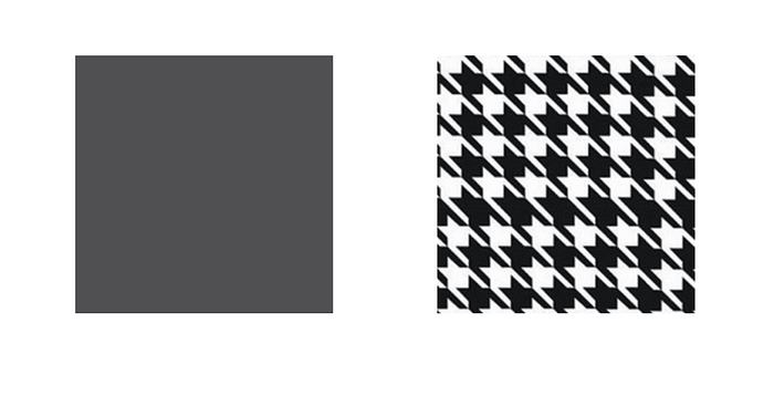
6. Texture
Elements with texture are perceived as heavier in comparison with the non-textured elements. Texture gives an object a pseudo-3D effect, and this effect makes an object perceived as heavier.
7. Whitespace
Whitespace is a space that has zero visual weight per se (simply because it doesn’t contain any elements). However, whitespace can be used as a tool to create more visual space for a particular object. Generally, the more whitespace near a certain object, the more attention it receives.
8. Z-depth
Elements in the foreground have more weight than elements in the background.

9. Personal interset
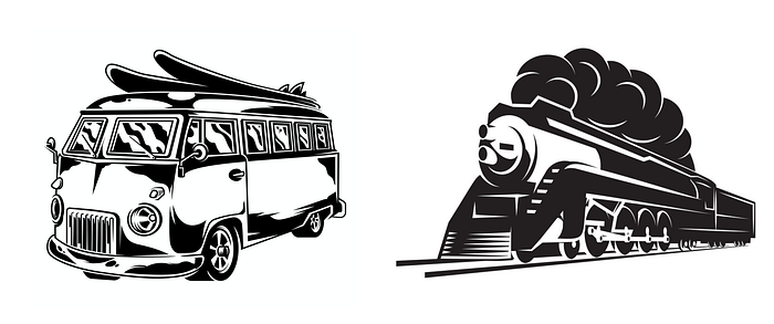
Viewers’ personal interests have an impact on how they comprehend design. Some things are more interesting for us than others. For example, when we see two objects (car and train), if we’re more interested in trains, then the image of a train will take our attention. That’s why when two people view the same page, they can easily look at different objects because of their different interests.
10. Human faces
Eyes and faces are considered as objects with heavy visual weight. Photos with human faces will always carry more visual weight.

11. Movement
Moving objects naturally attract our attention and suggest visitors where they should look next.
Conclusion
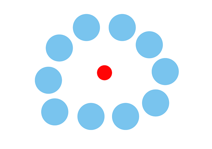
When it comes to visual design, the characteristics mentioned above cannot work in isolation. Visual weight is the sum of the characteristics mentioned above. While big objects generally get more visual weight than small objects, a small red circle surrounded by a generous amount of white space will perceive as heavier than large blue circles that surround it.
References
- Design Principles: Visual Weight And Direction
- The Power of the Center: A Study of Composition in the Visual Arts
Learn how to design better products
Interactions between computers and humans should be as intuitive as conversations between two humans. Interaction Design Foundation will help you to learn how to design for efficiency and persuasion.