12 tips for icon designer
In design work, sometimes you will need icons, which you can’t upload on the stocks or websites like a Flaticon. For example, you can’t find some kind of icon, or your customer asked you to make an original icon set. You can also take individual work on icon design. Icon design skill, will always be useful in your design work. To do this you shouldn’t have illustrator skill. You must follow some simple rules. So, let’s go!
Follow the style
First, choose style for your icons and follow it. Never mind what style you have choosed: outline, glyph, color, monochrome or something else, the main thing that all icons in the set will be the same. If one icon is outline and other one is glyph, second will have more visual weight, and your icon set won’t be harmonious.

Use simple metaphors
Your icons should be clear to users. They are needed to quickly read information through visual form. Try to make your icons as understandable as possible. Use familiar forms and simple metaphors there, where this possible.

Use grid
All icons in your set should have the same proportions and sizes. For this, you can use the grid. You can download the grids that I use here. Ideally, they should be visually placed in an imaginary square. If this is not possible, then you can to add small details to balance the composition. Or place your icons in a square/circle border.

The thickness of the lines must be the same
Your icons can have one kind of lines or lines of different thickness. For instance, for large details 2 px. line and 1 px. for little ones. Whatever you choose, all icons must follow this rule.

Rounded corner
If your icons have rounded corners, 2px. for example, all icons must follow this rule. You may think that this is not important, but it gives you harmonious and unity of form for your set.

Detalisation
The smaller the size of the icons, the less must be the details. Then the icon will not look like stain. You decide to make icons in more detail or less, but if your icons are highly detailed, will be better use thin lines.
Color
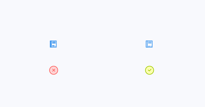
No need to make icons of different colors, if interface doesn’t require it. For example, check icon must be different from the cancel icon, so that the user can distinguish between them. Otherwise, use the same color or color combinations for all the icons in your set.

Add features
To make the set even more harmonious, you can add some functions to your icons. As an example, open contour lines.

How to make your icons more original?
If you want to make your icons more original, you can play with styles. For example merge glyph and outline, or add color spots.

Use integers in sizes
You should use only integers in the size of your icons, because if you didn’t it, you won’t have clear icons after export. For example 2 px., but not 2,12px.
Right export
Don’t forget about export. Change all strokes to curves and expand them. Also save source file with strokes for easy edits if it’ll need.
How can you earn with your icons?
You can turn your icon skills into money, by selling your icons on the websites such as Iconfinder, Iconscout or Noun Project.
I hope these simple tips will help you improve your icon skills.