
12 UX principles for digital Commerzbank products
At Neugelb, I was part of a small and dedicated team which reworked the Webdesign style guide of Commerzbank. While components were technically described and React code available, it had no explanation on how to design in general. Principles, design patterns, and sample pages? This knowledge was spread in 1:1 conversations.
First, we reviewed all existing designs and identified areas of improvement. Then we collected common questions and issues which we constantly came across. We formed universal principles which we combined with specific do’s and don’ts for a better guidance. Here are the best Commerzbank UX principles extracted from the reworked style guide. The text and examples are slightly adjusted. Enjoy!
1 • Increase added value
We have two essential characteristics of products and services: price and value. We express price in monetary terms. By value, we mean what a customer gets in exchange for the paid price—such as a convenient service, superior consultation, or growth in wealth. The value can be enhanced e.g. by offering customer support, an omnichannel experience, more flexibility, partner services, etc.

Do: In this fictive product, a dashboard creates value by giving an overview of relevant information and creating meaning out of data. This improves convenience and cuts time efforts for the user.

Don’t: In this simplified example, data is merely displayed without interpretation, visualization, or prioritization. The users have to analyze everything themselves.
2 • Create a seamless experience
A web service may include processes before and after using it (such as registration, authentication or downloading an additional app). That’s why we consider a Costumer Journey from end-to-end. Barriers and pain points are identified and solved, e.g. between Commerzbank websites and mobile apps, customer support, and branch visits. This also applies to advertising which refers to web services.

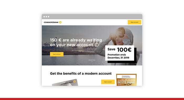
Do: In this fictive example, the Costumer Journey leads from Social Advertising to a landing page, then to the registration which is followed by an automated success message. The user has a seamless user experience and is delighted.
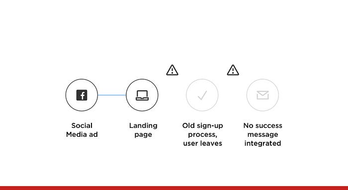
Don’t: In this example, advertising and the landing page were connected, but the registration form was too complex and the success message not even considered. This leads to a bad user experience and to more cancellations.
3 • Place relevant content first
Information should be prioritized, meaning that essential content and primary actions appear first. Further details are initially hidden and should be accessible when needed. Research indicates that users scan a page before they read it. Scanning patterns are based on the movements that our eyes tend to make when presented with a fresh page—which take a “F” or “Z” shape in most cases.

Do: In this example, all projects of a money-saving product are within the viewport and users can access them quickly.

Don’t: In this example, the stage takes up all space and the user doesn’t see the specific projects at first sight. Therefore, more effort and actions are needed to reach the goal of “seeing projects and their status”.
4 • Eliminate redundant content
When guiding the user towards a specific goal, we discard possible distractions. Everything that leads users away from achieving their goal should be avoided. When it takes a huge amount of cognitive load to use a website, the brain starts to slow down, causing feelings of stress. When a design is overwhelming the brain with information, the only way users can escape it is by leaving.

Do: In this case, it’s about opening a bank account and having one major call-to-action which can turn into a sticky button in the top navigation. This reduces the cognitive load.
Don’t: We avoid prioritizing everything in the viewport. We avoid repeating the same element over and over again. Instead, create useful sections and guide the user through the features, benefits, reviews, and sign-up.
5 • Optimize technical performance
Fast performance highly influences the user experience. Loading time has become a relevant ranking factor for web searches. According to Google, over 50% of mobile users abandon websites that take over 3 seconds to load. Research from Microsoft suggests that the first 10 seconds of the page visit are critical.

Do: A short loading time creates delight and trust.
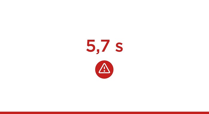
Don’t: A long loading time annoys users and increases the bounce rate significantly.
6 • Think about offline scenarios
If the internet connection is slow, the best interface is difficult or impossible to use. “Caching” and informing the user about the loading status improves the user experience. If a function cannot be used due to an interrupted internet connection, the user needs to be informed and the data should be saved. New attempts are automatically started or the user can repeat the action manually. Consider the file size of images and video assets. Use lazy loading, so the first content is displayed while the rest is still loading in the background.

Do: The user is informed about an error within the same product or service—e.g. with a “snack bar” at the lower bottom of the page. All input data is still in the cache and the user can continue when reconnected.
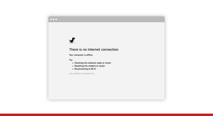
Don’t: The missing internet connection breaks the service and shows a standard browser error. All data is lost and the user has to start from scratch.
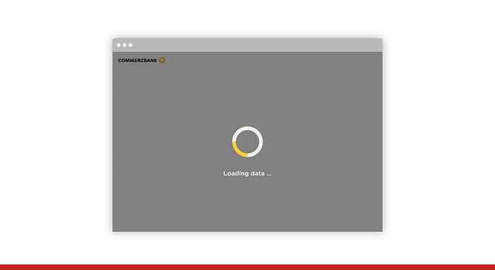
7 • Reduce perceived waiting time
We use progress bars, loading animation loops and lazy loading to communicate that a page or an application is loading. This decreases perceived waiting time when compared to a blank screen. If the loading process takes longer than expected, a system should communicate it.

Do: If possible, display the remaining waiting time e.g. with a progress indicator. Skeleton screens (placeholder blocks as shown above) indicate that first data are loaded and suggest which kind of content will show up next.
Don’t: The screen is blocked while loading, so the user cannot navigate back or interact with the interface in any way while loading. Since no lazy loading or skeleton screen is available, they don’t know what to expect.
8 • Provide feedback on interactions
No essential user interaction should be without feedback. If an issue or problem arises, we provide cues on how to resolve it, rather than just saying that something is not working.

Do: We provide feedback on user actions. In this case, a success message is displayed at the lower bottom of the viewport.

Don’t: We don’t just ignore feedback, because we think it’s not needed or relevant.
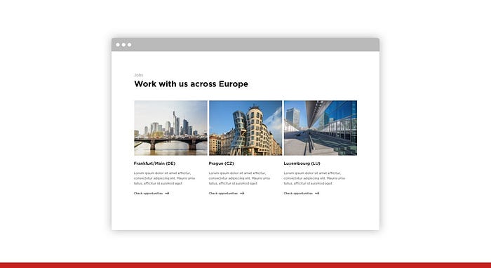
9 • Use dialogue
Conversational interfaces allow a more “natural” human-computer interaction. Dialogue helps users to find their way through a digital product without getting stuck in a dry process. We engage our users and build customer relationships.

Do: This job search is a short dialogue which filters the relevant job offers out of all available options.
Don’t: This job search is built around locations—which may not be relevant for some users at all. It can be described as a monologue.
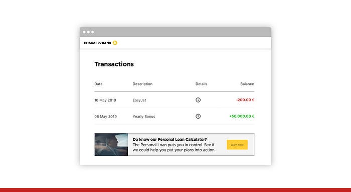
10 • Add personalization
Search and filters are the easiest way to personalize content. In combination with “cookies”, the input can be recalled the next time—even without the login of the user. The most common form of personalization utilizes personal accounts that work across devices. Users are identified and the content is tailored to their needs.

Do: In this fictive and simplified example, the user received a yearly bonus. At the end of the page, the user gets a personalized offer to open a saving account with a higher interest rate.
Don’t: In this example, the same user sees a non-personalized offer. The loan calculator is not relevant and does not fit the user need at all.
11 • Reuse data in a smart way
Users shouldn’t be asked twice for the information they have already provided. However, data must be verified or adjusted when needed. User actions and to some extent financial data can also be considered for personalization. Cautiously used, it can help users to do a job faster (more efficient) or to accomplish the job better (more effective).

Do: In this simplified example, the user is provided shortcuts to actions, he frequently uses (based on previous behavior).
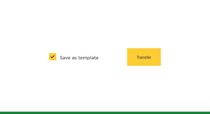
Do: In this example, the user can save a standard task as a template and reuse it later.
12 • Allow configuration and control
Users want to influence how their data is used and why certain content is displayed. Transparency and control are key factors for a good user experience, especially in the context of sensitive financial data.

Do: In this example, users have full control and can adjust personalization preferences e.g. in data privacy, messaging, and advertising.
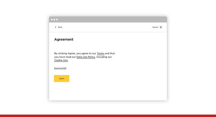
Don’t: In this simplified example, users are forced to agree without seeing the essential points of the agreement at first sight and without the option to adjust them to their personal preference.
Conclusion
Our small Neugelb team succeeded in creating universal rules combined with specific examples as do’s and don’ts. We put a lot of time and effort to test them internally to ensure that all principles are useful. This is in line with the overarching goal of Neugelb: using human-centered design to solve the right problems and to exceed user expectations.
Done at Neugelb Berlin/Frankfurt
https://www.neugelb.com
Core Team
David Dusanek, David Mühlfeld, Sebastian Fiegen (in alphabetical order)
Advisors and testers
Bo Jensen, Federica Deschino, Franziska Gronwald, Holger Grünwald, Joshua Pacheco, Malte Rojahn, Murilo Fonseca, Sandy Kauer, Tomáš Hustoles (in alphabetical order)

