13 Tips For Improving Landing Page Design

01/ Use a colour overlay on images with text
Sometimes you’ll have to work with some crappy images. Try using them more like a background texture rather than a main focal element by overlaying the brand colour at a semi-opaque setting. This will give you the necessary contrast to make overlaid text readable. In the example below, I also applied a dark blue drop shadow to the text to further boost contrast.

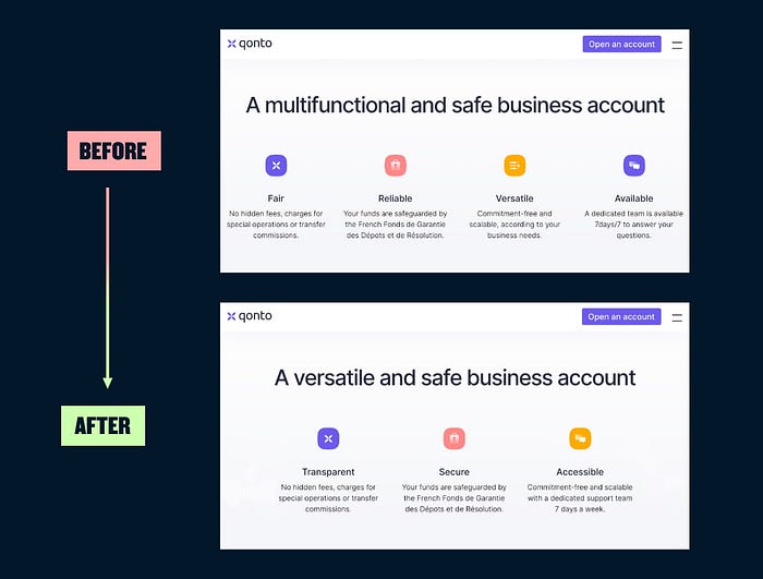
02/ Don’t over do negative space
Designers love negative space and we always hear how we should have more of it on the web. But when there’s excessive negative space between elements that belong together, the eye stutters and falls into empty voids instead of easily flowing over connected elements.
03/ No one likes a word salad
Anyone who has looked at website analytics knows you have a very small amount of time to grab someone’s attention. Get to the point.

04/ Even text only layouts should be visually appealing
Text only sections of a landing page can be hard to design, especially if you don’t have the opportunity or resources to use illustration, iconography or photography. Look to your brand colours and typographic details as quick wins to lift your design.

05/ Icons small, illustrations big
Icons are great, but they should know their place. These guys are simple by nature and love to play a supporting role. Blow them up a big and now you just have a bad illustration. If you’re using an icon with a title, you’ll want the title to pop out first.

06/ Use letter spacing sparingly
There are a number of ways we can use letter-spacing to subtly improve typography, but if you’re not an experienced typographer stick to just adding a bit of letter spacing to your all caps titles. Adding extra letter spacing to sentence case text can create issues with readability, as well as breaking apart the natural rhythm of a typeface’s design.

07/ Watch your line lengths in FAQs
The FAQ section is probably the web’s no.1 culprit in terms of egregious line lengths. Optimal line length is between 45 to 75 characters, including spaces and punctuation.

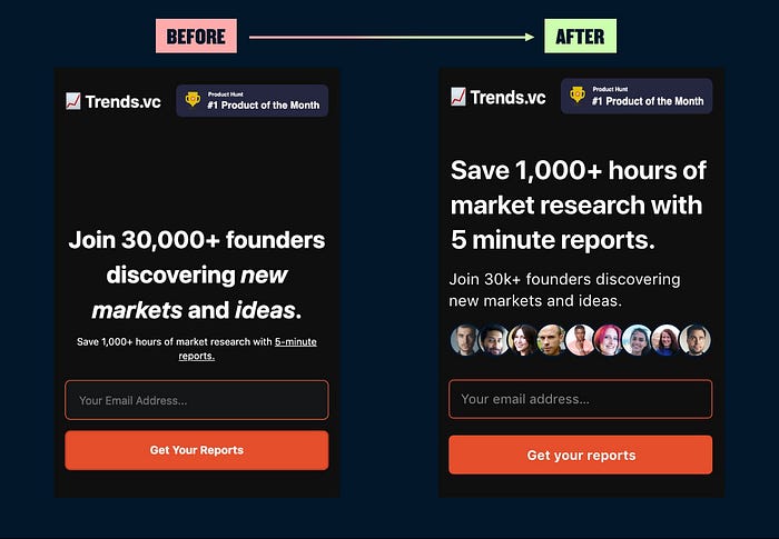
08/ Show me the value
In this example, the real value proposition was hidden in a barely readable subtitle. There was also an easy opportunity to add authenticity to the social proof by adding the faces of real users.
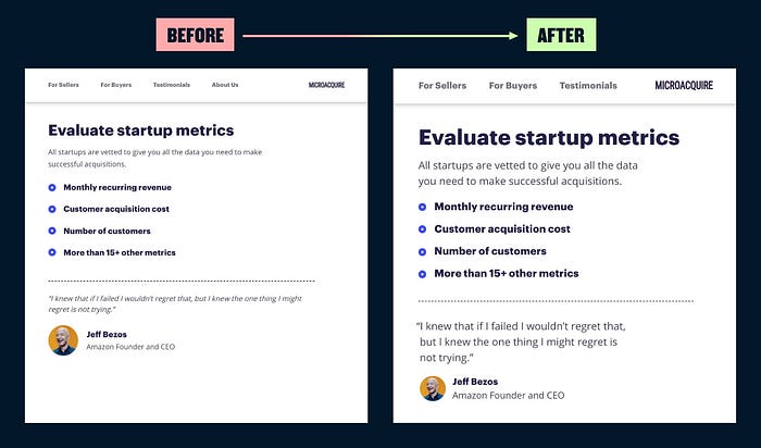
09/ No one likes tiny text
In this example, variable web typography was used in the CSS, creating scenarios where body copy was 11px and navigation links 9px. Browser defaults of 16px font size are now 20 years old — use modern fonts designed for screens and start body copy at 18–20px.
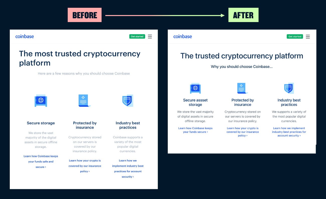
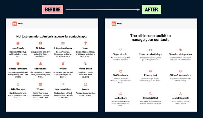
10/ Apply the rule of odds
Layouts pack more of a punch with an odd number of elements. If you have 4 points to make, trying saying the same thing in 3 by combining 2 points together. If that’s not possible, prioritise your points and cut the weakest. Be wary going to 5 in a layout like the example below, as it will feel like cognitive overload.
11/ Manage cognitive overload
Combine and reduce your points where possible. Create contrast in size between titles and copy to improve the visual hierarchy, and use negative space to create a calmer experience when you have a lot to say.
12/ Use bright colours as an accent
Using bright colours in large areas is going to run you into contrast issues, potentially failing basic accessibility requirements for your text. On smaller elements like buttons, you’ll probably need to avoid white text.

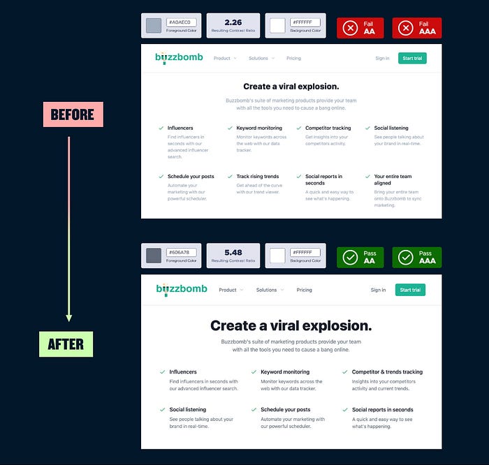
13/ Always check the contrast of grey text
Using grey text is a popular technique to create hierarchy between text elements. But this often leads to serious accessibility issues with text lacking sufficient contrast. Use an online tool to check contrast, and increase contrast in font sizing if you need to establish a clearer visual hierarchy.