Member-only story
14 Rules to Design Accessible Buttons

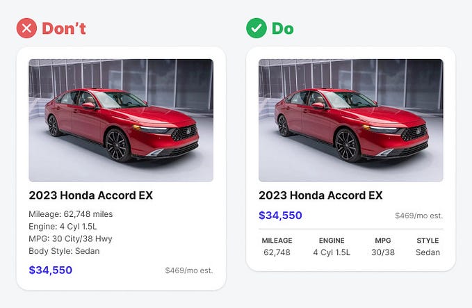
Buttons are designed so the users can perform actions while interacting with your application or product. Designing accessible buttons is essential for a seamless and inclusive user experience.
Below are a few rules with examples to make your buttons accessible to users.
Non-Medium members can keep reading the story here.
1. Make buttons look like buttons
Buttons should look like standard buttons. Using unusual shapes and styles will confuse users. Create a style guide to use while designing your application. This will help you stick with the standard theme and style.

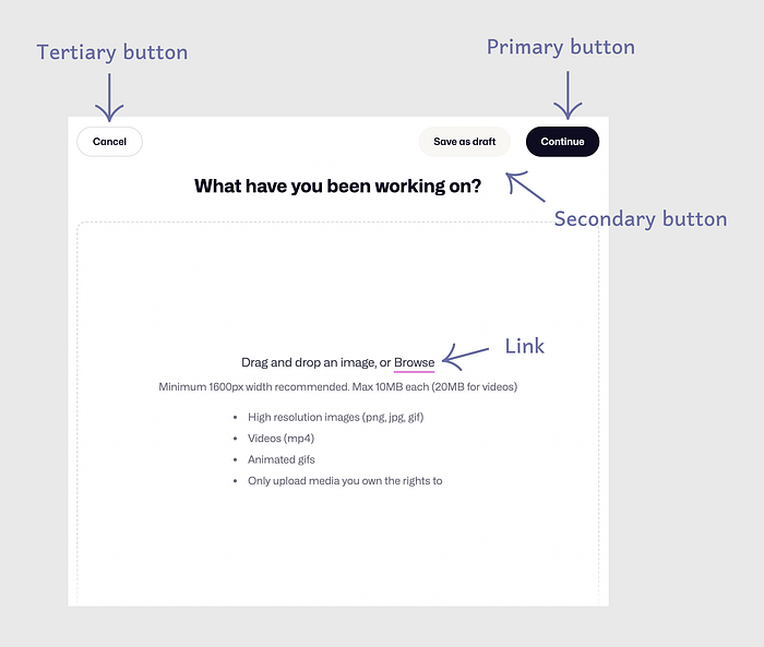
2. Differentiate buttons and links
Make a clear distinction between buttons and links. A simple understanding is that a button helps users perform an action, whereas a link allows users to go somewhere. The button should look like a button and not follow the appearance and style of a link, which is a simple underlined text.


3. Make primary buttons stand out
Usually, a page in your application involves one primary action users can perform. A primary button represents that primary action. The style of a primary button should make it stand out on the page from the rest of the items. Make a clear difference between primary and secondary buttons on the UI.


