14 Tips For Designing a SaaS Pricing Page

01/ Don’t miss your last chance to sell the outcome
If your prospective customer has made it to the pricing page, they’re right at the point of making a decision to either signup or move on. Don’t waste your H1 — reinforce the value proposition and remind them of the outcome of using your product.

02/ Show me the price
It’s almost never a good idea to hide the price. You create extra friction and doubt. If your competitor is showing me their price, I instantly feel I have more clarity with this product. Seeing transparent pricing provides your customers with a clear pathway for understanding how they might move through the tiers if their usage increases. And when you’re deciding on which numbers, consider the number 9 — psychological pricing suggests this really does work.
03/ Make those digits BIG
Now you’re showing the price make sure it takes the top spot in the visual hierarchy. After all, this is what people have navigated here to see. Small numbers look apologetic and suspicious, and slow your customers down in finding the info they’ll want first.

04/ Offer a discount upfront
So you’ve got your prices down and made them big, now let me see the amount go down as you tempt me with a discount. Monthly and annual options are fairly common, but why not 18 months? You could also try offering a small discount on the “popular” plan.

05/ Highlight your most popular plan
By highlighting your top selling plan you’ve just made what can be a stressful, confusing decision a lot easier by pointing the majority of customers to the plan that’s most likely to be a good fit for them.

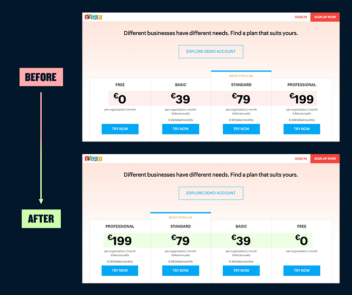
06/ Anchor your pricing with your most expensive plan first
By making the most expensive plan the first option most people will see, you create a price anchor that will influence the perception of the other plans. Steve Jobs famously pulled on the principle when he first presented the iPad with “$999” covering the screen behind him, and then went on to announce the actual price would be $499 to gasps of disbelief.
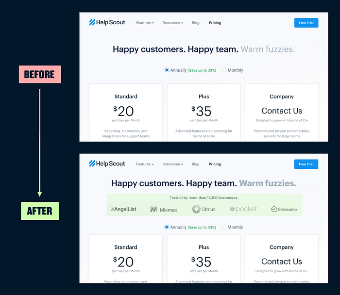
07/ Add some social proof and leverage social bias
In a confusing situation, we’ll often default to what others do. Showing testimonials or logos of prominent customers equates their success with using your product. “If they like it and it works for them, it should work for me.”
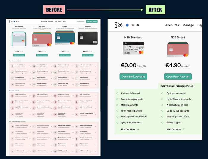
08/ Avoid a wall of checkmarks or icons
In this example below, we’re presented with an overwhelming wall of often repetitive information (the image only captures 50% of all the points). Stick with simple bullet points for lists on a pricing page and keep to the key points. Save yourself endlessly repeating points and head columns with “Everything in X plus”. If you have lots more to say, link out to a separate page for those who want it.
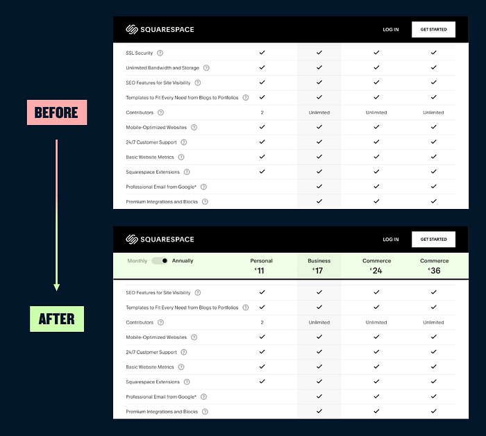
09/ Sticky headers for comparison tables
When you can’t avoid those checkmarks, make sure your top-level info for each plan is in a sticky header so it stays visible while scrolling. There’s no quicker way to lose someone than presenting them with a comparison table that makes for difficult comparisons.
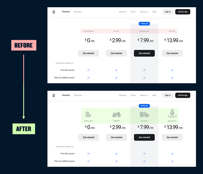
10/ Add some of your brand personality
If you have a minimal, clean pricing page you could consider bringing in a touch of your brand personality. Instead of some generic names for your tiers like Free, Basic and Pro, try thinking of something more memorable and illustrate each option.
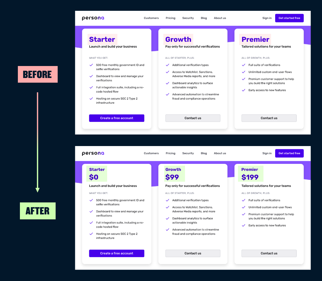
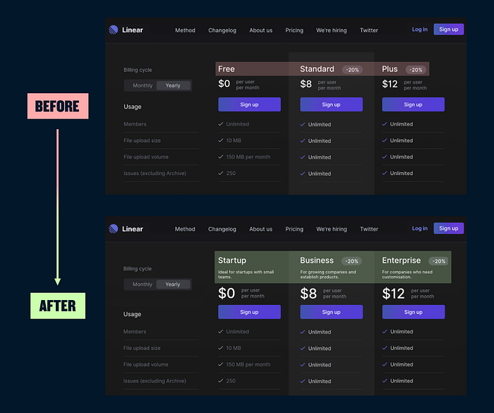
11/ Target and align each tier to your customer personas
Each tier of your plan should be targeting a customer persona based on research. Each offering should have in mind the persona’s demographics, feature priorities and willingness to pay. With this in mind you can consider coupling a title with a concise description of the plan that should immediately make it clear which plan is the right option for your different customers.
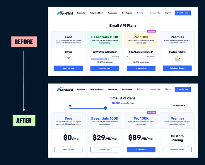
12/ Centre your pricing strategy around your value metric
Which value are different plans tied to? Users, contacts, storage? If you have one clear value metric, then you can consider using a slider to let your customers easily find an exact price tailored to their usage. In the example below, the customer has to navigate to a new page to get the final price, which will in most cases be much higher than the original price, only serving to disappoint.

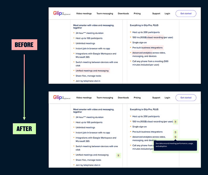
13/ Make sure you’re answering questions or objections
An FAQ below the fold is standard practice, but you should also look to your top-level points, adding context where there may be questions. Add tooltip explainers where necessary, so customers don’t need to scroll for answers.
14/ Simplicity sells
OK, so you’ve just read an article called, 14 Tips For Designing a SaaS Pricing Page, and you’ve got plenty of ideas. But wait. The most important thing of all is to make sure your pricing page feels simple and calm. In the example below, multiple sliders, lots of competing accent colours and iconography, makes it feel like each plan is shouting at you for attention.