Member-only story
If you’re going to use color effectively in your designs, you’ll need to know how to describe it precisely.
But sometimes, the words describing the color qualities can be pretty confusing. So I made this list of essential terms that UX/UI designers use frequently.
You don’t necessarily have to remember all of these technical terms. Just getting familiar with these different concepts is all you need.
- Achromatic — means without color. Achromatic colors can be anything from greys to a neutral color. It can also be black or white.
- Chroma — (or chromaticity) the degree of purity or intensity of a color. A color with high chroma appears more vivid or pure. A high chroma has no added black, white, or gray.
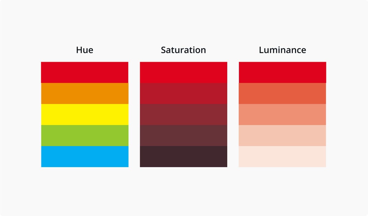
- Hue — another name for color. For example, a banana’s hue can be yellow. You can use the words “color” and “hue” can be used interchangeably.
- Saturation — is the intensity or purity of the color.
- Luminance — is the amount of brightness or light in color.
- Primary colors — refer to the colors that cannot be created by mixing other colors — red, yellow, and blue.
- Secondary colors — when equal parts of two primary colors are combined, secondary colors are created. They are purple (red mixed with blue), orange (red mixed with yellow), and green (yellow mixed with blue).
- Color wheel —is an illustrative model of colors in a circle. It shows the relationships between the primary, secondary, and tertiary colors. A primary color with a secondary color next to it on the color wheel creates tertiary colors.

- Analogous colors— refers to any colors that lie next to each other on the color wheel.