25 most popular google fonts — 2020
These are the 25 most popular free web fonts available on Google Fonts.
25 Most Popular Google Fonts — Google Fonts is a huge free directory of selected open-source fonts curated by the Google team and developed by font developers, designers, and agencies around the world. It was founded in 2010. Since then, it is regularly being updated and as of writing this article, it has 980 fonts.
In this article, we’ve collected the 25 most popular Google Fonts for February 2020
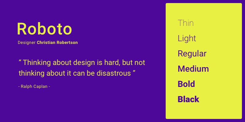
Roboto by Christian Robertson
Roboto has a dual nature. It has a mechanical skeleton and the forms are largely geometric. At the same time, the font features friendly and open curves. While some grotesks distort their letterforms to force a rigid rhythm, Roboto doesn’t compromise, allowing letters to be settled into their natural width. This makes for a more natural reading rhythm more commonly found in humanist and serif types.

Open Sans By Steve Matteson
Open Sans is a humanist sans serif typeface designed by Steve Matteson, Type Director of Ascender Corp. This version contains the complete 897 character set, which includes the standard ISO Latin 1, Latin CE, Greek and Cyrillic character sets. Open Sans was designed with an upright stress, open forms and a neutral, yet friendly appearance. It was optimized for print, web, and mobile interfaces, and has excellent legibility characteristics in its letterforms.

Lato by Łukasz Dziedzic
When working on Lato, Łukasz tried to carefully balance some potentially conflicting priorities. He wanted to create a typeface that would seem quite “transparent” when used in body text but would display some original traits when used in larger sizes. He used classical proportions (particularly visible in the uppercase) to give the letterforms familiar harmony and elegance. At the same time, he created a sleek sans serif look, which makes evident the fact that Lato was designed in 2010 — even though it does not follow any current trend.
The semi-rounded details of the letters give Lato a feeling of warmth, while the strong structure provides stability and seriousness. “Male and female, serious but friendly. With the feeling of the Summer,” says Łukasz.

Oswald by Vernon Adams
Oswald is a reworking of the classic style historically represented by the ‘Alternate Gothic’ sans serif typefaces. The characters of Oswald were initially re-drawn and reformed to better fit the pixel grid of standard digital screens. Oswald is designed to be used freely across the internet by web browsers on desktop computers, laptops and mobile devices.

Roboto Condensed By Christian Robertson
Roboto has a dual nature. It has a mechanical skeleton and the forms are largely geometric. At the same time, the font features friendly and open curves. While some grotesks distort their letterforms to force a rigid rhythm, Roboto doesn’t compromise, allowing letters to be settled into their natural width. This makes for a more natural reading rhythm more commonly found in humanist and serif types.

Slabo 27px by John Hudson
Slabo is a collection of size-specific fonts for use in online advertising and other web uses. The collection currently includes this font, Slabo 27px, and Slabo 13px. Each font in the collection is fine-tuned for use at the pixel size in its name.

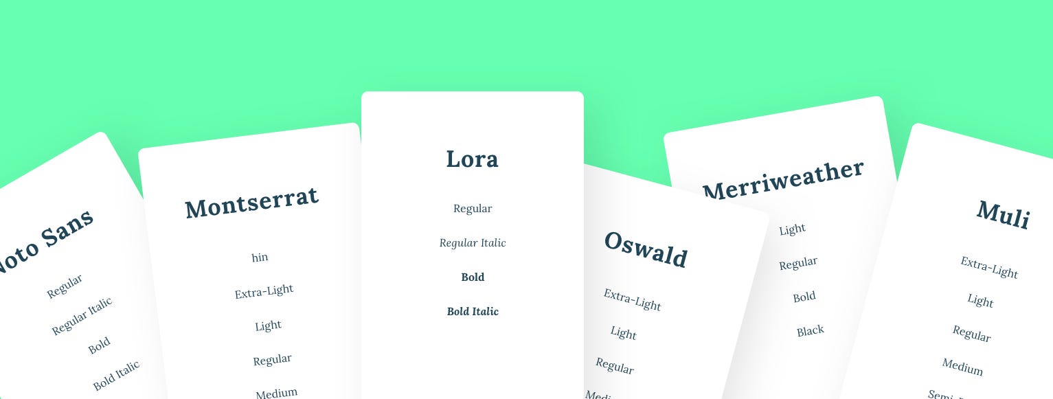
Montserrat by Julieta Ulanovsky
The old posters and signs in the traditional Montserrat neighborhood of Buenos Aires inspired Julieta Ulanovsky to design this typeface and rescue the beauty of urban typography that emerged in the first half of the twentieth century. As urban development changes that place, it will never return to its original form and loses forever the designs that are so special and unique. The letters that inspired this project have work, dedication, care, color, contrast, light and life, day and night! These are the types that make the city look so beautiful. The Montserrat Project began with the idea to rescue what is in Montserrat and set it free under a libre license, the SIL Open Font License.

Source Sans Pro By Paul D. Hunt
Source® Sans Pro, Adobe’s first open source typeface family, was designed by Paul D. Hunt. It is a sans serif typeface intended to work well in user interfaces.

Raleway by Multiple Designers
Raleway is an elegant sans-serif typeface family intended for headings and other large size usage. Initially designed by Matt McInerney as a single thin weight, it was expanded into a 9 weight family by Pablo Impallari and Rodrigo Fuenzalida in 2012 and iKerned by Igino Marini.
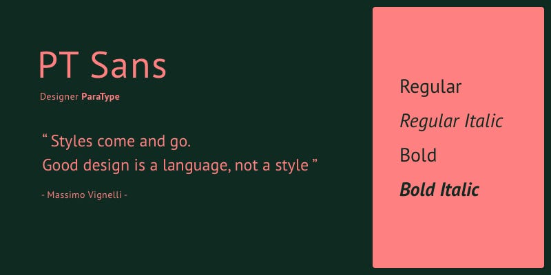
PT Sans By ParaType
PT Sans was developed for the project “Public Types of Russian Federation.” The second family of the project, PT Serif, is also available.

Open Sans Condensed By Steve Matteson
Open Sans is a humanist sans serif typeface designed by Steve Matteson, Type Director of Ascender Corp. This version contains the complete 897 character set, which includes the standard ISO Latin 1, Latin CE, Greek and Cyrillic character sets. Open Sans was designed with an upright stress, open forms and a neutral, yet friendly appearance. It was optimized for print, web, and mobile interfaces, and has excellent legibility characteristics in its letterforms.

Roboto Slab by Christian Robertson
Roboto has a dual nature. It has a mechanical skeleton and the forms are largely geometric. At the same time, the font features friendly and open curves. While some grotesks distort their letterforms to force a rigid rhythm, Roboto doesn’t compromise, allowing letters to be settled into their natural width. This makes for a more natural reading rhythm more commonly found in humanist and serif types.

Merriweather By Sorkin Type
Merriweather was designed to be a text face that is pleasant to read on screens. It features a very large x height, slightly condensed letterforms, a mild diagonal stress, sturdy serifs and open forms.

Lora by Cyreal
Lora is a well-balanced contemporary serif with roots in calligraphy. It is a text typeface with moderate contrast well suited for body text.

Ubuntu by Dalton Maag
The new Ubuntu Font Family was started to enable the personality of Ubuntu to be seen and felt in every menu, button and dialog. The typeface is sans-serif, uses OpenType features and is manually hinted for clarity on desktop and mobile computing screens.
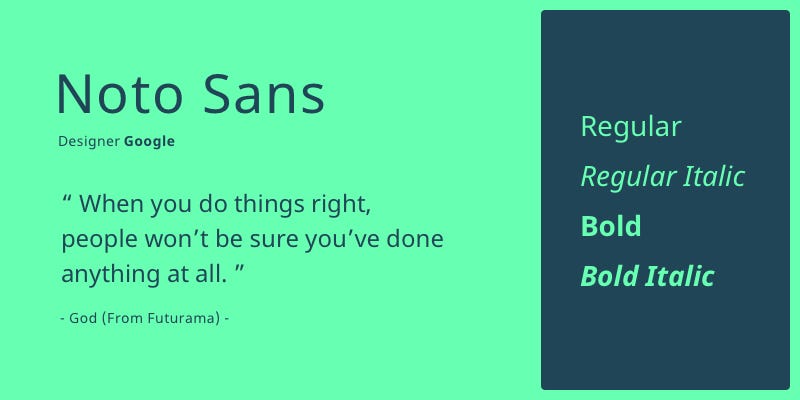
Noto Sans By Google
Noto helps to make the web more beautiful across platforms for all languages. Currently, Noto covers over 30 scripts, and will cover all of Unicode in the future. This is the Sans Latin, Greek and Cyrillic family. It has Regular, Bold, Italic and Bold Italic styles and is hinted. It is derived from Droid, and like Droid it has a serif sister family, Noto Serif.

Playfair Display By Claus Eggers Sørensen
This design lends itself to this period, and while it is not a revival of any particular design, it takes influence from the designs of John Baskerville and from ‘Scotch Roman’ designs. Being a Display (large size) design in the transitional genre, functionally and stylistically it can accompany Georgia for body text.

Poppins by Indian Type Foundry
Geometric sans serif typefaces have been a popular design tool ever since these actors took to the world’s stage. Poppins is one of the new comers to this long tradition. With support for the Devanagari and Latin writing systems, it is an internationalist take on the genre.
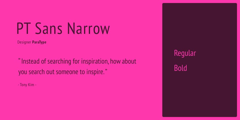
PT Sans Narrow By ParaType
PT Sans is based on Russian sans serif types of the second part of the 20th century, but at the same time has distinctive features of contemporary humanistic designs. The family consists of 8 styles: 4 basic styles, 2 captions styles for small sizes, and 2 narrows styles for economic type setting.

PT Serif By ParaType
PT Serif is a transitional serif typeface with humanistic terminals. It is designed for use together with PT Sans, and is harmonized across metrics, proportions, weights and design.

Arimo by Steve Matteson
Arimo was designed by Steve Matteson as an innovative, refreshing sans serif design that is metrically compatible with Arial™. Arimo offers improved on-screen readability characteristics and the pan-European WGL character set and solves the needs of developers looking for width-compatible fonts to address document portability across platforms.

Roboto Mono by Christian Robertson
Roboto Mono is a monospaced addition to the Roboto type family. Like the other members of the Roboto family, the fonts are optimized for readability on screens across a wide variety of devices and reading environments. While the monospaced version is related to its variable width cousin, it doesn’t hesitate to change forms to better fit the constraints of a monospaced environment. For example, narrow glyphs like ‘I’, ‘l’ and ‘i’ have added serifs for more even texture while wider glyphs are adjusted for weight. Curved caps like ‘C’ and ‘O’ take on the straighter sides from Roboto Condensed.

Titillium Web By Multiple Designers
Titillium is born inside the Accademia di Belle Arti di Urbino as a didactic project Course Type design of the Master of Visual Design Campi Visivi.

Muli by Vernon Adams
Muli is a minimalist Sans Serif typeface, designed for both display and text typography.

Nunito by Vernon Adams
Nunito is a well balanced sans serif typeface superfamily, with 2 versions: The project began with Nunito, created by Vernon Adams as a rounded terminal sans serif for display typography. Jacques Le Bailly extended it to a full set of weights, and an accompanying regular non-rounded terminal version, Nunito Sans.
The “25 Most Popular Google Fonts List” is based on Analytics — Google Fonts

Originally published at https://www.themasterpicks.com on February 28, 2020.

