3 Awesome User Onboarding Flows for Web
This is not going to be yet another “best practices” article because there is no definitive best user onboarding. User experiences vary from product to product. So, I have just picked a few user onboarding flows for web which I love! This is going to be an enjoyable ride, so let’s get started!
Dropbox
Frankly speaking, I remember there was a time when I didn’t like Dropbox so much. I don’t know what was the reason but I can definitely say that I am completely in love with now especially when I see how much effort Dropbox has invested in making its user onboarding awesome. And it really is!


Dropbox makes it unbelievably easy to understand the product and to get started on file sharing and saving. Note that the product tour does not take too much time but if the user wants to learn more, they can download the pdf teaching how to use both the web app and the mobile app. Noticed the cute illustration in the welcome message and the one used for the empty space? The empty spaces are used wisely: everything is fun and looks really neat.
These fun illustrations lighten the mood and they by no means hinder the textual content. Clarity of message is put above anything else.
Netflix
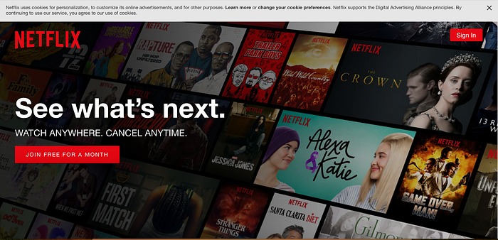
Netflix user onboarding goes as sexy as possible. The colors, fonts, images, everything speaks for itself. In theory, getting started with Netflix could be a total disaster for the users considering the huge number of movies and shows on the platform. However, Netflix is straightforward. Right on the first page, you see the text in big white fonts “Watch anywhere. Cancel anytime.” This is the most idiot-proof way for a paid service to let potential users know that it is paid.
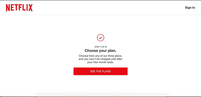
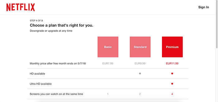
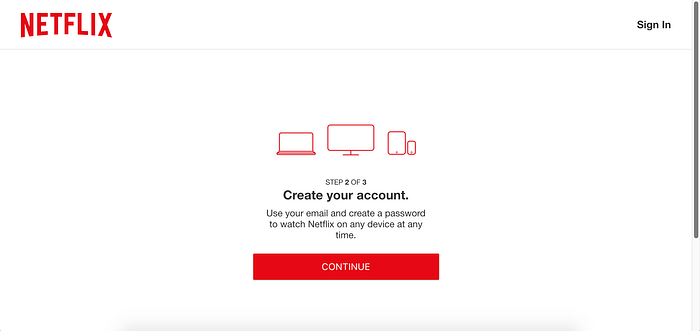
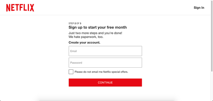

That said, they take the users right to the pricing page. All Netflix-ers are offered a free 30-day trial. Then the user just needs to add a payment method and to get started.
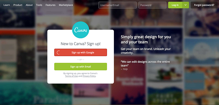
Canva
Canva’s onboarding is pure love. It’s like a whole school that teaches how to use the product for a variety of purposes. But unlike traditional classes, Canva’s “onboarding classes” are incredibly delightful. Take a look!
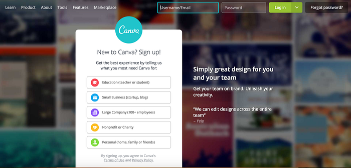
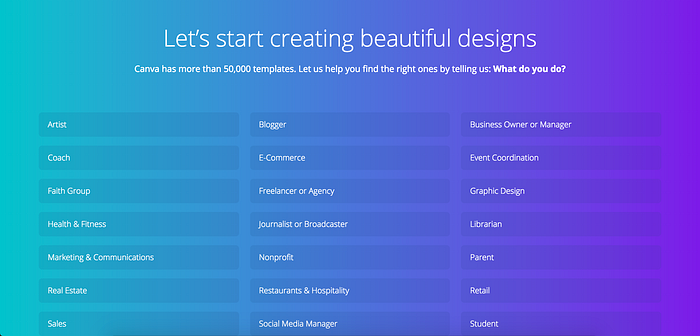
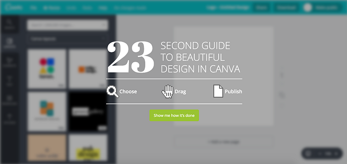
First off, Canva asks you WHY you want to use it. It does so to offer you a more personalized onboarding. As soon as you pick what you are most interested in designing, it shows you a tailored 23-second video (no audio though) which shows how you should create your preferred design. No 2- minute explainer videos or boring marketing videos. Nothing like that!
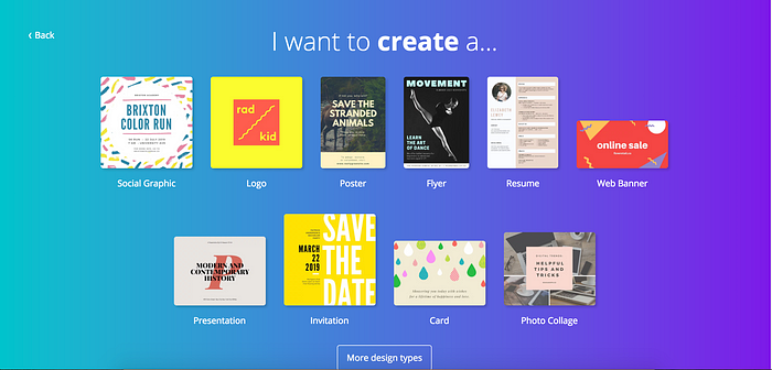
Instead, Canva explains to you how it works by having you actually use it. Step by step you create the design and see how easy it is to do. These little onboarding tutorials are both quick and fun. This triggers a positive response from the user. People at Canva know that the first impression is key that’s why they turn your first interaction with the product into such an awesome experience.
Conclusion
It is important to keep in mind that it’s not simply about getting users sign up. Making them understand the value of your product as soon as possible is KEY. This will help retain users by building a long-lasting relationship. So make sure you structure user onboarding the right way.
If you enjoyed this article, please hit that clap button to help others find it.

Rafayel Mkrtchyan is a product management consultant who helps companies improve their product discovery and delivery processes. He teaches teams how to set up a winning product strategy, run customer and product development processes, as well as robust their lean, agile, and design thinking skills. Contact him via contact@productguy.io.
Follow him: Medium | Twitter | LinkedIn