
3 design choices that make Whatsapp the best instant messenger
People love their messaging apps like their hometown sports teams. You’ll find die hard fans of iMessage, Messenger, Telegram, Signal, etc. defending their platforms with a ferocity found more in sports bars than on internet forums. Oh and I forgot Kik. But nobody uses Kik.
To fan the flame and of course spark civil and productive discourse, I’ll make the claim that Whatsapp is the best messenger product because of subtle but smart design choices that were made.
When iMessage launched in 2011, many predicted the demise of the popular internet-based chat app, Whatsapp. But years later, even with big entrants like Facebook Messenger, people (including myself) still use Whatsapp more frequently than all my other clients combined.
Sure there’s the cross-platform debate (iMessage isn’t available on non-iPhones) but I’d like to posit that there are some subtle design choices made by the folks behind the bright green logo that actually lead to it being the best product, agnostic of platform. Though they’re subtle, due to the frequency of engagement (you literally use these products multiple times a day every day) the impact is outsized.
I’ll use iMessage and Messenger as comparisons here.
Color
First, color. Both Messenger and iMessage opted for white backgrounds, with blue to indicate your messages and grey to indicate others’ responses. Whatsapp on the other hand opts for a default beige background, with your messages in light green and responses in white.

So? What’s the big deal?
The Job To Be Done for messenger apps, is typically something along the lines of “I want to communicate with my friends & loved ones, in a way where we both don’t have to be present at the exact same time”. The key here being who you are communicating with.
Not your clients. Not your boss. Your friends and family. The cold, clammy colors used by iMessage and Messenger sure look futuristic and cool, but given the Job To Be Done, the visuals don’t match what users are looking for. As cheesy as it sounds, when I talk to my friends and family I want to feel warm and fuzzy inside, not cold & sleek. The beige tones are warm, the playful icons destress me, and the colorful names make me feel like I’m sitting on a couch with my friends playing Monopoly. Because naturally, that’s where my fondest memories are.

Instead, iMessage & Messenger make me feel like I’m working. And when I’m home on the couch after a long day of work, the last thing I want on my mind is something to remind me of where I spent the other 90% of my day.
It’s tempting to make things beautiful, I know. I constantly fall prey to this, and am certainly not the shining example here. But designers need to get off their high horses and remember that just because a product looks great doesn’t mean it’s well designed. Design exists to solve a problem. If the problem isn’t solved well, hate to break it to you, but it’s poorly designed.
Information Architecture
When you click “create new” in both iMessage and Messenger, an empty bar pops up, prompting you to enter someone’s name or select from a list. When using Whatsapp, the first option is to create a new group, before selecting from a list of individual users.
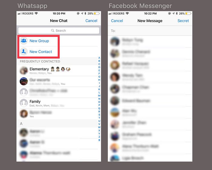
What this subtle difference tells us is that Whatsapp prioritizes group conversations over individual messages. Inevitably, because of that emphasis, more people create groups on Whatsapp. How many of your social interactions are only with one person? Sure you have a significant other perhaps, but more often than not, if I want the value of being included and informed by my friends and family, that happens in a group with multiple participants.
Not only that, but when creating a group, Whatsapp prompts you to enter a name for the group and pushes you to take a photo to represent what the chat is about.
As a user, that says to me that iMessage and Messenger are built for utility. They’re built for when I have the sole task of communicating important information to someone else. As for fun banter between friends and family to make me feel warm and fuzzy inside? That belongs on Whatsapp.
What results is that when I look at my list of Whatsapp chats, I see an array of colorful profile pictures, nostalgic memories, cute dogs, and funny emojis.

Yes, I like dogs.
The same unfortunately can’t be said of my iMessage chats. It’s a little intangible, and I know some of you may think it’s completely illogical. But humans are not logical. They’re emotional, and in order to make their lives better we need to be able to empathize with those emotions.
It’s almost as if Whatsapp feels like a place I can call home, versus a user interface that makes me feel like I’m staring at my electricity bill. And considering how frequently I open Whatsapp, I’d much prefer to feel at home 50 times a day than the alternative.
Interaction
I always lament to people that design communities like Dribbble have devolved into digital art, rather than design.
Design solves a problem, art is an expression. That means that aesthetics & flair should only be there if they solve a problem that the user has, and in fact be done away with if it doesn’t.
When you send a message in iMessage, notice the sound the app makes. It’s a nice little swoosh, lasting probably around a second. It’s timed with the bubble of what you typed moving into the chat window, followed after another second by the message “delivered” pushing up your message underneath.
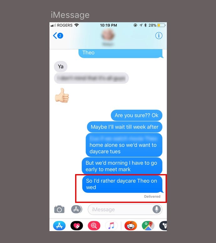
It makes for a great experiential one-two punch. Great sound, smooth animation of the “delivered” moving into the chat window. The problem is, as good as it feels to send a message, it feels slow.
Try and do the same in Whatsapp. The sound is a single dot, as if a drop of water dropped into a tub. It lasts probably a fraction of a second, and although I’d argue it’s not audibly as nice a sound, it communicates a better message. What it says is that your message, well, is instant.
As a designer, I try and put myself in the shoes of my user. What are they concerned about? What are the emotional anxieties and thoughts that are present when someone is performing a task?
It turns out, when people communicate via IM, they send a lot of messages. The next time you’re commuting and people around you are texting, notice how frequently they are hitting the send button. Speed, or at least the illusion of it, is certainly something that matters to people given how many messages they send.
The funny thing is, the speed at which an iMessage is delivered shouldn’t be very different from the speed at which a Whatsapp Message is. Whatsapp simply feels faster because the message appears in the chat instantly with the grey checkmark underneath it, and doesn’t have the word “delivered” appearing a second or two after you hit the send button. And that feeling, for myself at least, is valuable.
A lesson in empathy
Missed opportunities like this are rampant, not because we’re deliberately ignoring value, but because we’re incorrectly placing where we believe value exists.
Technology companies used to only value raw computing horsepower, but there are many occasions now where speed actually harms the user more than it helps. The research group Nielson Norman cites a study as such. The lesson is that just because speed matters for instant messengers, it as a feature itself is not the goal. Speed is simply a hammer that needs the right kind of nail to hit. And there are certainly situations where that hammer is the wrong tool for the job. Like fixing migraines, for instance.
We need to make sure that everything we are designing and optimizing actually makes people’s lives better. Otherwise we are simply spending time and money creating features that don’t need to exist. To do that, designers need to spend more time empathizing with users before getting lost in a rabbit hole of “cool things” that really serve no purpose.
Remember, at the end of the day, technology for its own sake is useless. It is only useful insofar as it solves human problems.
Join me for weekly product design insights where I share conversations I’ve had with top designers & directors from companies like Dropbox, what I’ve learned from scaling a startup into the millions in revenue, and more!

