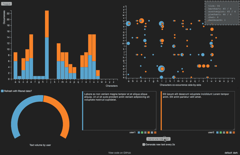
3 very popular types of charts in UI design

With dashboard management web design, the chart is an indispensable part. Using the right type of chart to represent data will greatly contribute to the user experience. Choosing the wrong chart type can lead to confusion or even misrepresentation of the data.
If you’ve ever designed a dashboard or worked on a project that required visualizing data graphically, it must be a difficult task for you. The difficulty comes from many aspects, difficulty in choosing the right chart type, or when you have chosen the right chart type, but the limitation of the library or the level of the FE team makes your chart not approved by the project team.
Pie and donut charts are often used, but in some cases, they are still not the best type of chart to represent data.
In this article, I want to share some of the most common types of charts in UI design. I also try to explain in the easiest way how to choose the right chart type to designing.
Choose the right chart for your design
On the dashboard management screen, the numbers would be meaningless without comparison. UX, data is often compared at different times. For example, if I say the number of users is 200 people, what does this mean? Doesn’t make any sense unless I also say that last month the number of users was 300 people and this month it is 200 people. Managers need to compare with the same period to express the specific meaning of the numbers.
Choosing the right chart for your design is important because it can affect the effectiveness of the message you’re trying to convey. Here are some tips to help you choose the right chart:
- Determine the type of data you want to represent: Before choosing a chart, you need to know what kind of data you want to display in the chart is it categorical or numerical data? Continuous or discrete data?
- Consider the message you want to convey: Different charts are better suited for different purposes. If you want to show changes over time, a line chart or a bar chart would be suitable. If you want to compare values between categories, a bar chart, pie chart or donut chart will be suitable.
- Keep it simple: Use charts that accurately represent data and don’t add unnecessary complexity. A chart with too many elements or too much information can confuse the reader and make it difficult to understand the message you are trying to convey.
- Pay attention to the axis: Make sure that the axis on the chart is correctly labeled and scaled to the data. This will help ensure that the chart accurately represents the data.
- Choose a chart that is visually appealing: The chart should be aesthetically pleasing and easy to read. Choose a chart that has a modern design that is clear and easy to interpret.
By considering these factors, you can choose the right chart for your design and communicate your message to your audience effectively.
3 Types of Charts in UI design
1. Pie chart
A pie chart is a circular statistical chart that is divided into slices to illustrate the proportion of data. Each slice represents a category and the size of the slice is proportional to the quantity it represents compared to the whole. The entire circle represents the total value of all categories.
Pie charts are useful for displaying data that can be divided into parts, such as the proportion of different types of fruit in a fruit basket. It’s important to note that pie charts are best used for relatively simple data sets, as it can be difficult to interpret the chart when there are too many slices.

2. Bar chart
A bar chart is a type of chart that uses different heights of bar to represent values. Bar charts can be created using a vertical bar, horizontal bars, or stacked bar (to show multiple different values of one unit).
Bar charts are commonly used in business and financial analysis to display data across different points in time. The way values are displayed for each point in time and the comparison with other points in time helps effectively communicate information. For example, a column chart can be used to display spending distribution by category in a household, with each segment of the column representing the amount spent on a specific spending category.
3. Line chart
A line chart is a type of chart used to display the changes in a set of values over a specific time period. The data is drawn on a two-dimensional plane, with the x-axis representing time and the y-axis representing the values. A line is drawn connecting the data points to show the change in value over time. Line charts are very useful in displaying trends, patterns, and changes in data over time, making them a popular choice for financial and business analysis, scientific data, etc. The slope of the line represents the rate of change in the data and the distance of the line from the y-axis represents the magnitude of change.
Chart libraries available for front-end development
Because of the characteristics of front-end programming, it will be difficult to code a new chart, so when designing, the designer should also look for the chart libraries, the design of the libraries is also very beautiful and modern. Using the library will save time for both the design team and the front-end team. Here are the Chart libraries you can refer to:
- Chart.js: An open-source JavaScript library that is easy to use and provides a variety of chart types, including bar charts, line charts, and pie charts.
- D3.js: A powerful JavaScript library that is highly customizable, but may be more difficult to learn and use than other libraries.
- Highcharts: A commercial JavaScript library that provides a wide range of chart types and is highly customizable, but requires a paid license for commercial use.
- Plotly.js: An open-source JavaScript library that is easy to use and provides a wide range of chart types, including interactive charts and 3D charts.
Summary
Choosing the appropriate chart for your design is important in effectively transmitting the information. Using the right chart can help present information clearly and accurately in a way that is easy to understand and allows readers to easily summarize the data. There are many different types of charts available, but not all of them are commonly used due to their specific requirements and difficulties in interpretation. When selecting a chart for your design, it is important to consider the type of data you are working with and the message you want to convey, as well as your target audience. By taking these factors into account, you can ensure that your chart is both effective and suitable to your needs.
Hope this was useful for you. Thanks for reading through.

