4 Mobile App Onboarding Flows I am in Love With
There are two types of people: those who believe that user interface does not need to be explained and those who think that while user interface shouldn’t be complicated, you cannot expect a new user to understand a new interface without any sort of help.
Guess what? I am the second type of guy. And I do believe that the right mobile app onboarding can save your app from uninstalls and a bunch of other creepy stuff. And today, I am going to show you which mobile app user onboarding flows I do actually like. Here we go!
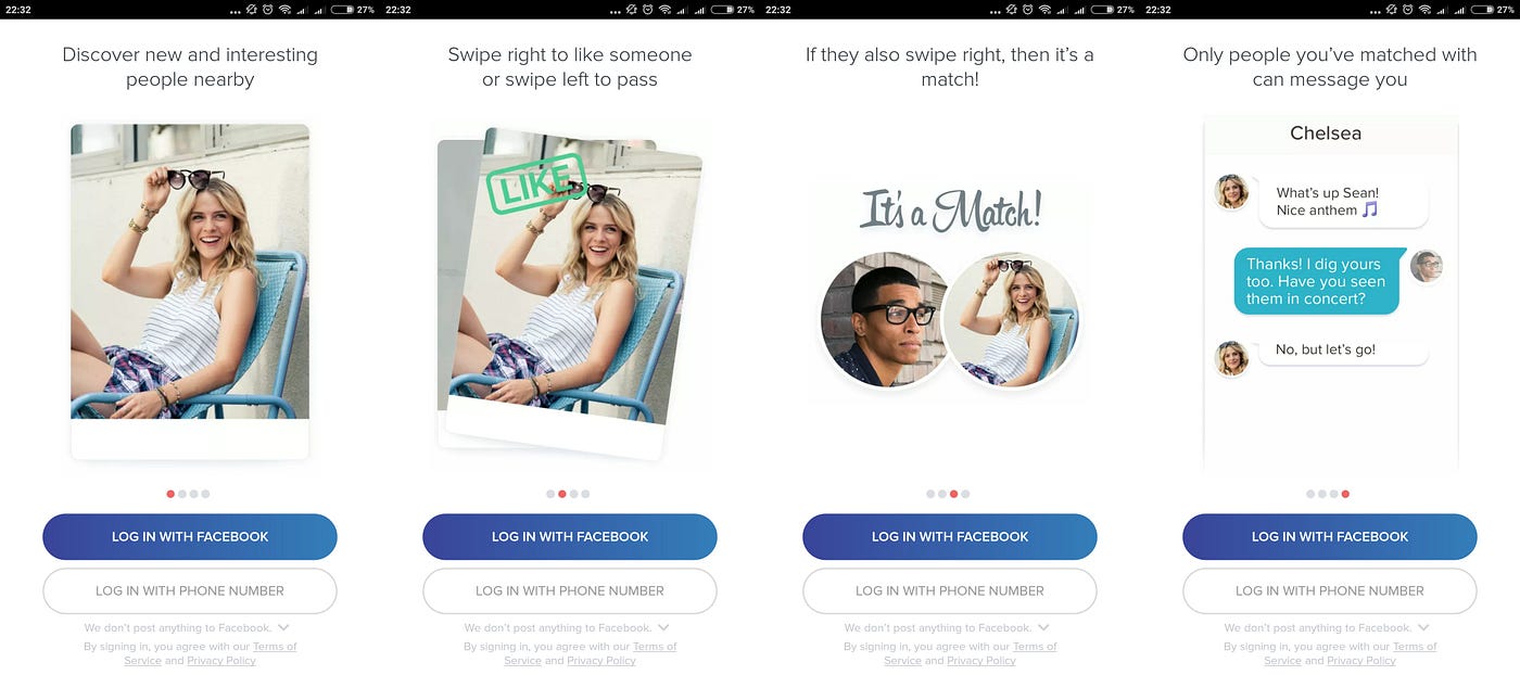
Tinder
A very specific UX feature, the swipe, stands at the core of this dating app. You only have to swipe right to “like” someone and swipe left to “dislike” them. If two users swipe right for each other, then they are a match. This allows them to start chatting.
Tinder’s onboarding flow starts with a standard four-screen tutorial that highlights how easy it is to get you a match by simply swiping left and right. And how easy it is to start a simple conversation with your possible match. The best part about Tinder’s onboarding is that you can skip it at any moment through logging in with Facebook or a phone number.
6 Minute Cellulite Buster
Health and fitness apps are on the rise these days. Of course, not all of them have got the perfect onboarding flow but the so-called “6 Minute Cellulite Buster” is quite good.
No, I am not trying to burn cellulite at home with an app, I have just done my research.
So, what I am trying to say about this app’s onboarding is that it’s so simple and stylish. I am not sure about the inside of the app but the onboarding is quite impressive in its simplicity. Flat design is used all over the onboarding flow with a few brief notes about how important it is to work out and to eat healthy and stuff like that. The design is consistent meaning that all those 6 screens have got the same style and it feels so nice. But the downside is that you cannot skip the onboarding at any moment you want to. You just have to swipe all those 6 screens until you get to the sign-up screen. Still, a pretty cool onboarding experience.

Buffer
Buffer is mostly a tool for digital marketing and SMM people. They can use it to schedule and publish their social media posts.
What distinguishes Buffer from all the other guys is first of all the language they use. No, it’s English of course, but it’s fun and intimate and sometimes even informal, very informal (lol).
Buffer’s mobile onboarding is simple and easy to understand. And here again, you can skip the onboarding by simply registering or logging in. However, instead of the standard “sign up” or “log in,” they got creative by using the phrases “I’m new to Buffer” and “I already have an account.” This is pretty cool considering that most mobile apps don’t risk the game. They avoid putting a lot of text or CTAs on the buttons. However, this is not the case with Buffer. They simply nailed it!

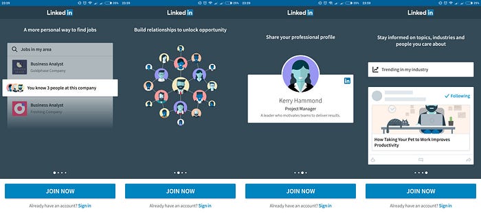
And last but not least, LinkedIn user onboarding feels interesting and professional. These guys have combined screenshot-like images with illustrations and the style is pretty consistent. At any moment, you can opt to sign up by pressing “Join now” or you can “sign in” if you have got an account. Note that the “Join now” button stands out more to make it easier for the LinkedIn newbies to sign up.
Another thing I love about LinkedIn mobile onboarding is that it says a lot with very little text. The trick is that unlike other apps, here the screenshots and the images are used not only as nice illustrations but as supplements for the screen descriptions. Look at the 3rd screen: instead of writing a whole lot of text about what professional profile is, they have simply provided a screenshot of a sample profile. Cool, isn’t it?
Summing up
No two apps can be the same. This means that there is no one solution for all or one design for all. But as you can see in the above examples, the onboarding flow can and should be simple, easy, and informative regardless the industry. Now that you know what app onboarding flows I like the most, let me know which ones are your favorites. Hit me up in the comments!
If you enjoyed this article, please hit that clap button to help others find it.

Rafayel Mkrtchyan is a product management consultant who helps companies improve their product discovery and delivery processes. He teaches teams how to set up a winning product strategy, run customer and product development processes, as well as robust their lean, agile, and design thinking skills. Contact him via contact@productguy.io.
Follow me: Medium | Twitter | LinkedIn