4 things no one tells you about prototyping in Figma.
Everyone has his favorite prototyping software: some prefer Invision (horrible creatures of the outer world I guess), others who own a Mac prefer Sketch and XD, others Figma like myself.
I have chosen Figma because I started using Windows 7 and had to easily collaborate with other people. This was possible with Invision too, but after 3 days of frustration, I uninstalled it. After some months I started noticing that some practices I adopted weren’t explained in any tutorial, and all came from continuous stressing mistakes and problems I faced while both developing websites and apps and designing. Let’s find out what ruined my workflow and how I personally fixed it.
4) You have to adapt to the resize bias.
Oh god, sizes. Everything looks perfect inside Figma, but when you develop with the same sizes outside, everything looks humongous. Why? Because you never work with a frame the size of your desktop. So you instinctively enlarge font sizes and images to look visible in a smaller rectangle. But when you bring that to full screen, you finally notice how that 24pt paragraph sucks.
If you experienced this problem, just follow more or less mindlessly size guidelines. Paragraphs should be around 14–18pt, subtitles 24–36pt et cetera. And in general, if it looks good on the small frame, just reduce it a bit again. Then, look at the preview. But never go too small.
3) Do not allow Google Fonts.
Wow, I can finally choose between 8965 different fonts! That is good for the first 5 minutes using Figma. Then, when you can’t even distinguish between half of them and the font preview mechanism is just bad, you’re going to pass hours and hours searching for the right font.
The easiest solution is this:
stop using Google Fonts, create a new project, and save a list of fonts you know and like. Like 20 of them for every need and style. And beware sharing your secret font recipes!

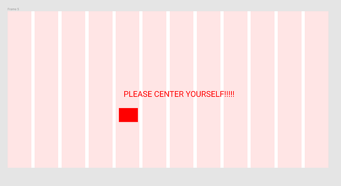
2) Fluffy grid columns and rows.
Oh yeah, the Layout Grid is great! let’s center something inside a column!. Oh wait. You can’t.
Replace them with rectangles.
Sounds stupid, but the easiest way is to replace them with invisible rectangles and use them as a guideline to the centering system. This will allow you to correctly center the main objects like Icons in a mobile app design.
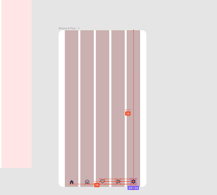
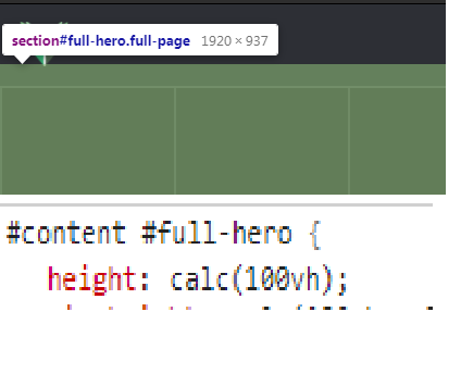
1) Stop using desktop screen resolutions, but calculate the viewport instead.
Premade frame sizes provided from Figma are useful, but extremely wrong when speaking of desktop design.
Why? Because those are the resolutions of desktop screens (and missing 1920x1080? really?) but do not calculate the real viewport.
What do I mean? Try designing a website using those sizes, then send the accurate numbers to the developer and prepare to see him scream. Why again? because every browser has its personal bar in the upper part.
Taking Chrome as an example (one of the most used browsers), it allows a viewport of 1920x969px on a 1920x1080px desktop resolution. That's a 143px difference. So, if you’re designing for the web, remember this number: 969px.
Conclusions
Figma is a great piece of software, and these aren’t inherently his problems, just misleading help-features that the more you know your job, the less you’re going to use.

