4 UX controversies that just won’t die

From hidden navigation patterns to the death of the User Researcher, Justinmind takes on 4 UX controversies that just keep coming back around
UX is an ever-evolving field, with designers constantly looking for innovative solutions to problems. With the ebb and flow of user demands, designers are kept busy redesigning UIs, breaking away from long-established usability conventions and kicking themselves for poor UX choices. In this post, Justinmind looks at four examples of controversial UX and why there has been so much debate over them.
User Researchers are no longer relevant
UX is all about creating meaningful, pleasurable moments and enhancing user satisfaction by seeking to improve usability and accessibility. So how do we know how to create these moments and experiences? Enter the user researcher, whose job is to understand user behavior and expectations through direct observation of users performing their usual tasks. Essentially, they are the key to investigating ideas for products and services that users truly want and need. So how could they be a dying breed?
We are our users, let’s design accordingly. It was Steve Jobs who said that “customers don’t know what they want” and used his own intuition to design what he and his team thought to be good design — the original user advocate. This was the man who rose to fame for co-founding Apple, inventing the iPhone, and becoming an all-round pioneer of the microcomputer revolution of the late 90s. Was he lacking knowledge about the user? We think not.
But we’re not all a Steve Jobs — and we shouldn’t all think ourselves user advocates. Luckily, a recent User Testing survey has confirmed that user research is not on its way out. In fact, user research budgets have been on the up for the past 4 years. The 2000+ software, business and marketing professionals that User Testing surveyed confirmed that user research is still very much alive and kicking.
They are however seeing a shift in the practice of user research from the start of the design process to the development stages. More and more, companies are introducing user research in to the programming phase. Through continuous investigations into user insights and feedback, the idea is to ensure that the user insights is taken into consideration throughout the building of the actual product. User researcher = knight in shining armor.
“More customer-centered products, better user experiences — and an increasingly competitive market in which companies that don’t invest in UX become extinct.” User Testing
Takeaway: we can’t all claim to be geniuses. User research is a necessary cog in the user experience wheel, helping to keep UX and development teams informed, on track and able to innovate.
Pop-ups: love em or hate em?
Restricting your view, sticky, interrupting your chain of thought. Pop-ups. Ugh! Can’t help but hate them. Modal windows, modal pop-ups, dialog boxes: pop-ups in all forms have developed a reputation for being the most annoying type of advertising for the majority of online visitors. In fact, a 2013 Apigee survey concluded that that 70% of internet users found pop-ups to be as bothersome as lottery scams.

But despite the nuisance, designers continue to include pop-ups on-screen and lots of us still end up engaging with them. Why is this?
Well, for the designer, the pop-up offers an opportunity to inform the user of the main site’s content in the most direct way possible. By taking over the entire browser interface, they direct the user’s attention towards the call-to-action. And for the user, they can be informative. The corner pop-up, for example, is less intrusive than the central pop-up and can be a handy way for the user to sign up, subscribe or find out more information about the page they’re visiting.
Takeaway: Pop-ups have earned their place in the UX hall of shame, but perhaps we’ve just been using them wrong. The aim of any website is to increase its reach and conversion. Everything on your site should be contributing to this, including the pop-up. Check out this nifty guide to do pop-ups right and avoid users leaving your site prematurely.
Minimalism is overrated
Minimalism in UX is indeed a controversial subject. On one hand, it can be beneficial. Web minimalism can result in faster download speeds, clearer navigation and improved conversion (perhaps helped along by the lack of pop-ups?!). Why is this? Well, minimalism improves the user experience by helping to reduce the risk of overwhelming or confusing the user. A minimalist layout can help to centralize user focus by removing distractions and placing the most important content in the most obvious spot. In order to achieve this, the UX designer needs to pay attention to white space and the visual hierarchy of the user interface. As web designer Connor Turnbull has it, “space is a fundamental parameter in web design”. Designers always need to take space into account, whilst assessing the overall structure and the amount of content to be displayed on the page.
“Messy people are happier” Quartz Media
On the other hand, minimalism isn’t always the way to go. There are those that say that minimalism is overrated — just because something looks organized doesn’t mean that it is. Quart Media covers a great story of minimalism versus clutter in the office here. Defined by their organizational methods, the staff is divided into minimalist ‘filers’ and clutter-happy ‘pilers’. Whilst the filers were busy filing any and every piece of paper they had ever laid their eyes on, the pilers were focused on throwing away anything that didn’t present immediate value. For the filers, what they filed was memorable to them, and they were more likely to remember where they had put things.
Translate this back to web design and we can see a similar pattern. Whilst many minimalist UIs, chock-full of white space, may look clear and crisp, they may be missing important information or be too simple for a growing site. Worse still, a website could end up looking sparse and cheap.
Takeaway: It’s always best to keep things simple to avoid frustrating the user. Good communication leads to trust and trust inspires loyalty. But don’t overdo it with the white space — make sure you’re giving the user just enough information to keep them on their toes.
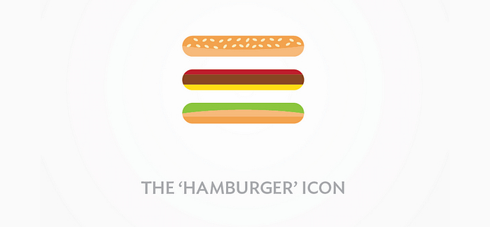
Hidden navigation: the hamburger menu
The hamburger menu is no stranger to criticism. It’s had its fair share of beef, pardon the pun. The hamburger navigation button came around in the early 1980s with the arrival of the Xerox Star, rising to the top when mobile device use took off.
There’s no doubt that the hamburger is an ideal candidate for mobile where there are lots of navigation links involved. It’s a clean, simple and direct choice; offering a minimalist 3-bar display, and taking up very little room in the corner of your screen. Running out of space on screen? No problem, place it in a hamburger. So what’s the problem?
Out of sight, out of mind. The problem is that the hamburger is too good a space saver. It’s a glance-less navigation option, hiding items from the user, and making it more of a challenge to move through the app or mobile site. It effectively takes away from the mobile app’s intuitiveness, and interrupts the user journey.
Takeaway: The hamburger was certainly a leap forward in mobile navigation patterns. But perhaps having made its mark, it’s time to let other navigation patterns take the lead. Read up on the alternatives to the hamburger here.
At the hands of the user, UX trends can perish as quickly as they come to life. Testing out your designs is a surefire way to gather feedback from the user, stay on top of the trends and avoid controversial UX. After all, if something is going to work, testing it is the only way to prove it to the non-believers! Why not try testing out your next big idea during the prototyping stage of the design process and avoid unnecessary rework later in the game?