Member-only story
5 Changes You Will Love From My Telegram Redesign
My first contest on Uplabs and what I learned from it
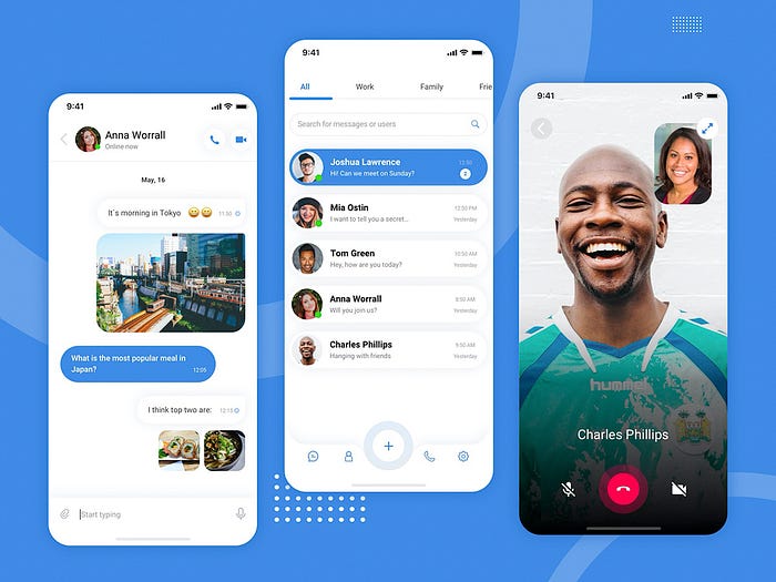
I have recently enrolled in the Telegram Redesign Challenge on Uplabs and become a finalist of this contest. I created my own Telegram version and would like to share 5 things that I learned from this challenge.
If you like my Telegram redesign, you can vote on it here by clicking on like button.
1. Telegram Is Too Basic
When I started my redesign I opened the app and realized one thing: Telegram is too basic in terms of UI. That means that programmers took a standard template and went ahead with it.
I wanted to save all functionality, but give new breath for the app. So I designed a layout with white space and brand color only. I also updated typography with the Roboto font.

This font has a good readability and a wide range of weights. I concentrated my attention on Regular and Bold weight only to simplify the app look. I use Bold for headings to emphasize them and Regular for the text.
Also, I added a slight difference in font colors. Headings are darker not only because of the bold weight but also because of black color. Usual text is a bit lighter.
#000000I have selected #000000 color for my headings. This is the maximum black color that I can use. It will maximize my chances to get diverse tones for other texts.
#7e7e82For main text, I have selected #7e7e82 color. It is a bit lighter version. The difference in tone create visual hierarchy and prioritize information.
2. Telegram Bottom Navigation Is Not User-Friendly

Why Telegram does not have bottom navigation with main functions? Instead, users need to…


