5 common UX dark patterns and user-friendly alternatives
Find out how dark patterns impact user experience, and how they can be turned into user-friendly UI design
UI design gets dark sometimes. Particularly when companies exploit their user interface to trick users into doing something they wouldn’t consciously do, usually for profit. Sounds improbable? If only! Companies often use so-called ‘dark patterns’ to baffle users.
In this article you’ll find some of the most common user experience dark patterns and reveals how, with just a little bit of tweaking, they can change into UI patterns that promote positive user experiences.
What Are UX Dark Patterns?
Basically, dark patterns are UI tactics that encourage the user to take a path they didn’t mean to take. These patterns take the principles of good UX and UI design, and turn them on their head. In dark UX, color theory is manipulated to misdirect, language is used to confuse rather than clarify, and the user is exploited to boost company reach or profits.
Why Are Dark Patterns So Common?
See that bit above where we talk about company profits? That’s why dark patterns are so ubiquitous. Companies are often looking for short-term results, and increases in numbers rather than qualitative stats like ‘user happiness’. And dark patterns work, in that sense; they successfully trick people, so companies keep using them.
But consistent use of tricksy UI patterns and dark UX is in fact damaging to the company in the long-term. Users don’t like being hoodwinked, and will call dark patterns out on social media (witness the #darkpattern hashtag on Twitter).
Plus dark patterns stop working after a while and companies have to think of something else. Why not design good user experiences that keep users coming back for more, instead of UI patterns designed to trick?
“Any short-term gains a company gets from a dark pattern are lost in the long term,” Hoa Loranger, NN Group
So, here are 5 common UX dark patterns and some user-friendly alternatives.
1. Deliberate Misdirection
Anyone who’s ever booked a budget flight online will be familiar with this dark pattern classic. Take the example of airline Ryanair. Users are directed to buy travel insurance, but on clicking the dropdown menu they see a list of Countries of Residence. The opt-out for purchasing travel insurance is way down the list, under the unintuitive listing ‘No travel insurance required’.

The darkness lies in the fact that the pattern is misdirecting you — you think you’re picking travel insurance, but then suddenly you’re telling them your country of residence, and it doesn’t look like deselecting travel insurance is an option. Unless you skim down the list and spot it there, formatted to look identical to the countries of residence.
Misdirection is easy to transform into a positive UI pattern. Allow users to answer the actual question they are being asked, and avoid mixing categories of response. Different selections — i.e. a country and a paid add-on — should be structured differently and placed in different parts of the interface.
2. Invisible Unsubscribe
A user’s inbox is their personal space. Users guard access to that space pretty vigilantly, and the ability to unsubscribe from a mailing list is a key part of that. Most companies and email service providers make unsubscribing simple. But some prefer dark patterns instead.
Check out this example, where the unsubscribe button is formatted to be… invisible
Invisible unsubscribes are the worst cases of dark UX. But plenty of reputable companies try to make it difficult. Take Amazon, who grays out their Unsubscribe option. Or companies who format it to make it look like it doesn’t have a link.
The solution? Simple — format the link like it’s a link, and always include the unsubscribe option. For example, we make it easy for Justinmind subscribers to stop our mails if they want to (sad trombone).
Invisible unsubscribe dark patterns are so common there’s even a Tumblr dedicated to them.
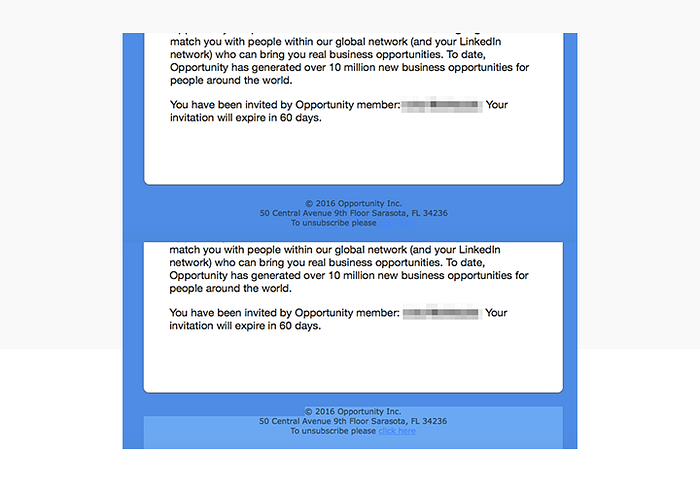
3. Growth Hacking Through Spamming
No one likes email spam. But even worse than getting spam is finding out that you yourself are the unwitting spammer. This can happen when apps or services you join ask for access to your email contacts — they make out like they just want to help you find friends already using the same service, but in reality they want to spam all your contacts with invitations to join up. Classic dark pattern.
Take the well-documented example of LinkedIn, which was exposed by blogger Dan Schlosser in a much-read Medium post. The professional networking platform asked Dan to strengthen his network; that actually meant ‘send 1000s of emails to contacts not on LinkedIn with one click’. Worst part? The emails purported to be from Dan himself, not LinkedIn. In 2015, LinkedIn lost a lawsuit about the pattern to the tune of $13 million USD.
4. Forced Continuity
Dark UI design gets really dark when money is involved. This is the case in examples of ‘forced continuity’, a UX pattern that sees users sign-up for a free trial of something only to find themselves slyly rolled into the paying scheme without prior warning or permission. And it’s not just small companies or hungry start-ups that trick users into signing up for monthly payments — big companies such as PizzaHut and Ryanair (again) have been condemned for concealing monthly sign ups as ‘special offers’.
How does it work? Often through button styling or disguised adds. For example, a pop-up can appear offering a discount or special offer; in the small print will be a condition saying that the offer depends on becoming a monthly ‘member’. Luckily, users are now pretty switched on to forced continuity thanks to several high profile legal cases.
Assuaging user fears about getting tricked into monthly membership fees depends on formatting UI buttons honestly and clearly.
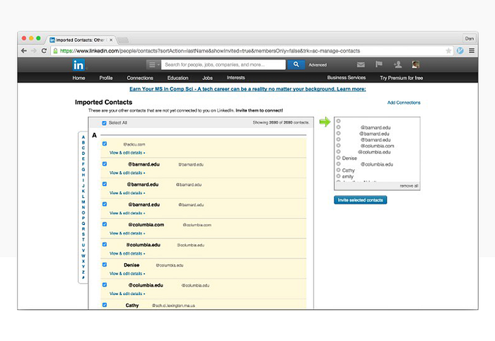
5. Expanding Shopping Basket
Also known as ‘inertia shopping’ or ‘negative option billing’, this dark pattern consists in an extra item being snuck into your cart when online shopping, usually via a well-hidden or confusing opt-out button. Thankfully the pattern is now illegal in most European Union countries.
Despite that, some companies still try varieties out. Take the example of Sports Direct, called out by Anthony McLoughlin in Tone: the sports apparel store offered online shoppers a ‘free mug’ and magazine. Great! Except the mug cost 1 euro, and was added by default. Users had to actively Deselect the option. If only 1 in 10 shoppers gets caught out, that’s a big increase on profits worldwide.
The user experience rule for this is — give the user control over what they put in the basket. Extra items, if suggested, should be deselected by default. Additionally, the full price should be made obvious at every step of the buying process.
5 common dark UI patterns and user-friendly alternatives — the takeaway
It’s not difficult to turn sketchy UI design into user-friendly UI patterns. Put the user first, design for experience not for short-term profit, and be transparent about what the interface is doing. Ultimately, if a business’s UI creates a shadey, suspicious experience that leaves the user feeling defrauded or patronized, that business will lose out in the long term. If you rely on dark patterns you’re fair game for a competitor to come along and provide a product, service or interface that wins over customers through delightful UX design, not through dark patterns.
The original post can be found on Justinmind’s blog.

