5 Features of the Best Content Style Guides
I was assigned to create a simple content style guide for my company’s Help Center, consisting of FAQ articles, step-by-step tutorials, and our support page.
But before heading off to design my own guidelines, I wanted to learn how some of the best-known style guides were created and what it was that made them so impactful.
The key takeaways from these top guides helped me craft a useful content guide for my team.

What is a content style guide?
Content style guides inform the words, design, and material used across a brand’s platform, allowing employees from different departments to create on-brand content. They are the set of standards your teammates are requested to follow when creating content.
What should you include in a content style guide?
At its most basic level, a content style guide should include:
- Brand voice and tone
- Proper grammar usage
- Best practices and examples
The guides I’ll be referring to in this article include:
- Mailchimp Content Style Guide
- Atlassian Design System Content Guide
- Shopify Content Guidelines
- The Conscious Style Guide
From these guides, I noticed five key features that I would use to help me create my own guidelines.
1. Start with voice and tone. Use this as a scale for creating content.
Mailchimp puts it wonderfully,
“You have the same voice all the time, but your tone changes. You might use one tone when you’re out to dinner with your closest friends, and a different tone when you’re in a meeting with your boss.”
First, understand your brand’s voice. Is it humorous, optimistic, straightforward, or bold?
Next, use tone to adjust your brand voice according to the situation. Emphasize these differences throughout your guidelines.
Shopify describes how they adjust tone for their error messages:
“Avoid sounding overly apologetic, too technical, or hyperbolic… Don’t downplay the error by telling merchants not to worry or by adding humor to a negative situation.”
Adjusting tone for error messages is crucial. Seeing error messages can be frustrating for users, and they may feel as if they have done something wrong (even if they didn’t). The content surrounding them should be direct and helpful.
Atlassian’s style guide even includes a visual scale for reference:

2. Show that writing = designing in the grammar section.
The grammar and mechanics section is the one I found to differ the most across the guides, which makes sense. This is where we can incorporate more brand personality! (For instance, are exclamations like the one I just used allowed?)
Include specific instructions on how to use:
- Capitalization
- Abbreviations
- Quotes
- Contractions
- Punctuation
- Proper nouns
- Lists
- Currency
- Date
- Time
…and anything else you feel applies to your brand. Mailchimp has a section on emojis. Whether you personally love or hate them, remember to make decisions based on what best reflects your brand voice.

3. Make your guidelines skimmable.
Since your teammates will be using your guidelines for reference, make it as easy as possible for them to find the instructions they need for the content they’re creating.
Since you will likely build on these guidelines over time, they can become pretty robust. Keep sections organized and don’t be afraid to break up large areas of text with titles and images.
Atlassian breaks up larger sections with different titles and examples:
This brings me to my next takeaway.
4. Include good and bad examples. The “Yes” and the “Nos”. The “Dos” and “Don’ts”.
Incorporating clear examples of what you should and should not strive for help drive your points home.
For instance, read this example from Shopify:
“Menu lists give users a horizontal set of nouns when space is limited. The order of nouns is often based on logic such as most recent orders.
Nouns in a menu should be concise but still give the user enough information so they can easily find and accurately select the item they want.“
Now look at this example again, but with their “Dos” and Don’ts”:
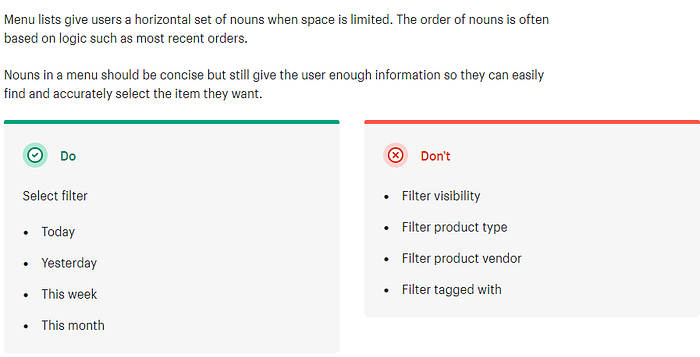
Clear examples provide context.
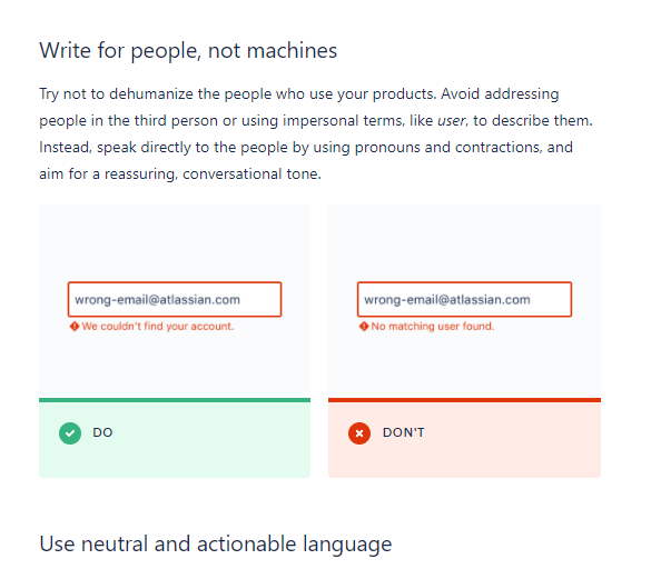
5. Human-centered, clear, concise, useful, and accessible. Always.
This takeaway is a general consensus among all of the guides I’ve seen. The foundation for creating good content is to ensure that it’s all of the above.
If you’re interested in learning more about how to make accessible content, I recommend taking a look at the Conscious Style Guide (and subscribe to their newsletter!)


