Member-only story
5 Innovative Google Translate App Redesign
Top UI redesign for the most famous translation app
We start with this clean and modern redesign made by Ciuban Razvan.
The main screen interface consists of two parts: in the upper part there is the source language and text, in the bottom part the destination language and the text translated.

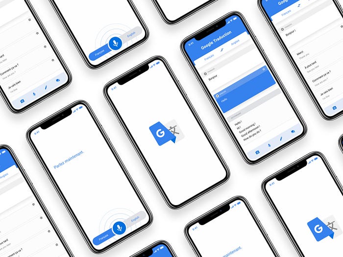
The restyling made by Anthony Choren isn’t really different from the current one used by Google. He mainly changed the animation of how voice input is made and changed the translation screen using rounded cards
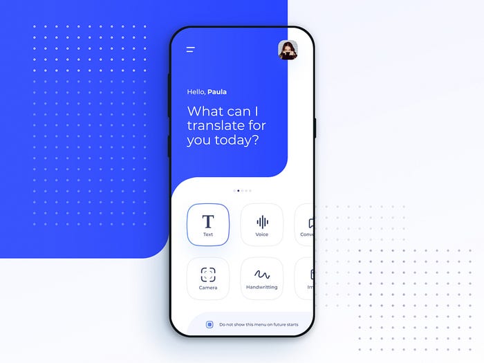
Fábio Santos instead, created an interface with rounded big buttons on the home screen to chose the different text source features like text, voice, conversation, camera, and handwriting.
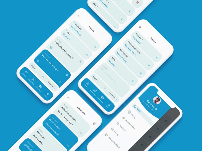
The Duc Nguyen interface’s, due to the bubble views, remember a chat app. The different text sources are on the bottom tab bar while the user details are on a left side menu.
