Member-only story
5 Laws of UX that Bumble Follows
Let’s See What makes Bumble UX design Better than Tinder.
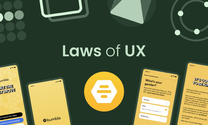
If you don’t know what Bumble is, it is a dating app, which is very popular in some countries after Tinder. Most people nowadays prefer using Bumble over Tinder because of its design and simplicity.
In this article, I am going to share some of the laws that the Bumble app follows that I noticed when I was watching this app’s screenshots on mobbin.com. I have installed it for the research purpose only ;)
All the screenshots are taken from mobbin.com so a big shoutout to them.
#1 Aesthetic-Usability Effect

I personally like the UI design of Bumble better than Tinder’s UI design. It is much simpler and easy on the eyes. The colors are much more subtle and cool, even though the database of girls is a little smaller compared to Tinder.
This is what the Aesthetic-Usability effect is in real life. If the UI design of your app is pleasing to the user, they will ignore the errors or bad sides of your design, but it has some limits. If Bumble doesn’t even show me any girl images, then I’ll leave, even though the app design is good.
#2 Fitts’s Law

Bumble's designers have designed the app to be used with one hand for the most part. For swiping and liking, you don’t need two thumbs. One can get the job done, and that’s what Fitts’s law is all about.
Fitts’ law explains that the time to acquire an object depends upon the distance and size. For example, if the button is close to your thumb and bigger in size (e.g., the continue button in the above image), you can…


