6 Simple Tips On Using Color In Your Design
Color is one of the most powerful tools in the designer’s toolkit. But like any other tool, it should be used with care.
Below you’ll find a list of highly practical tips for using color.
1. Design in grayscale first
Starting design with color is a fairly common mistake among designers. While it might be tempting to fill out the layout with color, it’s better to avoid that temptation. By starting in grayscale you’ll be able to focus more on creating solid visual hierarchy rather than exploring an infinite number of possible color combinations.
2. Think in terms of visual weight
Visual weight is a natural property of an object to attract the eye of a person. The more visual weight the object has the more chance that users will notice it.
Visual weight is a sum of 3 properties:
- The size of the object (generally, bigger objects have more visual weight)
- The amount of negative space around the object (more whitespace, more chances that users notice the object)
- The color of the object (contrasting color make the object more noticeable).
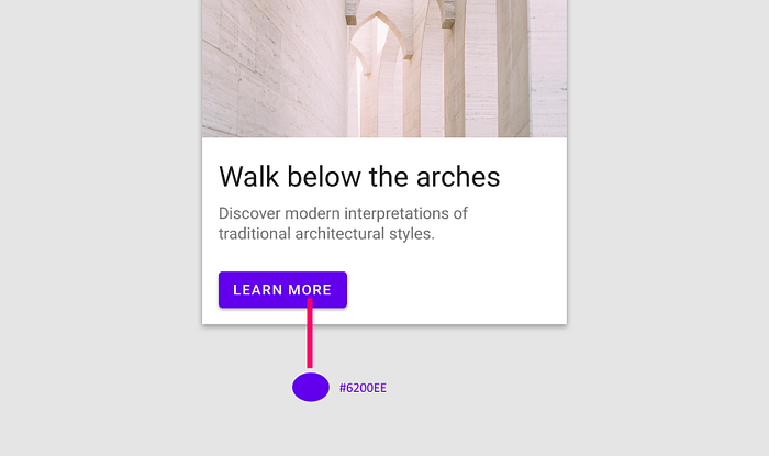
Put more visual weight to the objects that you want your users to see. For example, if you design a landing page, you probably want a call to action button to be one of the first elements users notice when they visit the page.
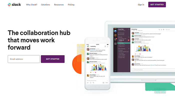
3. Match colors to the brand
Brand colors should play a key role in creating a color palette. Try to use your brand’s colors in the layouts you design.

If you’re in the process of defining your brand colors, try to think of the box and select unexpected color combinations. Why? Because it’ll help you create a more memorable design for your users.
Recently many brands started to use bright colors for their design. Bright colors give energy and a sense of immediacy.

4. Find a well-balanced color scheme
Improper use of color can easily overwhelm your users. If you don’t want to distract or confuse your users, you should try to achieve harmony in your design. And this happens only when you have a balance in the visual experience.
Here are a few simple rules that can help you with that:
The 60–30–10 Rule
The 60–30–10 is a very simple rule for creating well-balanced color palettes. The idea is simple —when you choose a new color palette, the 60% of the palette should be dedicated to one color (usually, it’s a neutral color), another (complementary) color makes up 30% of the palette, and a third color (accent) is used for the remaining 10% of the design.
The rule of max 3 colors
“Do not wear more than three colors in an outfit otherwise you’ll look like a clown or a parrot” — this is common advice that personal stylists give to their clients. Unless you’re an expert in combining colors, it’s better to limit the total number of colors you use in your design.
If you think your design needs more colors, try to use darker & lighter variations of already selected colors.
Use color palate generators
Color palette generators simplify the task of finding well-balanced color schemes. Here is a list of color palate generators:
5. Use color as a cue
Color is not just for decoration; it can (and should) serve a clear functional purpose. Designers should use color as a functional element to simplify the process of interaction with a product. Along with a shape, color is something that users rely on when they interact with digital products.
Using color, it’s possible to:
- Distinguish interactive and static objects
- Describe the current state of the object (i.e., active/disable element)
- Focus user attention on an important message
But to achieve good results, it’s essential to make sure color is used consistently. In other words, if you decide to use a specific hue for a clickable object, this color should be used in all parts of your product. It will give users the ability to rely on their previous experience when interacting with various parts of your product.
6. Think accessibility first
Color-contrast ratio
The right contrast between text and background is an essential part of the user experience. Each time when you place two colors with low-value contrast next to each other you make your copy very difficult to read.
The problem becomes even more critical for mobile design. Mobile users can be outdoors or in bright places that cause screen glare, and it’ll make your text unreadable.
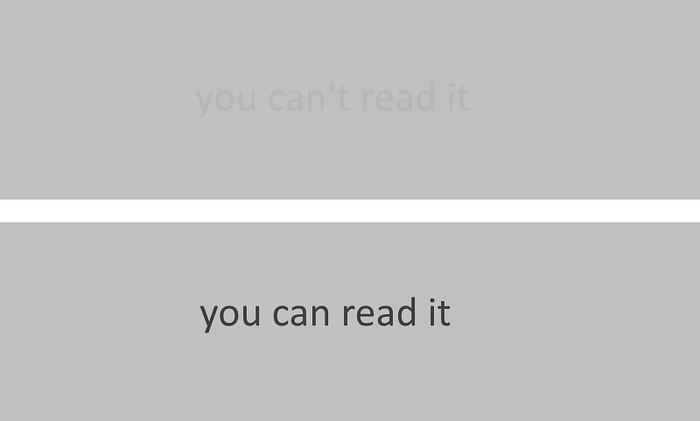
WCAG 2 requires a contrast ratio of at least 4.5:1 for normal text and 3:1 for large text, and a contrast ratio of at least 3:1 for graphics and user interface components (such as form input borders).
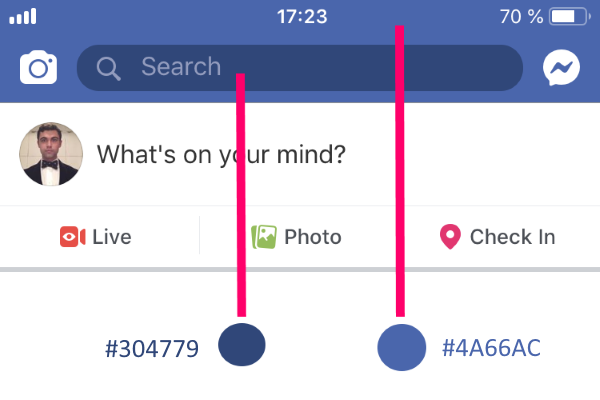
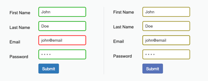
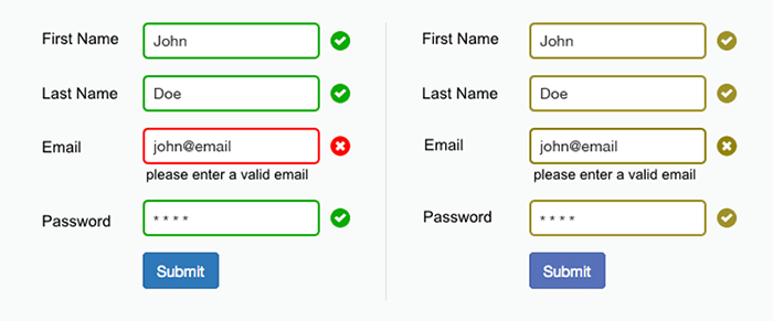
Never use color alone to convey the meaning
Approximately 8% of men and 0.5% of women are affected by some form of color blindness. Deuteranopia (red-green color blindness) is the most common form of color blindness. Such users have a hard time interacting with UI that use color alone to convey the meaning (e.g. use red color to deliver the error state).
Use color accessibility testing tools
Color accessibility testing tools will help you test your visual design and find the places where you need to use more contrast.
Test your color choices
No matter what colors you choose to use in your design, it’s essential to test your color combinations with real users. The colors you choose to use should work for people who use your product.
Learn how to design user interfaces
Interactions between computers and humans should be as intuitive as conversations between two humans. Interaction Design Foundation will help you to learn how to design for efficiency and persuasion.


