
5 UI Patterns: Navigation That Makes Good UX Sense
Designing UI patterns for web and mobile that optimize your user experience and improve your bottom line
Accessible navigation guides users through the flow of information in the UI and helps them complete their tasks, boosting your UX and driving up your web/mobile conversion. Likewise, if a user can’t find their way around your site or app, that site/app is useless to them — poor navigation design makes for poor UX and causes users to drop off the conversion funnel. It’s no surprise then that poorly designed/neglected UI navigation can have a disastrous impact on your bottom line.
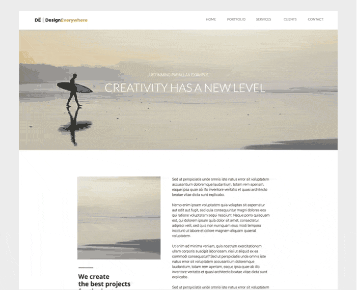
The secret to UX-friendly UI navigation begins with the navigation menu. In order for users to get from Point A to Point B on your website or app, they need a map to guide them. Designing the navigation menu should take precedence in the design process. Prototyping your navigation menu before development will provide the resources you need to visualize and interact with your designs in real-time, from the start.
Let’s take a look at 5 common UI patterns. Each of them you can prototype using interactive prototyping tool Justinmind.
Dropdown Menu For Smooth Website Navigation Design

A dropdown menu is an expandable UI navigation with several values that the user can select and, from there, be taken to another area of the website. The dropdown is a website navigation design that transport users to a new location in a website and command menus that execute an action based on the last option selected.
When to design a dropdown menu
The dropdown menu is a great way to navigate a website when you have lots of options to display and you want to conserve space.
Familiar and easily to scan, a good drop down menu can improve click-through rates. But it has a time and a place, so think about your UX patterns. The menu needs to contain enough navigation values so that the user knows how to interact with it (e.g. single click on chosen value as opposed to a double click using a radio button), and not so many that the user has difficulty scanning the menu list. Use it wisely and it’ll do wonders for your ux ui design.
The Sliding Hamburger Mobile Menu

The sliding hamburger menu, or slide menu, is a common Android and iOS mobile menu for displaying multiple links. In its ‘resting’ position, the slide menu is hidden from the screen. By triggering a hamburger icon, the user can access uncovered navigation links.
When to use it
The sliding hamburger menu works well with responsive web design. For instance, the Android Navigation Drawer for the Android Gmail inbox, the YouTube and Facebook UIs.
The slide menu is ideal for hidden navigation, for instance to de-clutter a mobile screen that has lots of navigation links. Read more on our best practices for slide menus here.
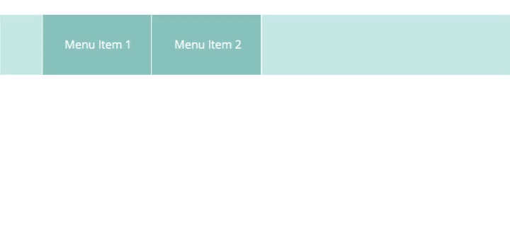
Fixed Position Menu Web UI Pattern
What is it
The fixed position menu, or sticky menu, is a web UI pattern whereby the header area (menu, website title and logo) remains visible as you scroll down, and the page’s content flows beneath it. Sticky headers have become a web UI pattern standard — Google + and Dropbox both have sticky menus.
When to use it
Fixed position menus should be used on pages of websites where an action is intended, such as retail, e-commerce sites. Users can get to their navigation options in seconds — making the fixed menu really powerful. Speed is the most important thing to the user when browsing your site. In fact, according to an Akamai and Gomez.com study, 79% of online shoppers won’t return to a site if they had trouble with performance.
Custom Mega Menu For Web Navigation
The mega menu is an expandable, multilevel menu for navigating websites. It has two-dimensional panels that are divided into groups of navigation options (tabs) and all links within each tab are available at once — so there is no scrolling involved. Users click or hover over a tab to view the links it contains.
Like dropdown, megamenus menus may use icons to provide structure and submenu visibility. They may also include images or colored fonts alongside the navigation links to direct the user’s attention to notable content.
When to use it
Megamenus are great space savers, hiding content until the user hovers over the menu bar to reveal all navigation links. A Nielsen Norman Group study reveals that the greater the number of links to be displayed on a webpage, the more popular mega menus are.
This menu is best for accessible web design, for users with visual impairments or senior web users. They are also popular with magazine-style blogs that contain lots of different topics.
Card Grid For Responsive Navigation
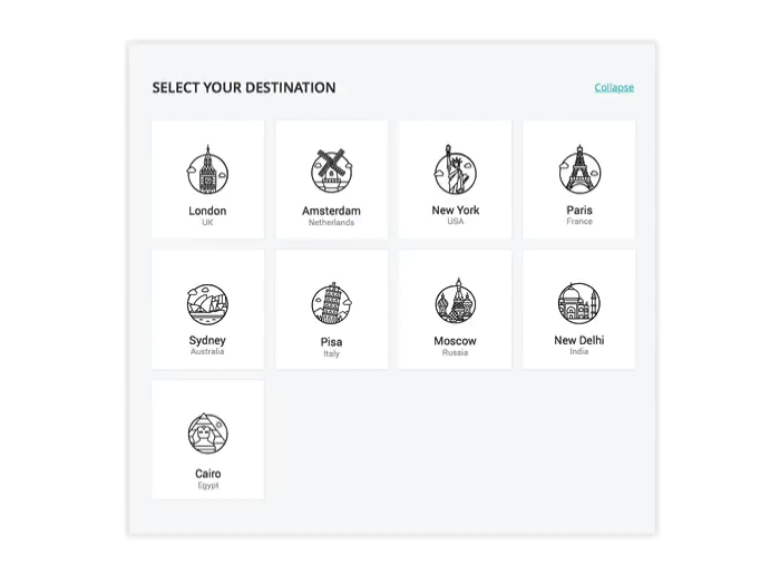
The grid is a navigation pattern used both in web and mobile navigation. The grid contains a set of images divided into blocks that are expandable and collapsible. It is another highly visual structure that allows you to group relevant elements together and visualize themes and UX flows.
When to use it
The images within the grid provided large click/tap targets, making the grid the ideal candidate for mobile UI navigation. They are also used in many web designs and websites for browsing visual content, such as image sharing site Pinterest, and music streaming service, Spotify.
And because of their logical, adaptable layout, card grids are perfect for responsive navigation! Lucky that.

