6 best practices for 404 pages with killer UX
Design error pages that boost usability, improve user experience and even raise a smile with these 6 top tips
Urgh, a 404 page! No one likes that, right? But hold on a minute. 404 error pages don’t need to be a total UX nightmare. When designed to delight and direct users, 404 pages can transform from sources of frustration to opportunities for conversion and branding. Good UI design, a focus on user experience and a little human empathy can go a long way towards improving 404 page design.
This post will look at 5 error page best practices to make 404 pages more user friendly. Follow them for better usability, stronger branding and delightful user experiences.
Turn user error into UX opportunity
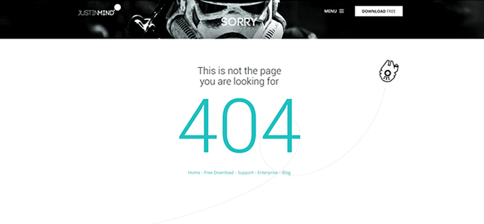
A standard, out-of-the box 404 page gives users only one option — go back to where they came from. What a downer. According to the principles of gamification, users want to feel like they’re making progress. So design 404 pages that allow users to progress to other parts of your site, commonly the home or features pages. This way you’ve got a lot more chance of keeping them on sight and nudging them in the right direction. Justinmind keeps it simple by giving users 5 key paths to follow:
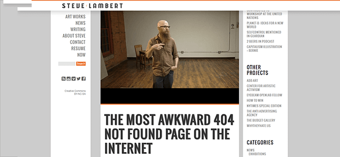
And don’t just give them links. Add a search box to the 404 page to allow give users back a sense of control over their experience and facilitate task success. Designer Steve Lambert combines a search box 404 with a toe-curlingly good video to create a fun and functional 404 user experience.
And for usable search box design, Gyorgy Fetete has some great tips right here in Smashing Magazine.
Explain, don’t just error message
There’s probably nothing more frustrating than landing on an error message, and then being so confused by the error message itself that you have to Google it. Take the prime example below:
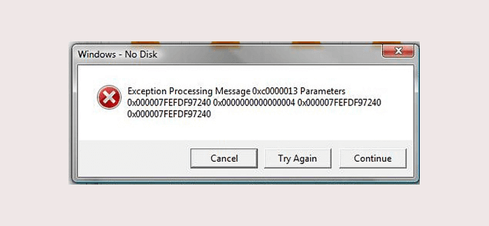
Excuse me? UX designers everywhere are screaming right now. Good 404 messages should concisely explain what went wrong in plain language, and what to do next. Just like Bloomberg does below.
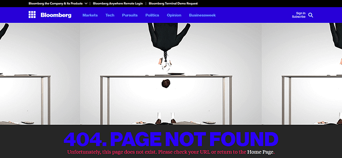
Less clutter, higher user success rates
A lot of sites used to fall into the trap of “Panic! The user got a 404! Let’s show them everything we got and see if they bite” Bad idea. Overwhelming the user with a 404 page jam-packed with links to every nook and cranny of your site is a surefire way to cognitively overload an already frustrated user. And as NN Group guru Kathryn Whitenton makes clear, cognitive overload and usability do not go hand in hand.
Best practice is to design a 404 page with a handful of key links, including a link to the Home page as an easy get-out for users who’re not sure what they’re looking for yet. Other options to include might be to a blog, product features or About Us.
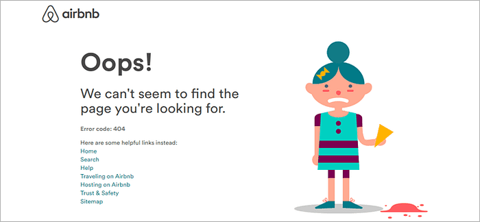
In general, aiming to include up to 4 links on a 404 page is good practice. Airbnb include more, but they’re Airbnb.
Read our interview with Airbnb’s Director of Experience Design
Use 404 pages as branding opportunities
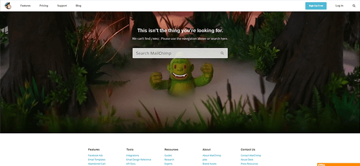
For many users, a 404 page might be the very first interaction they have with a brand. That’s a lot of pressure for one little error page. Follow basic best practices such as ensuring that the aesthetics of the page fit with the rest of the site, microcopy mirrors the tone throughout, and that icons and visuals are coherent with other sites or products.
Just bear in mind that functionality has to come before form in a 404. Make the brand’s look and feel serve the function of the page, like Mailchimp does:
Add a little humor
Make ’em laugh, kiddo. This advice isn’t just for would-be comedians and first dates. Adding humor to your 404 page design can also tap into so-called ‘visceral design principles’. Or, as they explain on blog Mysterious Trousers,
“The satisfying feeling we get when potential energy is converted to kinetic energy. That point where we release energy from a design in a way that creates surprise, delight, or simply a response that satisfies our desire to engage, manipulate, and shape our experience.”
A 404 page can be an opportunity to convert user frustration into satisfaction not through navigation success, but through laughter. Check out the Justinmind team’s favorite 404 from Bluegg:
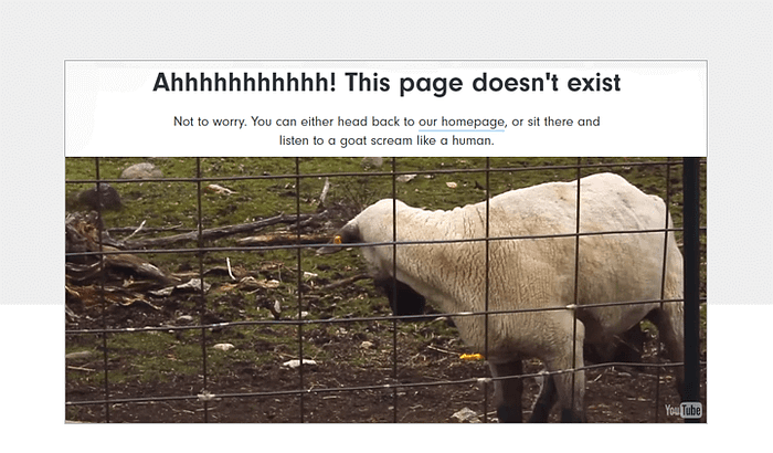
Renny Gleeson goes into this in more detail in his fascinating TED talk, which explores how we can fix that broken feeling generated by 404.
Pre-empt the need for 404
Error messages happen, and no matter how awesome your site or app you’re never going to stop that. People are always going to type URLs wrong. But that inevitability doesn’t mean you shouldn’t work your hardest to reduce the number of people who see your 404 page. Make sure you’re not directly users to broken links internally by staying on top of site maintenance. Use tools such as 404 Checker and Screaming Frog to find and fix broken links and direct them to more appropriate or fresher content.
Best practices for 404 pages with killer UX — the takeaway
404 error pages used to be a huge source of user frustration and abandonment. But it doesn’t have to be that way. Increasingly UI/UX designers are seeing 404s as a way to keep users engaged, introduce their brand and solve user problems. These 6 best practices will go a long way towards helping you create 404s that feel less like frustrations and more like delightful interactions.
Read the original post on Justinmind’s blog


