6 best practices for dashboard design

Dashboards are used to display the most important and useful information in your app. Read on to see our tips for perfect dashboard design.
Dashboards are present in many of the web and mobile apps we use daily, from photo-sharing apps to business intelligence suites. In this article, we take a look at dashboard design, pick out some best practices to apply and show you some ways that Justinmind can help you with dashboard design for your prototypes.
Contents:
- Dashboard design basics
- Different types of dashboard
- 6 best practices for dashboard design
- Dashboard design made easy with Justinmind
What is a dashboard?
At its simplest, a dashboard is a screen in your application that displays information. Normally, a dashboard provides the user a global overview, with access to the most important data, functions and controls. In reality, a dashboard often becomes a sort of homepage, especially for power users. In this article, we’ll take a look at some dashboard design best practices, and some of the ways Justinmind can help you to create an awesome dashboard design.
Dashboards should only show relevant information
We call them dashboards because, just like in a car, they’re meant to show us critical, pertinent data at a glance. But how do we establish what’s relevant enough to show in a dashboard? Think about how it’s done in a car. The car’s dashboard is used to show the driver information relevant to the task of driving the car — speed, distance covered, engine revs, remaining fuel and warnings when something isn’t working properly. We don’t expect a car dashboard to display information about the news, local places of interest or upcoming appointments because however interesting this information is, it’s not relevant.
Deciding the relevant information to display in your application can be tricky. Firstly, it’s all important! Of course it is. If you haven’t already done so, develop user personas and map out user stories so you can understand the expectations that users have in your app. For most application dashboards, users will expect to see information about their current status, as well as any urgent information, warnings or alerts that they need to deal with.
A great rule of thumb for data disclosure in dashboards is that you should always start with a high-level overview and provide easy paths for your users to increase the level of granularity.
Bottom line: dashboards must always save the user time. Always design your dashboard so that it helps your user to be more efficient.
What are the most common dashboard components?
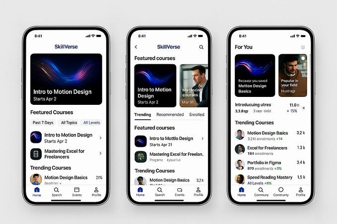
Depending on their intended use, dashboard designs can vary widely. But all dashboards are made of cards. Depending on the type of dashboard, each card might contain profile info, notifications, quick links or navigation, key data, graphs and data tables. Make sure you use the correct type of card for each component.
Tip: The best dashboards tend not to include more than 5 or 6 cards in their initial view. Try to stick to a single screen to improve dashboard UX.
Choose a dashboard design type
You’ve probably read that there are 3 main types of dashboard design. In fact, this is only true when looking at Business Intelligence dashboards. The three main types of BI dashboard are:
- Operational dashboards — these dashboards help the user see what’s happening right now
- Analytical dashboards — these dashboards give the user a clear view of performance trends and potential problems
- Strategic dashboards — this type of dashboard lets the user track their main strategic goals via KPIs.
Here are the main advantages of the different BI dashboard types, and when to use them.
Operational Dashboards
Operational dashboards are used to show your user their current status in your app. Use operational dashboards to display critical information that’s time relevant. For example, in a web analytics application, the operational dashboard could include information like: active users on site, top social referrals and pageviews per minute. A classic example is the Google Analytics Real-time dashboard.
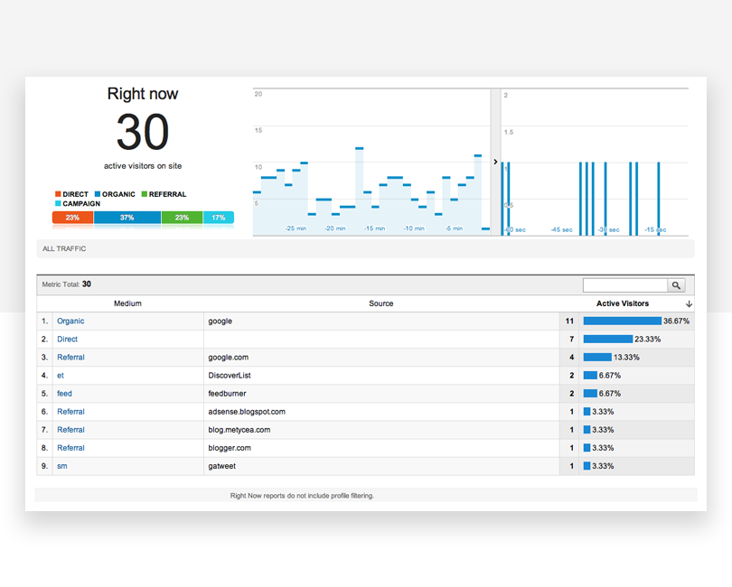
Operational dashboards are great because they let your user check their status at a glance. You should structure them so that the most important data is visible at top left (for left-right reading languages), helping your user get a snapshot as soon as they open the dashboard. They can contain a few graphs but shouldn’t reflect detailed data views.
Analytical Dashboards
Analytical dashboards are used to present key data sets to the user, always reflected against previous performance. They should be data-centric, and show as many relevant data views as is feasible. Analytical dashboards should lead with key account data front and center, and should minimize graphical elements. They serve as a barometer of the user’s status in your application, and make it easier for a user to spot problems. Check out this nice example from Mirrorgate:

Strategic Dashboards
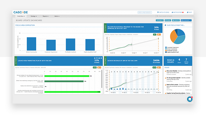
Strategic dashboards are used to indicate performance against a set of key performance indicators (KPIs). As seen in this great example from Cascade, a strategic dashboard should reflect how your user is performing against their strategic goals… and not much else.
Other dashboard types
Outside of the business intelligence realm, dashboards can come in all sorts of shapes and sizes, depending on your application type. Schedules, profile pages, your movie library… if it’s a single page with the most important information or actions the user might want to access, it’s a dashboard.
Platform dashboards
Platform dashboards are used to give a user access to controls, tools and analytics related to their account on a social platform. The YouTube Studio Dashboard is a good example. A simple initial view shows the user’s latest videos, with some stats for each. There are also cards for channel analytics, comments and news and tips. In the sidebar, the user can access a large number of tools and account controls, including the video manager, channel status and more. YouTube keeps things simple, while giving the user complete control.

Time-in-app dashboards
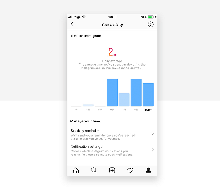
A popular new trend in mobile apps is to give the user information about how much time they’re spending in each app. If you’re working on a new social app, you’ll want to include this kind of dashboard. The idea is to help users to see if they’re spending too much time on their device. Instagram’s Your activity dashboard is fairly typical. It’s very basic, leading with the user’s average daily time in the app, with a bar chart showing how daily time in app has changed over the last week. Finally, the dashboard includes two control options that allow users to reduce their daily time in Instagram.
6 dashboard design best practices
1 — Decide what your users need from your dashboard
The first step is to know your audience. Once you’ve learned your user personas through, you should be able to answer the key question: what will my users expect from this dashboard?
Think about the 5 takeaways your users will want to see in your dashboard. Then apply the F and Z reading pattern, and structure your page accordingly.
2 — Responsive dashboards hand power to the user
Adding a responsive design to a dashboard allows the user to decide which data they want to focus on. The key to a good responsive design is a clear, easily understood UI which allows the user to control exactly which data needs to be front and center in the dashboard. Check out this responsive dashboard by Cuberto, with a cool slider interface which allows the user to focus on the main data window or the drilldown data in the right-hand sidebar. The way the level of detail in the graphs changes as more focus is added is really beautiful.

3 — Great dashboards lead with key data
We love dashboards that cut out the bunk and lead with big, bold numbers. A dashboard like this communicates confidence and decisiveness. For example, take a look at this social influencer profile dashboard. The styling is on-trend with a modern, clean design. There’s lots of white space and clear, bold takeaway data. Presenting data like this helps the user see what’s important in an instant, doing what a dashboard should always do: save the user time.
4 — Use information architecture for great dashboard design
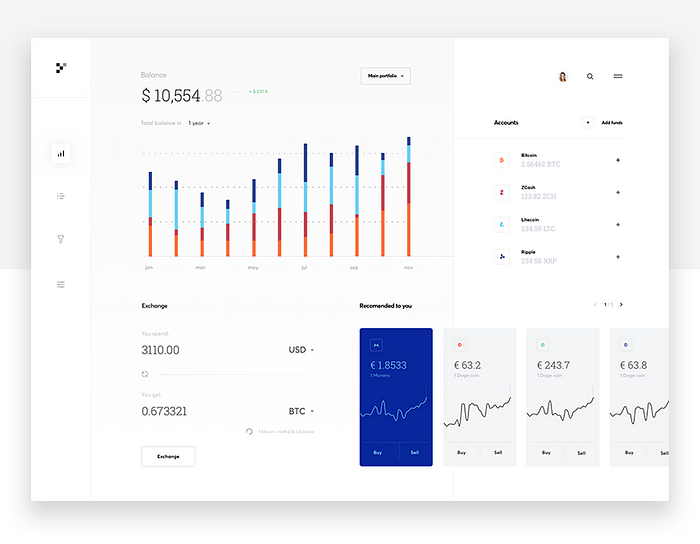
When you design your dashboard, consider the principles of information architecture and hierarchy when you decide which cards to show and in which positions. Remember the F and Z patterns that reflect how a user’s eye scans a page? Apply that logic to the structure and order of elements on your dashboard. Lead with the absolute top must-have takeaway, and let your dashboard flow from there. All the elements are important, but some cards are more important than others. This cryptocurrency dashboard leads with account balance. It’s the bottom line that counts, after all.
5 — Use different views to keep things light
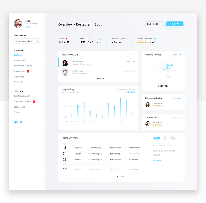
We like dashboards that use different views to keep the main view as simple as possible. Take a look at this dashboard for a restaurant management web-app. Note how the user can filter data by date, switch between restaurants, and access information about reservations, outgoing payments, employees, shifts and external providers, all while maintaining a clean and simple look. Imagine trying to include all that info in one screen.
6 — Use consistent design language and color scheme
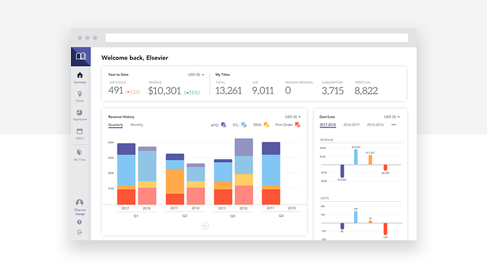
Just because dashboards often include data views, that doesn’t mean they can’t look drop dead gorgeous. By keeping things light and airy, with prudent use of color, this publisher dashboard delivers clear visibility, simple navigation and striking good looks.
Dashboard design made easy with Justinmind
It’s easy to create beautiful, UX-friendly dashboards in Justinmind. Here’s how to get started:
- Keep it simple
Only include the most relevant information and for your users, at least in the initial screen. Where suitable, allow your user to drill down into more complex data and options. - Group related or relevant data
When you have datasets that are easier to understand when seen together, find ways of presenting them in a single card. But be careful not to confuse the user. - Use Justinmind’s dashboard UI kits
Save time and create better-looking, more usable dashboards by using Justinmind’s dashboard UI kits. Read on to find out more.
UI kits for custom dashboard UI design
To help you create custom dashboards in your prototype, Justinmind features a Charts UI library. It lets you choose from a selection of line graphs, bar charts, bubble charts, gauges, maps, XY charts and more, to create familiar-looking dashboard simulations. The UI kit includes everything you need to create custom dashboards in your application.
UI Kits for Salesforce UI dashboard design
Thanks to our Lightning Design System UI kit, you can use Justinmind to prototype Salesforce apps and products, including a full range of dashboards.

Salesforce’s Lightning Design System is a series of UI elements, patterns and guides aimed at delivering business apps with excellent and consistent UX design. Aimed at fostering rapid application development, our Lightning Design System UI kit includes all the elements and info you need to create a stunning dashboard prototype. From buttons and navigation to cards and notifications, you can use the UI kit to create dashboards as well full eCommerce apps, registration pages, welcome mats… the possibilities are endless.
UI kits for SAP Fiori dashboard design
SAP’s Fiori is the design system to use when creating SAP applications. Billed as a way to “re-imagine the SAP user experience”, Fiori uses modern UX principles to deliver better-looking, more consistent SAP applications. Use Fiori in your SAP app prototype to see improvements in productivity and usability.
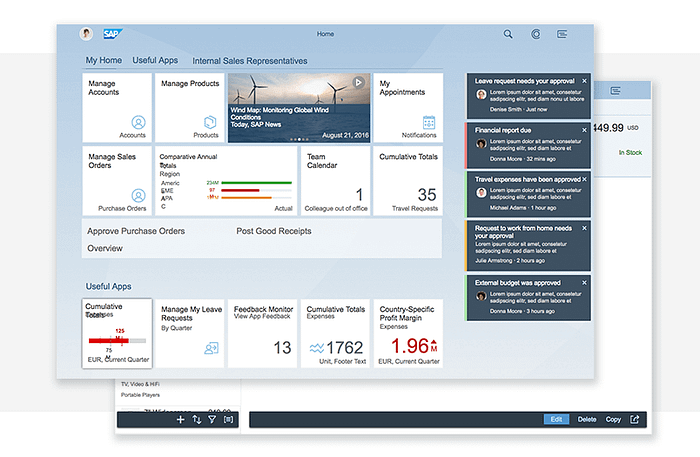
Justinmind’s SAP Fiori UI kit lets you prototype your SAP app before launch, helping to improve productivity and efficiency. Justinmind makes it easy to implement SAP architecture from the very beginning, crafting native SAP apps which your users will feel comfortable using.
UI kits for dashboard design in Oracle Alta UI
Alta UI is Oracle’s design system for apps in its Cloud service as well as for apps in Oracle Fusion. The Alta UI aims to simplify and improve the user experience by reducing elements and using a cleaner, more modern design, and reduced chrome for a better UI. It also focuses on multi-device support, new, simple icons and a mobile-first approach with responsive page widths and large touch targets.
Justinmind’s Oracle Alta UI kit includes everything you need to create mobile and web prototypes:
- Icons
The icons in our UI kit are designed to match the Alta UI icons, they’re mobile-first, customization and responsive. - Design Patterns
Why waste time creating forms or home pages when you can use a pattern? Justinmind’s Alta UI kit includes patterns created to Oracle’s specifications. - Data Grids
An instantly recognizable way of displaying data, the data grids in our Alta UI kit match oracle’s standards, so you can be sure your prototype looks just like the final product.
Conclusion
Dashboards need to communicate the most important information for the user, in a simple, easy to understand screen. They should be structured to reflect a logical information hierarchy, providing the user ways to drill down into the data when necessary. Above all, they should save the user time. Thanks to our dashboard UI kits, creating an excellent dashboard design is easy with Justinmind.