6 tips to excel in designing dark mode
This article is the curated list of tips that can be followed while designing dark mode for any device.

There has been a never-ending hype about dark mode since its inception. As much as they look cool to use they are as challenging to design especially for young designers.
So here are 6 tips that I concluded while learning to design for dark mode. Hope it helps you too.
1. Avoid using pure black backgrounds
We often think that dark implies “black” but this is not the case while designing dark mode. In fact, using black as a background color nullifies the whole purpose of dark mode( which is to diminish the eye strain while using the screen). Although white screens create a strain on the eyes but using black as a background is more harmful than that.
So a Big No-No To Black.

2. Avoid using saturated colors
For those who don’t know what saturated colors are — In simple words, any color whose opacity is 100% is a saturated color. A color that doesn’t have any tint or shade of any other color is called Saturated color.
According to WCAG( Web Content Accessibility Guidelines) using non-saturated color in dark mode violates the accessibility criteria.
Hence Don’t Use Saturated Colors In Dark Mode

3. Add enough contrast
Contrast plays a very important role to provide accessibility to the users while using dark mode. Especially while using extremely small devices like smartphones and extremely large devices like presentation screens.
Hence Always Use Enough Contrast In Dark Mode

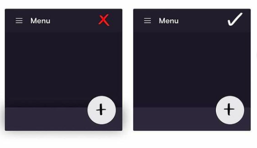
4. Do not just reverse colors
This is the most common mistakes that even well-practiced designer make sometimes. They tend to reverse all the colors from normal to dark mode, which can help to a certain extent but not for the whole product.
Therefore Never rely on reversing colors while designing dark mode

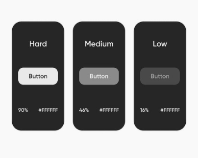
5. Make colors pop on the screen
Using low opacity colors increases eye strain and are really hard to read. Also, it helps the user to focus on the more important stuff first like CTA.
6. Dark places don’t have shadows
Since dark mode already has inbuilt depth in it. Adding additional shadow wouldn’t make any difference, instead of elevating components on UI and adds blur making users’ eyes strain to notice blurry parts. Even though the whole point of the dark mode is to minimize the eye strain and catalyze reading stamina.
Try implementing these tips in your design and lemme know your experience(if it helped you to improve your designs or not) in the comment section.
If you like what you just read. Please appreciate down below with a clap 👏 so that others can also stumble upon this article and can design their lives as they desire. To know me more you can find me here.