Member-only story
7 Laws of UX that Headspace Follows
How Headspace Uses Laws of UX to Design better Interface.
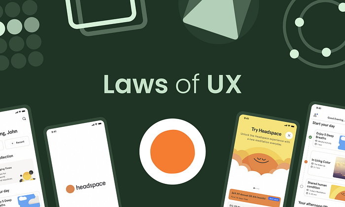
Today in this article I’m going to share some of the laws of UX design that Headspace follows, basically who doesn’t know about headspace it is a meditation app that has millions of users worldwide.
It is one of the best-designed apps that I used, it follows several laws of UX which you can learn and implement in your design.
So without wasting time, let’s check them out.
#1 Aesthetic-Usability Effect
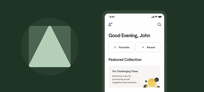
“Users often perceive aesthetically pleasing design as design that’s more usable.”
These companies know that therefore they make their product tasty, but designers use it more ethically, they trick the user’s minds to make them like the app and provide great feedback to them.
How Headspace uses the Asthetic-usability Effect:
- Designing the app with vibrant colors makes the user get attracted to the design with its beautiful color, and simplicity of design.
- By making the corners rounded which give a cute look to the app.
- By adding cool cartoonish illustrations which make you feel calm.
- Cool animations during the initial phase of setup.
- Rounded typography, which is cute and feels good to the eyes.
#2 Hick’s Laws
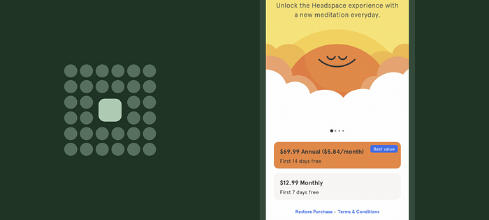
According to several kinds of research, it was found that the number of options you give to a user confuses them and makes the decision-making tough and the user will take a lot of time to make the perfect decision.
“The time it takes to make a decision increases with the number and complexity of choices.”
Just like going out and having a lot of places to go makes the decision to go for the place is a tough decision.


