Member-only story
7 Simple Button Design Tips That Make a Big Impact
Published in
5 min readOct 10, 2024
While working on design projects, I have developed a set of practical tips that help me maintain design standards throughout the process.
Today, I’m sharing a few tips specifically related to button design. These tips will help you create buttons that are visually appealing and user-friendly.
Non-Medium members can keep reading the story here.
1. Don’t Wrap Text on Buttons
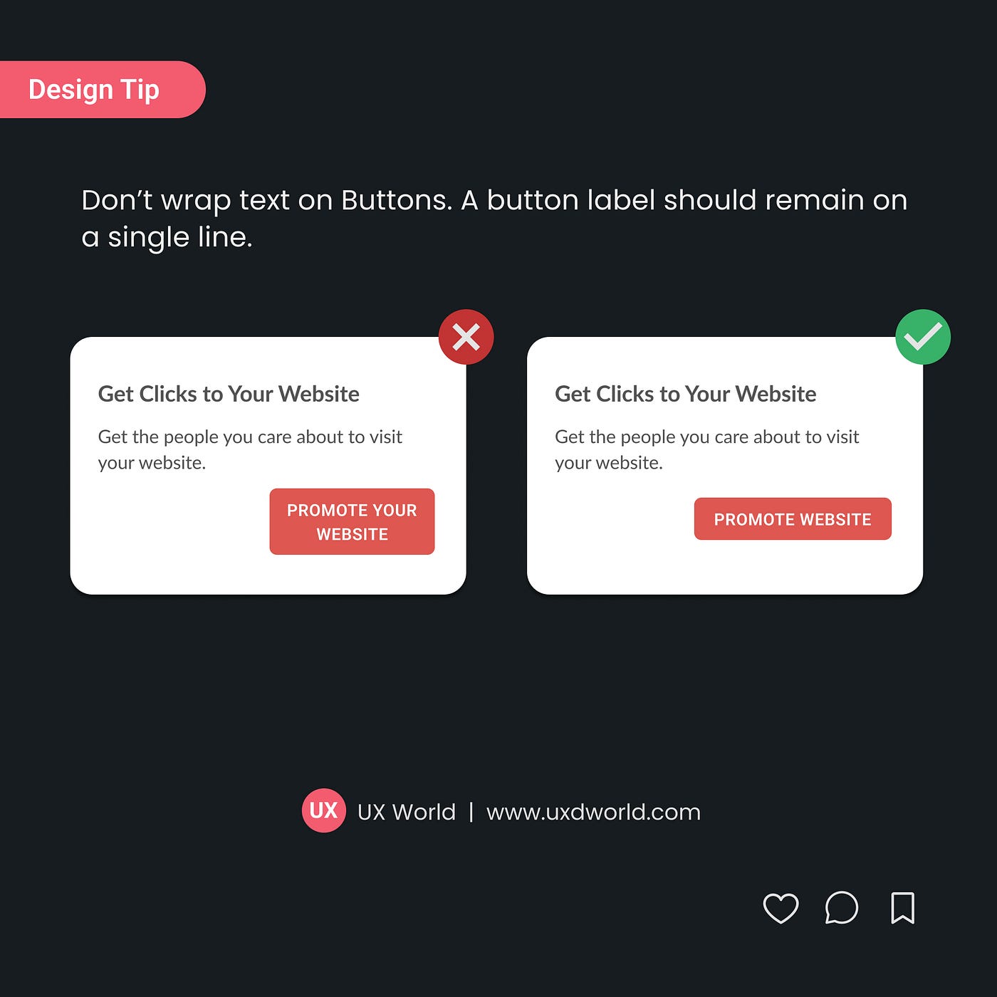
Don’t wrap text on buttons. A button label should remain on a single line.
- A single line of text is easier to scan, ensuring users can quickly understand the button’s function.
- Buttons with wrapped text can look cluttered or uneven.
- Keeping all button labels on one line helps maintain consistency across the interface.
- Use concise labels and avoid lengthy phrases on buttons.
2. Use Action Verbs as Button Labels

Button labels inspire the users to take action. To indicate what a button will do, use the function as the label of the button.
- Always use button labels that are clear and meaningful to the user.
- When users read the button labels like Save, Preview, and Publish, they know exactly what the button will do when pressed.
Find more tips on button labels:
3. Don’t Use Disabled Buttons
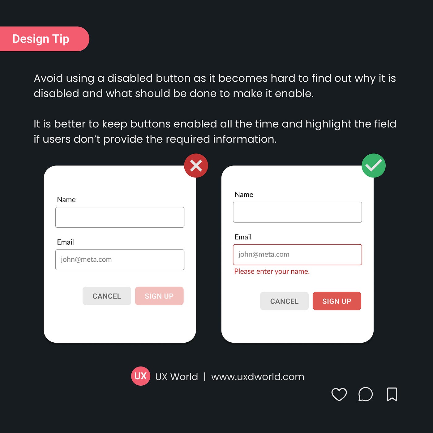
Avoid using a disabled button as it becomes hard to find out why it is disabled and what should be done to enable it.
- Disabled buttons break the flow of…