
7 Things To Remember When Selecting Fonts For Your Design
Typography plays a crucial role in the success of a new design.
Optimizing typography is optimizing readability, accessibility, usability(!), overall graphic balance. (Oliver Reichenstein)
That’s why selecting an appropriate typeface for text usage is important step in every design project. Depending on a project, finding the right font can take a few minutes or a few days.
Here are seven key factors to consider when searching for an appropriate typeface:
1. Branding
A font you select should embody the character and spirit of your brand. Try to match the font style to your brand’s character.
2. Legibility
It’s evident that it’s better for a typeface to be clear and legible, rather than so unreadable. If people have to spend extra time to understand what have written, then they will disregard your design.
Avoid using fancy fonts or uppercase text in large bodies of text as it forces strain on the reader’s eye. It’s better to use decorative typefaces only for titles and headlines.
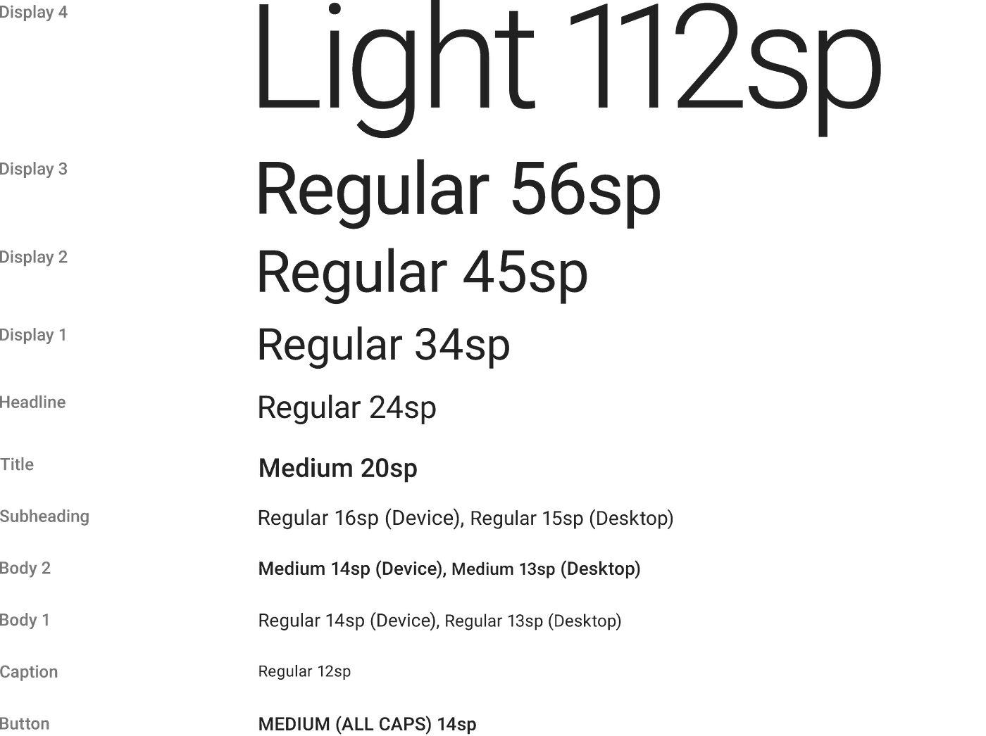
Also, it’s vital to choose a typeface that works well in multiple sizes and weights to maintain readability in every size (check that the typeface you choose is legible on smaller screens!)
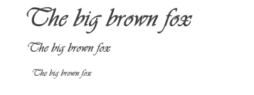
Try to avoid fonts that use a cursive script, such as Vivaldi (in the example below) — although they are beautiful, they are difficult to read.
3. Serif vs Sans
Usually, one of the first determinations to be made when selecting a typeface for text is serif or sans?

While the decision can be based on several key points, one of the most important points is the length of your copy. Generally, serif typefaces are easier to read for lengthy copy than sans. Serif fonts help the eye travel across a line, especially if lines are long.
But it’s also important to consider your target audience. Sans is preferable for young children, or anyone just learning to read. Sans is also good for readers with certain visual impairments.
Also, it’s a safe bet to use “web safe fonts” — fonts that are supported by all major web browsers by default. Here are some safe sans typefaces you might start with:
- Arial
- Tahoma
- Verdana
And here are some safe serif typefaces:
- Georgia
- Lucida
- Times New Roman
4. Font Family
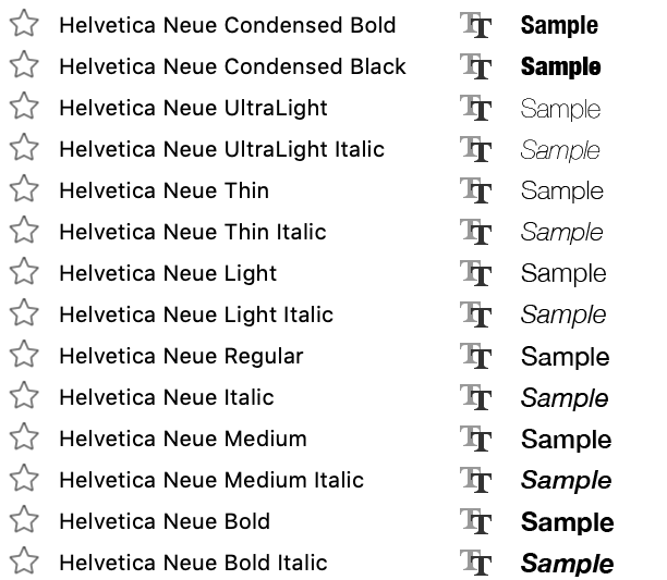
Some fonts are members of ‘superfamilies’ — they come along with a selection of different styles and weights that give designers more creative freedom. For example, the Helvetica Neue superfamily includes the following sub-fonts:
When choosing a font for your designs, you need to know how large a font family needs to be to meet your project typographic requirements. For many projects it’s enough to have two weights with italics, while others might require additional versions to create good visual hierarchy.
Much of the time one typeface is all you will need to use in your designs. However, there are certain occasions where you’ll want to use multiple typefaces (i.e. one for body text and another for a title).
Here are a few tips for font pairing:
5. Limit the total number of fonts
Avoid using more than 2–3 fonts in your design. Each time when you think you need a new font, play with different font sizes for existing fonts.

6. Avoid using too similar fonts
The whole idea of using multiple fonts in design is creating a visual diversity. That’s why there’s no point choosing two fonts that look identical. In fact, the more similar fonts are, the more likely they will clash.
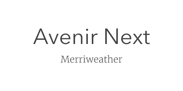
7. When selecting two fonts, use decisive contrast
When you choose to use multiple typefaces, make sure the typefaces you’re using have substantial contrasting differences. But remember that the contrast is not the same as conflict. The ideal combination of fonts should create harmony.
Follow a simple rule of thumb —find the two typefaces that have one thing in common but are otherwise vastly different. Combining serif with sans serif is a classic move.
The key thing when combining two very different fonts is establishing a clear hierarchy between the two — one font should be more prominent than the other. And this can be achieved by varying the size and weight of each typeface.
Tools for finding and pairing fonts
Here is a collection of tools that will help you find and pair the fonts for your design project:

