7 UI/UX Design Rules for eCommerce Websites

We have recently joined Quora. So if you have any question about UI/UX or about graphic design in general, that you’d like us to answer for you, you may drop me a question here.
But that’s not why I started writing this post, in the first place. Joining Quora has made us discover some interesting questions that people have about UI/UX. Certain things that we had probably never thought about explaining turned out to be a big question for many. So, we have now decided to take some of these questions, and elaborate the solution here in a better way.
One such question that I found intriguing was
“What are some unwritten UI/UX rules for an e-commerce website?”
Guess what my first step towards the answer was? I simply set aside all the knowledge gained as a designer, and asked myself, “What annoys me when I shop online?”
It took maybe 2–4 minutes, but I found a lot things like
- Hurdles in finding the product I want
- Cluttered interface that makes it difficult to focus
- Lack of appropriate filters
- Lack of enough or good quality product images
- Not enough product details
- No reviews to judge the product
- Hard to find buttons (especially for cart and wishlist)
- Uninvited deals and offers hitting on my face
See, there are so many already! I’m sure there might be few more if we joined in heads.
I jotted these down. Next, I called the designer back in me, and set down to write the basic do’s and don’ts of designing an e-commerce website:
#1| Easily accessible products

The protagonist of an e-commerce website is its product(s). So, obviously, you’d want to showcase them really well. Allow us to help you here.
Points to remember:
1. Focus on the products.
You would not want to keep your audience hunting for what they seek while you put unwanted content and ads before them, right?
2. Keep the interface clutter-free.
There should be enough breathing space between elements so that users don’t get anxious while trying to walk through the products and other related content.
Moreover, on a mobile interface, lack of space between elements might result in unwanted taps and subsequently in quitting the app.
3. Categorize the products clearly.
Make them attractive.
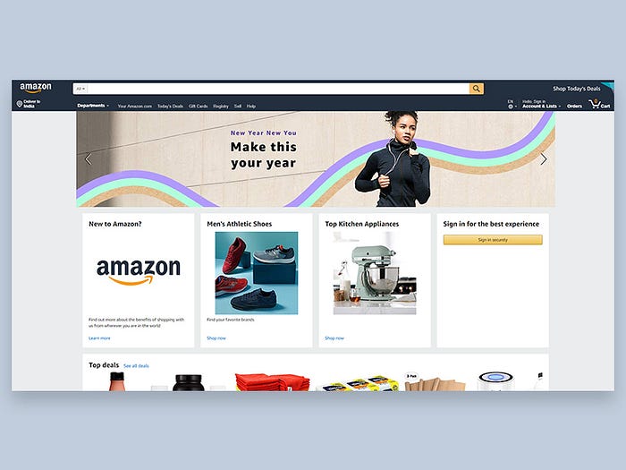
Now, websites like Amazon simply list the products and don’t require much promotional content. So they can put all their focus on listing the categories and product.
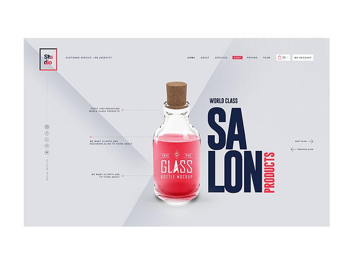
On the other hand, there’s this theme that we had designed; we call it Studio. This is one that promotes the business and sells its products. So, this has a completely different way of showcasing the product categories.
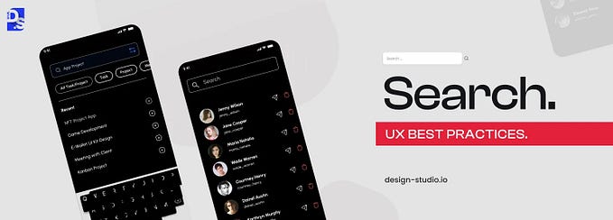
4. Include a search field
Imagine a HUGE store that has a massive collection of different kinds of products. Now picture yourself all alone there with no one to help you find what you want.
Devastating?
That’s exactly what a shopping site is without a search field. So make sure that your audience doesn’t feel lost.
#2| Easy checkout option

Make sure that the ‘Add to Cart’ and ‘Add to Wishlist’ buttons on the product detail pages are pretty easy to find.
Researches have proved that most cart abandonments occur due to two main reasons:
- lengthy or complicated checkout process, and
- additional shipping charges.
Well, the latter isn’t in your hands, but the former is.
Points to remember:
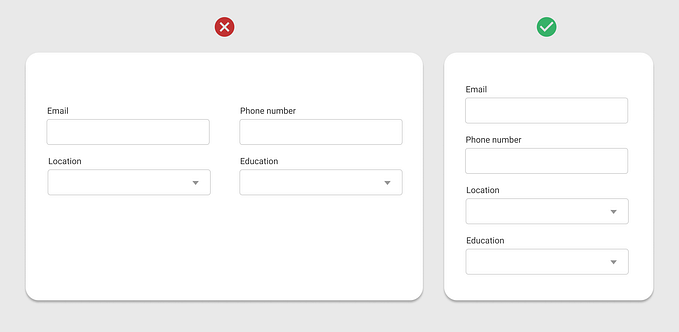
1. Collect basic user information.
Allow the user to fill in the minimum information required for shopping. If (s)he loves the shopping experience, (s)he will come back later, and can then fill in the rest of the details.
2. Show clear purchase details.
Before redirecting the user to the payment page, show the details of the purchase.
This will convince the user that nothing extra or unwanted has been added in the cart by the store. Moreover, a quick run through the items in the cart will allow the user to see if anything has been added accidentally or if anything needs to be changed.
3. Redirect to the relevant page.
Once the purchase has been completed, show a proper confirmation.
On the same page, you can suggest similar products that the user might want to shop. Basically, tempt them!
If you wish, you may also include a CTA below/beside the purchase confirmation that leads to a separate page where the user can track the progress of delivery.
Of course, these might have to be separated while designing the interface for mobile.
#3| Gorgeous images

Would you like to buy something that looks boring? Maybe it’s very useful but you will definitely have second thoughts, won’t you?
The only window for accessing a product on an online store is the set of photos of the product. If these look boring, then no one would want to take a second look at it. The photos must lure the user to either buy or at least to take a detailed look at the product.
Points to remember:
1. Use professionally shot photos.
Photography is very important when you intend to persuade someone into buying something. Professional photoshoots might seem costly but result in huge ROI’s in the long run.
2. Optimize the images.
No one likes to wait, least of all while staring at an electronic screen.
If the images are not optimized properly, then they may take too long to load. This might result in quitting the product, and repetitions of such instances might ultimately result in quitting the website or application.
Note: All design elements must be optimized for faster loading.
#4| Product details

The importance of product details need not be described separately. We all know that, don’t we? When words and images are the only ways to learn about something, details and specifications become extremely important.
Points to remember:
1. Provide as much information as possible.
Remember that there might be detailed paragraphs as well as small points in the overall description. While you are designing, keep in mind the room needed for adding in information in short paragraphs. Big chunks of text repel people.
2. Include multiple images.
Keep the facility of showing several product images. The more the better. Don’t think more than 6 or 7, of course!
Zoom on hover is great for showing image details, so you might want to keep that in mind, too. Some products might also have one or two videos. Keep room for the same.
#5| Product feedback

Reviews and ratings are very important in online stores. They instill trust in people and help them to take a decision.
Did you know that 95% of people read online reviews before making a purchase?
Now that’s something to brood over!
Points to remember:
1. Include ratings and reviews
You may show an average rating of the product on top and then detail on the different reviews.
Don’t forget to include a section for the customer to leave a review for a purchased product.
2. Sort the reviews
You may try having options for sorting the reviews based on relevance and date. This will help people to look for reviews as required.
#6| Offers

Ah! Those delightful offers and deals of the day! These definitely deserve a place on the main screen/page.
Points to remember:
1. Keep the message precise and clear.
Since the deals demand attention, make them look attractive. At the same time, they should convey the message clearly and in few words.
2. Include banners.
Depending on the look and feel of the application, you may have few banners sliding through on the top. These are a great way to show the best deals and draw attention.
3. Keep it subtle.
There’s no point in designing beautiful CTA’s if people are annoyed by them. After all, not everybody might be looking for deals.
When you design the sections for offers, keep them subtle. The main product categories should not be disturbed because of these.
#7| Filters

For every category that you are showing, even for search results, use appropriate filters.
Points to remember:
1. Keep sorting and filter options separately.
Remember that sorting product is not the same as applying filters. So, keep them separate.
Bonus Tip
And here’s a final generic suggestion.
Accessibility
Whether you are designing the interface for web or for mobile, remember these things:
1. The F-shaped reading pattern:
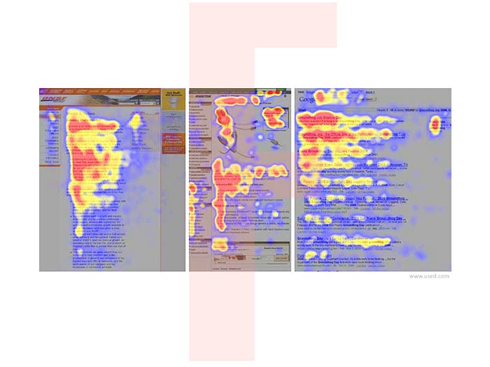
Be it any website or article, people usually follow an F-shaped pattern for reading. So, you may arrange the important elements accordingly.
2. The Thumb zone:

While browsing on a mobile device, the finger that is used most frequently is the thumb. So, the most important elements are placed where the thumb can comfortably reach.
So, that’s it. These are few basic “rules” that can help to get the project going. You can go on adding your own ideas as the project unfolds.
Happy designing!
Planning to take your online business to the next level? We can help!
About the author:
Sudeshna Adhikary is a UX researcher at Design Studio. Creativity is her middle name. Exploring, learning, believing in super-human powers, talking and eating are her favourite things to do.
Originally published at design-studio.io on January 11, 2019.


