
9 Most Common Mobile UX Mistakes
by Nick Babich
The difference between a good app and a bad app is usually the quality of its UX. But making changes on mobile UX can be a tricky process, especially if you come from a web background. This list will get you on the right track by helping you steer clear of common pitfalls.
Mistake #1 — Not Optimizing for Mobile
The mobile user has a device which is not only smaller in terms of real estate, but is also frequently on a lower connection speed or limited data plan. But mobile users want to get tasks done quickly, as they’re often on the run. As a result, speed and responsiveness are the most important.

Any moments of confusion create opportunities for the user to disengage with the app.
Takeaway: You should focus on both speeding up processing time and making common user flows smart & simple. Otherwise, you increase the risk that users will abandon your app for a competitor’s. Good example is LA Times:

Mistake #2 —Copying Your Competitors Experience
Implementing generally accepted good practices without questioning if they suitable for your product. Even the world’s most innovative companies have resorted to copying. While competitor’s experience is generally a good starting point, each product is unique in it’s goals, audience, value, functionality. What works for someone else doesn’t mean it will automatically work for you.
Takeaway: You should take something great and either put their own spin on it, or they attempt to improve it in some way. The thin line between good experience and blind copy is one marked by improvement.

Mistake #3 — Adding a Lot More Features
I am absolutely sure that you are familiar with Pareto principle. In the world of business the Pareto principle is the rule that says 80% of profits come from 20% of customers or clients. In case of mobile experience this means 80% of app users never utilize more than 20% of its features. This 20% becomes the whole product.

Takeaway: Stop adding new features and focus on existing instead .Make sure you get constant feedback from your users. In order to collect valuable feedback, you need to make it easy for users to provide it. And you need to pinpoint which features are most popular, and get rid of the ones that are not provoking interest.
Mistake #4 — Login Walls
Everyone knows there are a ton of benefits to having users sign in, but users almost always annoyed than when they come across a login wall. Because demanding that users must register or log in before they can use an app or see website information has high interaction cost.

Takeaway: If registration is a pain point, why not see what happens when you remove that pain entirely? Just allow users to skip registration. Etsy knows how to get a user hooked before asking for information. When you first download their app you are given two options: you can sign up for an account or you can start searching the store and take a look at trending items:
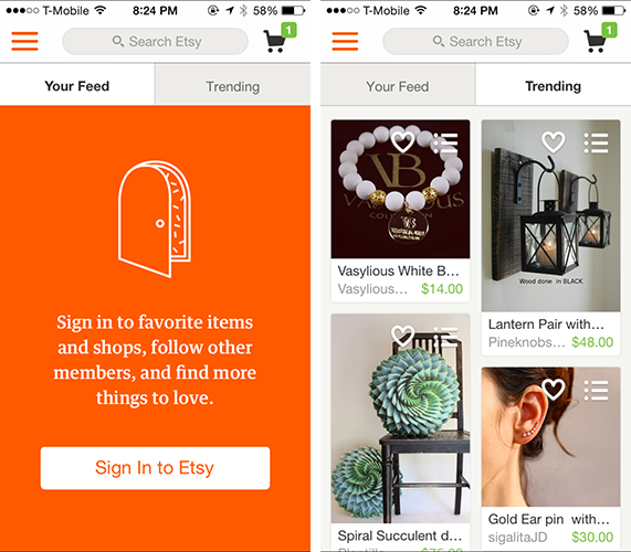
And you are only asked to sign up for an account once you are ready to make a purchase.
Mistake #5 — Onboarding First
Onboarding supposed to give users a great sense of value for an app, making sure they know all they can do with your app, and what they’ll get out of it. Common onboarding approach is to provide a tutorial to teach your users how to use your application. This concept can be extremely powerful when done well. But what if your users are already familiar with the core value proposition of the app and simply want to get started using it as soon as possible?
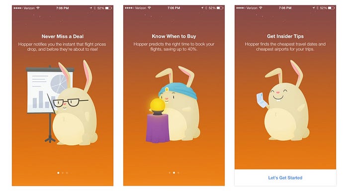
Takeaway: Trying to convince users of possible value through a tutorial can impede them from getting to the actual value in an app. Vevo wanted to see if removing tutorials could possibly improve user experience. After testing two variants: one with and one without, the results were clear. Without tutorials, 10% more users logged in, and 6% more signed up:

Mistake #6 — Bombarding Your Users With Permission Settings
Both ask your users for permission both too early and also asking them for access for too many things are common mistakes. When you open a new application the last thing, you want to see, is multiple popups in a row asking for permission:
- App Would Like to Send You Push Notifications
- App Would Like to Access Your Locations
- App Would Like Access Your Contacts
- App Would Like to Access Your Camera

Takeaway: If this permission is critical, find the right time to ask it and tell the user why you need access. That way user understand the benefit of giving you this permission. Cluster does a great job of this. Instead of asking for permissions as soon as you open their application, they hold off and ask for it when it’s going to benefit you:

Mistake #7 — Bombarding Your Users With Push Notifications
Whilst push notifications can be a valuable way to interact with users, if you bombard them with missives, they will get frustrated.
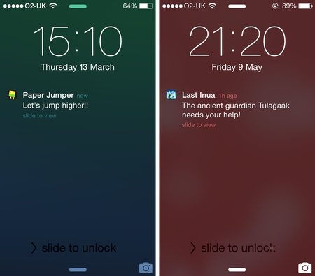
Takeaway: You should always think carefully about the triggers for push notifications, so that communication never becomes irritating.
Mistake #8 — Underestimating How Long Updates Take On Mobile
Since an app is hosted on a client’s phone, any updates need to go a long way before users will have them. After development, any changes are subject to an often lengthy app store review process.
Takeaway: Fixing mistakes on mobile can be an excruciating process, but integrating testing (e.g. A/B testing) as part of your development cycle can help alleviate much of the risk.
Mistake #9 — Request for Personal Information Right After First Launch
How would you react if during onboarding process app is asking you for your credit card information? Like most people, before you offer up that kind of information most probably you want to see what the service is offering and get to see how the app actually works.
Takeaway: Ask such information only when it’s beneficial for user.
Conclusion
If you want your app to be successful, you have to consider UX to be not just a minor aspect of design, but an essential component of product strategy. Keeping these common UX mistakes in mind will help you improve your product. Improving the user experience is an ongoing experience.
Thank you!
P.S. Also check 7 Mobile UX Mistakes You’re Probably Making Right Now by Lynn Wang

