
For the last couple of days I spent my evenings analyzing Apples product pages, making mind maps and taking numerous screenshots of product sections till my desktop was covered in multiple small thumbnails. You wondering why I did this?
Undeniably, scrolling through Apples product pages feels like being on a digital journey, infused with highly detailed product shots, astonishing animations and user centered content. But what makes Apples product pages different from other websites? Why does it feel effortless reading Apples product descriptions or why do we suddenly have less difficulties comprehending any of the technical terms listed on the technical details pages? To uncover some of the mystery and hype accompanied with the high-end brand I cover various UX principles starting with the overall site structure and appearence first and fishing with Apples content strategy.
Overall Site Structure
The following section is structured into 4 subsections, analyzing not only the general site structure, but also various techniques used to make information more understandable.
Chunking
Instead of long unstructured paragraphs Apple usually prefers to separate content into individual pieces with plenty of whitespace, images or video footage put between each text block. Except from the legal section at the very end of each page its very unlikely for viewers to stumble across exzessive amounts of text on any of Apples product detail pages. Thanks to the small text blocks scattered across the site, it doensn’t feel like much of a commitment to start reading — it’s just a couple of lines anyways right?
Splitting information into separate pieces is generally referred to as chunking and can be used not only for text but any kind of information you are working with. Generally displaying enormous amounts of information on a website not only makes for a bad first impression and generally increase the risk of costumers to leave, it also gives users a harder time memorizing information. For instance imagine memorizing a long unstructured number „454678007“ compared to the following structured version „454–678–007“. Although both numbers are identical, recalling the latter rather than the first one seems like less of a struggle.
Immersion & Interactivity
Apples product pages are not just about information being stacked on top of each other, it’s an interactive experience. As the user scrolls through the page, images move, text fades in and product animations make clear what words would struggle to explain. Instead of just getting information about the product, the user explores it one feature at a time as he is slowly moving down the giant one pager.
Browsing through the Apple Air pods page, leaves no question unanswered as incredibly detailed 3d animations not only show the superficial outer part of the product but also every tiny technical detail embedded within. Aspects normally hidden beneath the elegant design of the Air Pods suddenly become visible making the product even more desirable for potential costumers.
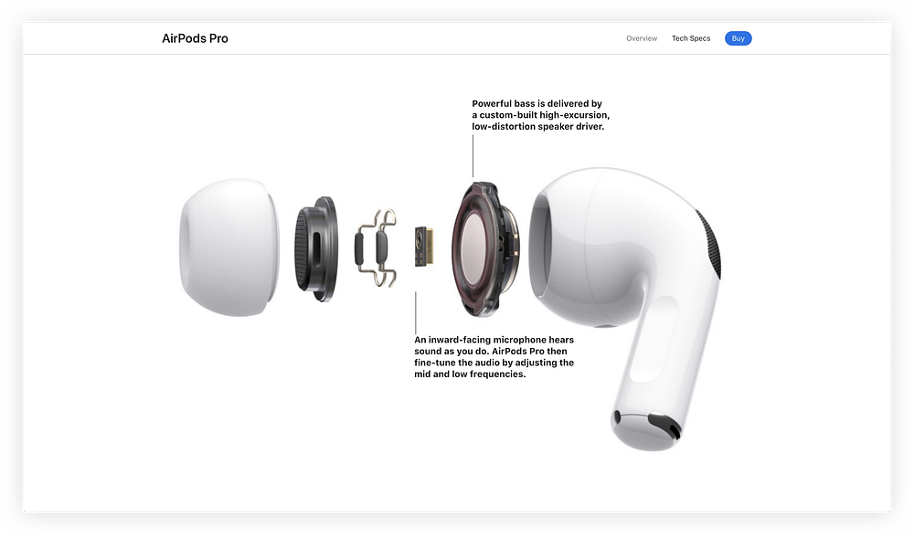
Giving the user the opportunity to explore the product in 3D space not only comes surprisingly close to viewing the product in real life, it offers an interesting approach to market products online in general. As conventional Ecommerce sites primarily rely on static product images and brief descriptions to sell their products, users often lack sufficient opportunities to fully understand the product. In contrast, Apple offers a much more immersive approach, giving users the opportunitiy to view and understand their products in a more playful and detailed way.
Surprise & Play
Undeniably Apple has mastered the art of surprise, looking at the individual product pages leaves no doubt about that: Site transitions constantly change, products get moved and rotated in any way imaginable, incredibly detailed close ups leave no detail unseen und just when you think there is nothing left to see an astonishing site transition proves you wrong.
Moving one feature at a time through Apples long onepagers doensn’t feel like getting some dry information about any of the products you are interested in, but rather feels like a digital journey with constant suprises put between each paragraph you read.
Community & Social Proof
Besides all the detailed product shots, impressive animations and bold headlines, Apple constantly incorporates community driven content into their site: Artists give advice on improving your dull looking portrait shots, a pensioner tells you why owning an Apple Watch almost saved him from getting a heart attack & videographers shoot cinematic looking video footage on the new iPhone Pro..
Suddenly products such as the iPhone Pro or the Apple Watch no longer remain those abstract polished looking 3D renders shown on Apples product pages, but turn into a tool people use on a regular basis. Meaning arises and eventually watching one video after another, makes you wonder what owning an Apple Watch would feel like. Maybe your life would change for the better and eventually owing the new iPhone Pro just advertised by the hipster looking photographer you listened to would help you shoot those highly detailed, stunning looking photographs? Just like in the tutorial videos, it’s no longer about the looks anymore but about having a tool which empowers you to do things you weren’t capable of doing till now.
Seeing products being used by other people not only helps create meaning, it establishes trustworthiness: In contrast to the marketing driven product pages, community driven content gives costumers an opportunity to create an opinion based upon the experience of others. Listening to other people instead of the bold headlines displayed on Apples product pages, gives the impression of listening to someone independent and makes potential costumers more likely to buy into a product they were first hesitant about.
Content Strategy
Apart from providing highly immersive web experiences, impressive looking page transitions and all the other aspects previously mentioned, Apple puts great effort in writing headlines and copy texts people resonate well with.
Tone of Voice
Although selling highly technical products and having a well known reputation of being a high end brand, Apple maintains an easy to understand, mostly informal and even playful tone of voice: Reading the copy texts gives the impression of listening to a smart, yet easy going and humorous person who cares about making technology available and understandable for everyone. For instance take a look at the paragraph below — it’s playful, rythmic and makes us feel understood as it responds to common user concerns at the end of the sentence.
“Survives splashes, sloshes, sprinkles, sprays, splatters and spills. iPhone SE is water resistant to 1 meter for 30 minutes. It’s not afraid of a little coffee, tea, or soda either. And dust? No worries.”
Mapping
What does it mean to have a camera capable of shooting 20 megapixels instead of just 10 or why is the new iPhone SE’s battery better than the one built into my current Phone? Of course seeing big numbers as you scroll through the technical details page gives the impression of the new products being superior to the ones released prior to that, in fact for the most part this may be true, but what does it mean practically to shoot with a 20 megapixel instead of a 12 megapixel camera or to have an A9 chip and not an A13 Bionic chip built into your iPhone?
Generally, it can be hard comprehending all of the abstract technical terms and numbers we get bombarded with when buying any new digital product, unless any of the numbers are translated into a format we have less difficulties with understanding. For instance look at the way Apple advertises the new battery built into the new iPhone SE:
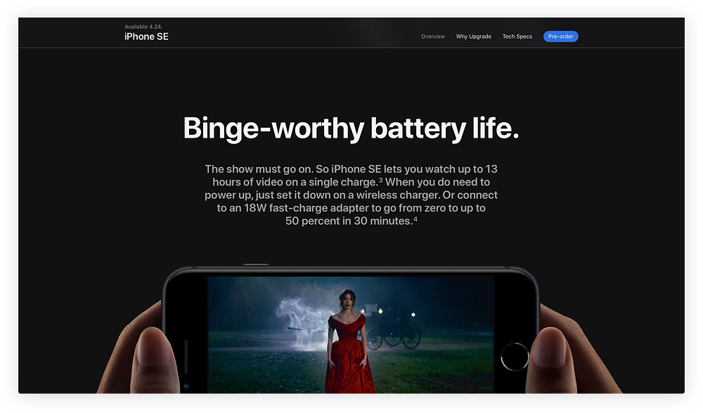
Providing that example instead of just writing a bare number not only makes anyone smile reading the headline, it also gives most people something they can relate very well to. Who wouldn’t like to have an additional 3 hours to watch his favorite Netflix Series? Adding that small detail besides an otherwise dry looking abstract number, makes people pause for a while and a feature normally overseen suddenly becomes understandable as well as desirable to people.

Relevance & Practicality
Apart from translating complex technical terms and numbers into a format people can better comprehend, Apple provides context, making products become even more relevant to costumers. For instance take a look at the copy written for the iPhone Pro’s wideangle camera:
“When you just can’t squeeze everything into the frame, zoom out. Because the new Ultra Wide camera captures four times more scene than ever. It’s like stepping back — way back — without taking a step.”
Rather than focusing solely on the technical aspects of wide angle cameras, the product is explained using a practical example everyone can relate to. Immediately the reader may think what shooting wide angle pictures feels like and the effort it takes to get everything into frame with conventional cameras. As the reader starts imagining himself struggling with his current product, he no longer stays passive , but starts to actively reflect on his own experience taking photographs.
Clarity & Safety
Undeniably getting a new product is an investment and although we may feel excited scrolling through Apples product pages, buying a new product is also accompanied by worries. Especially if users didn’t have an Apple product previously making the step and switching devices can feel like an even bigger commitment to make. Apparently well aware of that fact, Apple has an entire page dedicated to resolve any of the common misconceptions related to switching devices:

As seen in the screenshot above, possible concerns are addressed instantly and constant guidance is provided, encouraging users to solve their worries directly on Apples support pages rather than on their own.
Apart from their support pages, Apple constantly challenges users to question their current beliefs on technology and to actively reflect on their own opinion as seen in the following example:
“Smart HDR. And you thought your photos couldn’t get any better.”
Reading the headline makes us pause for a while and to think about the almost cocky statement just made. Directly beneath Apple resolves the paragraph, showing what it looks like to shoot photographs using their new HDR technology. Instead of just telling us about the new camera eventually being better than our existing one, Apple provides direct examples diminishing any of the last concerns the reader may had.

References & Images
Air Pods Pro: https://www.apple.com/at/airpods-pro/
iPhone SE: https://www.apple.com/iphone-se/
iPhone 11 Pro: https://www.apple.com/iphone-11-pro/
Switching Devices: https://www.apple.com/switch/


