
8 UX Design Strategies That Will Stand the Test of Time
When it comes to UX design, there are a lot of passing trends that come and go. Everyone seems to think they have the inside scoop on what will be popular in the upcoming 12 months. However, some UX design strategies stand the test of time year after year.
Following careful steps to create a design is a smart way to start. This means doing your research, analyzing statistics for your site and similar sites, creating a mockup site and testing for usability. There are eight design strategies that will serve you well, no matter what type of website you’re designing.
1. Mobile Responsiveness
Over the years, the need for a site to be compatible with mobile devices has grown. Mobile users are about five times as likely to leave a site if it is not optimized for mobile browsing. This trend will only continue to grow as more and more people purchase smartphones and start using them to browse the Internet.

A good example of a site with strong mobile responsiveness is Open Wear. Not only does the page load quickly, but it is visually pleasing and sized for smaller screens.
2. Remember Secondary Users
If you’re been designing for a while, you probably know to do your research and target your website to an ideal user. However, don’t forget the secondary stakeholders as well. Building a site to benefit just one group is not the best long-term strategy.
Keep in mind the audience you might like to reach out to, but haven’t yet. Let’s say you sell a product for seniors, but you’d like to start reaching out to those who care for the elderly. These would be your secondary users.
3. Include Multimedia
Including multimedia, especially videos, can create engaged, happy users. About one-third of all online activity is video watching, with many of these viewers sharing the videos they watch. Videos are here to stay and are a necessity for most websites and companies. If you really want to reach consumers on their level, video is the way to go.

One example of a site using video effectively is LAI Video. Their “Rethink Hungry” video makes people realize what a problem childhood hunger can be in an entertaining way. The purpose is to get the viewer to take action. By using the video on the landing page, it crates interaction with the site visitor from the first moment.
4. Usable Architecture
Architecture is the way your site is organized. What are your main folders and subfolders, and how do they work together? If a visitor lands on your page, he or she should know exactly where to go and which action to take from that moment on. This includes more than just navigation — though that is important — but also a plan for how the entire site will be mapped out. If all the articles are in the blog folder, all the new articles should stay there, for example.
5. Personalization
One thing sites have started to do that has been really effective and should only grow as a strategy in the future is to personalize the user experience. This can include elements such as product recommendations, greeting the visitor by name or even allowing the user to change the color scheme on the website for easier viewing or simple preference.
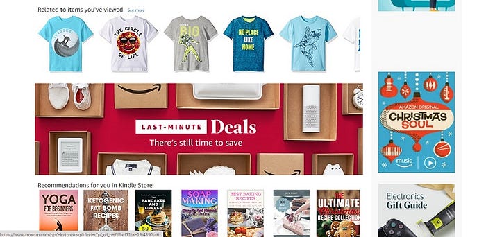
One example of a site doing a great job of offering personalization options is retail mega-giant Amazon. Amazon makes recommendations based on your previous purchases and on browsing history. They even take this a bit further and will offer suggestions based on similar products and what others who have also searched for that item have bought.
6. Limited Clicks
Imagine you visit a website to download a free guide your friend told you about. However, instead of landing on a page, giving your email and downloading the guide, you have to click down through several tiers. More than likely, you are going to get frustrated and possibly bounce away from the site. After all, there are dozens of sites offering free guides on any number of related topics.
Do yourself and your site visitors a favor and figure out how to minimize how many times a user must click to be funneled where they want to go.
7. Show Some Fun and Personality
Anything you can do to make the user experience interesting and fun is a boon for your website. Don’t be afraid to show off your personality — just make sure the overall design is fun, but not aggravating to navigate or loaded down with cumbersome animations. Of course, the personality of each website differs widely, so your first step is figuring out exactly what your site personality is.
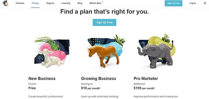
One example of this type of fun profiling of personality is from the email marketing website MailChimp. They have jokes throughout their site, fun graphics and so on. Note how their pricing page uses animals to show the different levels for different newsletter list sizes. A newborn lamb represents a new business, while an elephant is the pro marketer level.
8. Use Negative Space
Don’t be afraid to use white space in your designs. Negative space is easy on the eyes and draws the user’s attention to where you want it to go. The simpler your overall design, in some aspects, the better. Not only will pages load more quickly, but site visitors won’t be confused with so much clutter and noise.
Using these UX design strategies is good for both B2C and B2B businesses. It can create a singular focus that drives conversions. Users have come to expect a certain level of UX familiarity from sites, so implementing these eight things is a good place to start to meet their expectations.
About the author:

Lexie is a freelance UX designer and writer. She enjoys conducting A/B testing and sending off prototypes to clients. She manages Design Roast and can be followed on Twitter @lexieludesigner.

