8 ways to reduce cognitive load: Part 1
Prevent your users from a headache when they look at your site (and decrease bounce rate).

Have you ever wondered why your users consistently keep behaving differently from you expectations? There is a huge chance your design asks them for more attention they are able to give. Yet, there are ways to make it easier to users to go with the flow and increase conversion.
What is cognitive load
Have you ever seat on lecture or meetup listening to a talk on relatively interesting topic, yet could not overcome the urge to grap your spartphone and start scrolling down Instagram? Are you in this exclusive club? Does it mean you are a social-media addict or your concentration skills cry for solid training?
Not necessarily. But it do illustrates well what cognitive overload is – the situation when the required amount of information to complete a task (in this case – to understand a piece of information presented during the talk) is too much to be processed easily in working memory.
Yet, the notion of cognitive overload should not be confused with cognitive load as it happens from time to time on UX blogs.
Cognitive load as such is:
The total amount of mental effort that is required to complete a task involving processing of information.
The difference between the two is well described in a short talk by John Sweller, the emeritus professor of University of New South Wales and the educational psychologist who has created the cognitive load theory in the 1980's.
Why cognitive load matters in web design
When browsing the Internet, users come across series of tasks that involve information processing. This happens no matter if the web experience was designed mindful of the existence of such phenomena as cognitive load or not. Therefore, it better be if you do want to fail.
Psychology is hardly ever taught extensively in design schools, which is one of the reasons for everyday online headache that we have face. The representation of information, be it pictorial, textual, verbal or haptic, can either help reducing the friction that occurs during information processing or increase it. Unfortunately, if often does the latter owing to the deep inner feeling of the web designers that using rich visuals and a variety of animation is the proof of their craft (and not the reason why people exit a website being hit by waves of frustration).
What are the kinds of possible harm on both user experience and conversion that are caused by unwilling increment of cognitive load by too much of design?
- Raise of bounce rate (users quit the site fast, because what they experience is too much or they do not understand what is the site about or what is the action they are supposed to do).
- Shallow depth of user visits (users leave a website without going to different sections and pages of the website as they do not understand what to do).
- Raise of time per visit without raise of conversion (users spend a lot of time looking for a piece of information, but they cannot see the way to complete actions to get expected results).
- Decrease of conversion (the users are confused how to perform an action from A to Z)
- Decrease of the number of returning users (bad user experience prevents users from coming back).
Yet, there are ways to prevent users from experiencing this problems and the brand from experiencing the harms cognitive overload can create.
1. Make instructions simple
Good design is self-explanatory. This characteristic is called affordance – the ability of product to communicate straightforwardly what is the action that can be performed with a product. The form of chair indicated that you can seat on it and the wheel of computer mouse indicates you can turn it with a finger.
Affordances do appear in the digital world as well. If you need long copy to make user understand what is the action that can be performed — consider if the same can be communicated with visuals.
Moreover, keeping it simple and short makes it more likely for users to actually read the instructions and prevent them from making mistakes.
Good example: ConversionXL
Short copy, clean screen, big red button — not much place for an error and confusion.

2. Use schemes that already exist and users know them
Like logging or search, there are actions that do not need the wheel to be reinvented. Since our brain tends to reduce the amount of information that has to be processed, it automates many of the actions that we use everyday. The part of the consciousness that is responsible for automated actions is called by David Kahneman ‘System 2’ in his bestseller book “Thinking: Fast and Slow”.
Such things as recognising a certain object as a representative of a category of objects (your laptop as a laptop, not a rectangular electronic object that has a screen and keyboard and allows to type information and see the results live) are automated by our mind for the efficiency of its work.
Therefore keep the things within conventions if you want make it easier for users to go through an interface. This prevents them from spending their precious time on learning what it is what they are looking at. Instead, they can immediately perform actions.
Good example: Gazeta Wyborcza
Do anybody doubt that what is displayed on the image below is a screen from an online version of a newspaper?

3. Be predictable
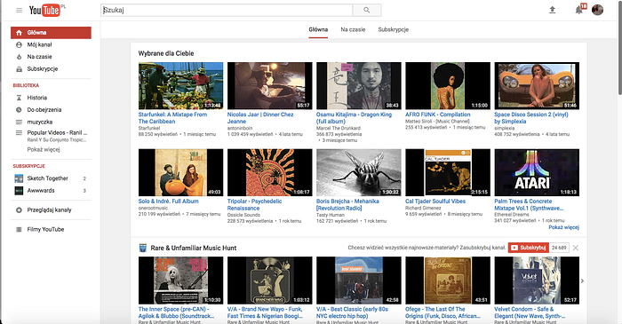
Interface should behave the way users expect it to behave. The situation when it does not do it is called cognitive friction and uses our working memory to process information and deal with what is going on on the screen. Crazy animations and surprises on every click? Creative as it might sound, it does not seem a good idea for well-performing site.
Good example: YouTube
Super simple, or maybe — super boring, but is used succesfully everyday by people on all levels of computer competences: from professional youtubers to even babies watching cartoons (and their grannies!)

4. Keep copy intuitive and obvious
Creativity and poetic, surprising metaphors is not necessarily what is expected from a technical copywriter. Keep it obvious – users no not actually READ websites, they SCAN them in search for certain key words that users already have in mind.
“Full forecast” and “Search location” — no doubts what to do.

Coming in Part 2:
4 more ways how to reduce cognitive load and reading list for further tips how to make it easier for users to move around a site.

