9 usability issues that plague mobile apps today

Building a solid mobile app in 2018 means paying constant, close attention to its usability. There are many usability issues that plague modern-day mobile apps, which you, dear reader, will be able to find listed below. Luckily enough, with the right tools and a little patience, they can easily be avoided or remedied, helping you build that ultimate app. Read on to find out which usability issues most mobile app publishers face nowadays, and what you can do to eliminate them.
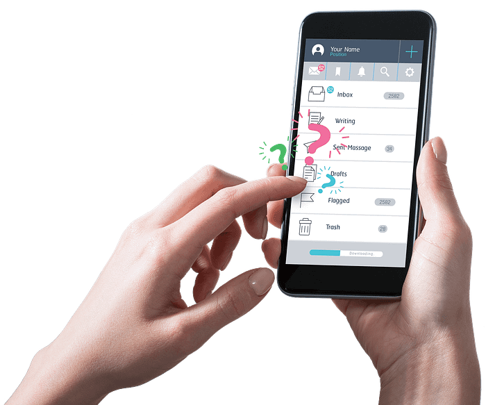
1. Too many taps

When we’re using an app, we want to get to the juicy parts as soon as possible — read:immediately. So states the Principle of Least Effort. Some will tell you apps pros tend to complicate their navigation, adding too many options and levels. As a result, users are faced with way too many taps necessary to get the task done. On the other hand, while trying to reduce taps, some app pros will oversimplify navigation, which can result in users not knowing exactly where to go within the app and why. Each solution is poor and has the same result — dented usability. In order to avoid these traps, you need to carefully balance between providing just enough information and making navigation as speedy and efficient as possible.
2. Disregarding landscape mode
There has been a lot of talk about landscape mode in terms of mobile app usability, but it seems that the talk has gone in the wrong direction. Just slapping a landscape mode onto an app won’t suffice — it needs proper attention, almost to the point where two modes are considered as two different apps. Portrait mode is mostly used with one hand and on the go, while landscape mode is usually used while static, and with both hands. App pros should consider different approaches to the UI and the UX for two different modes to make sure usability is up to standards on both fronts.
3. Ignoring different platforms
Building apps for Apple’s iOS is fast — especially when compared to Android. With the latter, app pros need to keep in mind different hardware manufacturers and how they modify and optimize their versions of the OS. For example, an app optimized for Sony Xperia doesn’t necessarily mean it will work flawlessly on Samsung’s Galaxy S9. Sometimes, pressed by tight deadlines or even tighter budgets, app pros tend to focus mostly on a single version of Android, or a single manufacturer. However, with Android taking up more than half of market share in the US alone, it is worth spending a little extra funds and time on optimizing for some of the biggest names in the Android universe.
4. Turning a blind eye on OS versions

Building apps that mimic the look and feel of the operating system is important for usability — it prevents any inconsistencies in the user experience and helps users learn and adapt to the app faster, as the app’s navigation is intuitive and familiar. Operating systems change every now and then, and sometimes these changes are more or less subtle. Not paying attention to them could result in the app feeling outdated. For example, Android’s Oreo comes with a “picture in picture” mode, which is something of a split-screen mode. It allows users to continue watching video while interrupted by chats or other apps. It’s a nifty little feature that improves usability quite significantly, and those apps that do not take advantage of it might feel severely outdated or simply bad. Also, users can end up feeling the app lacks proper support.
5. Resolution miscalculations

Besides paying attention to different operating systems, as well as their versions, app pros also need to keep in mind that different devices come with different mobile screen resolutions. For example, the Sony Xperia Z5 Premium has an insane 3840 x 2160 resolution. Samsung Galaxy S9 works on 2960 x 1440, while Apple’s iPhone X sports 2436 x 1125. This can spell trouble for the devs, because an app can look really cool on one device, and completely broken on another, even if they’re on the same operating system and the same version.
6. No auto-filled customer data

This is one of the newer usability issues that is making rounds among app pros. Auto-filling customer data is a particularly important among retail apps, but also very useful among all others that employ user-submitted data. Apps that do not auto-fill user data, such as search queries (for virtually any app with a search bar) are nowadays perceived as poor in terms of usability. One thing that app pros need to pay attention to, when building an auto-fill option is to make an accessible, clearly visible edit button, in case the auto-filled data happens to be “incorrect” and users need to change it (billing info, most likely).
7. Unresponsive gestures
Unresponsive gestures are a huge friction point for any app’s usability. Technically, unresponsive gestures occur when a user performs a gesture and receives no response/reaction from the app. It is also an umbrella term that covers a few issues: buttons that do not work, counter-intuitive gestures, and UI elements that are mistaken d as navigation elements, when in fact — they are not. Flawed navigation elements need no particular description — they make the app look unprofessional, create frustration and disappointment in users and can wreak havoc on the app’s retention rates. Navigation elements with unintuitive gestures are a more subtle problem. What if the app requires users to swipe when they feel they should be tapping? More importantly — how does one spot such a usability issue and eliminate it? The best way would be to employ qualitative analytics tools — touch heatmaps, to be precise. Such a tool can help app pros spot counter-intuitive and unresponsive gestures with ease, improving usability and consequently — retention rates.
8. Confusing or vague content
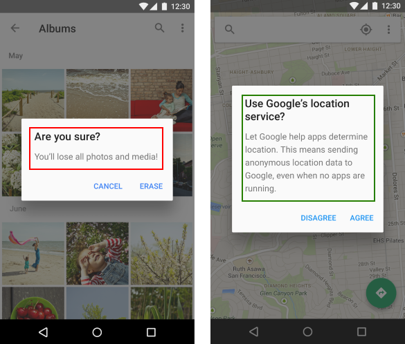
Pop up content, when done right, can do wonders for an app. It can help users progress through their in-app journey. It can provide additional information or help app pros get instant feedback. But the majority of app pros aren’t doing it right, which is why pop ups are generally considered persona non-grata. So, how do you do it right? Choose the right content for your pop-up. Choose the right timing when it will appear. And make sure it doesn’t feel like a chore, or a task, to the users, by offering something in return. Most of these things can be tested and perfected through the A/B method, paired with a qualitative tool like user session recordings, so one should make sure to employ all the weapons in their arsenal.
9. Deep Navigation
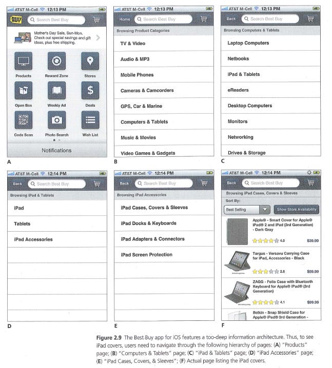
One of the biggest and most common usability issues that still plague today’s apps is organizing navigation that is three, four or even five levels below the app’s home screen. This problem can leave a huge dent in the app’s usability as it increases the time needed to get a task done, and requires a lot of back-and-forth, which is something impatient mobile users do not have the time for. Getting it right is hard. Each app is unique and requires a unique approach to the navigation problem, so there is no easy or all-encompassing advice we can give. Get creative and test often, something’s bound to work.
Conclusion
Usability means paying attention to the little things — differences in operating system versions or resolutions. Dancing on the thin line between succinct and incomplete navigation, or between intuitive and unresponsive gestures. It means paying attention to potentially confusing content and the lack of auto-filling features. But with awareness and the aid of A/B testing, qualitative analytics tools and some brainstorming, mobile app usability becomes a playground where app pros can demonstrate their creativity and love for the craft.