A design yearbook of 2016
The design community has a lot to be proud about!
As 2016 comes to an end, there’s lot to ponder about, lots to savour and lots to carry ahead to 2017. I thought this is the best time to recollect all the bubbling trends and high points of the year.
Hope you enjoy the roller coaster ride!

Let’s take a look at the top 5 design news that got you talking this year round

Millions of people around the world turned on their smartphones and scanned their screens for the black-and-white Uber icon, only to find it was missing! Instead they found a colourful geometric shape — hexagonal if they drove, circular if they were a rider — surrounding a small, bit-like square. Not just that, the colours and patterns varied from country to country — red in China, turquoise in India, dark teal in the United States — but everywhere, the app will opened with an elegant, patterned animation, welcoming users to the new Uber.

The rebranding of Uber had many wondering if the company had taken a wrong turn. There was a continuous buzz about the design, so much so that the design head of Uber, Andrew Crow, stepped down in a month’s span.

On 11th May 2016, Instagram was totally trending on Twitter. It got a completely new look — the icons and the entire app! Keeping to the concept of the previous app icon, the new one too had a simpler camera and the rainbow had a gradient form. It was indeed full of colours and much more lively in appearance.
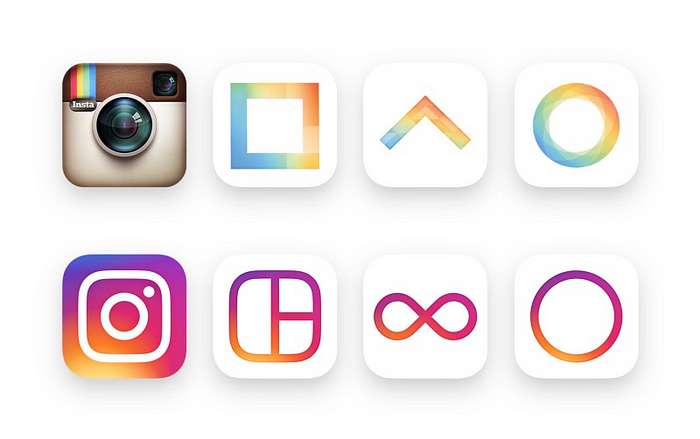
The crowd in favour and against the revamp was distributed. But, for or against, everybody was talking about it..

I am pretty sure, you would recall this tweet that made the design community go crazy on twitter within few hours!

Spencer Chen, vice president of marketing and business development for the Chinese online retailer Alibaba, exposed the similarities between these companies’ logos and ones printed in a 1989 design book, “Trademarks & Symbols of the World”, which had illustrations of nearly identical logos to those of modern companies — Medium, Airbnb, Flipboard and Beats.
Designers on Twitter were quick to point out that this sort of thing happens a lot in the design world, especially in logos where there’s a finite combination of abstract letters to construct.

The Facebook feed suddenly got a lot more expressive. As they rightly said, everything in the feeds isn’t likeable — They may be funny or loveable or sad and so on... After a long user research Facebook came up with six new reactions to any post.


DC comics updated their logo design in May 2016. Drawing on DC’s extensive 80 years of heritage, the new identity brought together classic designs and retro fonts associated with the brand and gave them a contemporary spin.

Loyal fans of DC came up in great support of the new icon as it was evident from their twitter handles! However, the chunky, chipped font and circular motif didn’t win everyone over.
Missing out on any important design news of 2016? Drop it in the comments below!



Did I miss out an amazing GIF you saw somewhere in 2016? Please drop the link in the comments section. I don’t wanna miss out any funny GIF!


Call to actions are the most important element of your website/app. And designers have always experimented on them to design something that absolutely stands out. Glowing CTAs was one such attempt and I must admit that it is beautiful!

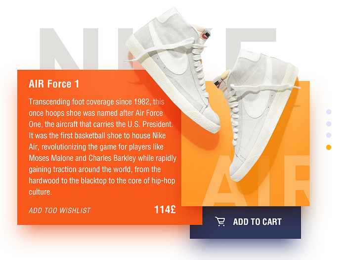

This is the hottest web design trend of 2016! I absolutely love it — it’s vibrant, colourful, and beautiful! You would have correctly guessed why I used the same for the UI trends banner! ;)
Spotify came up with this trend and its only growing everyday. It’s quite trendy, with new sites changing to a duotone format almost daily. This effect is vibrant and can spice up an overused image


There are no wrong colours if you use them wisely! And the trend of using bright and bold colours has rightly justified it. Colours can draw attention, set a mood, influence users’ emotions, perceptions and actions. When it comes to web & mobile app design, this is definitely the time of vibrant and bold colours.
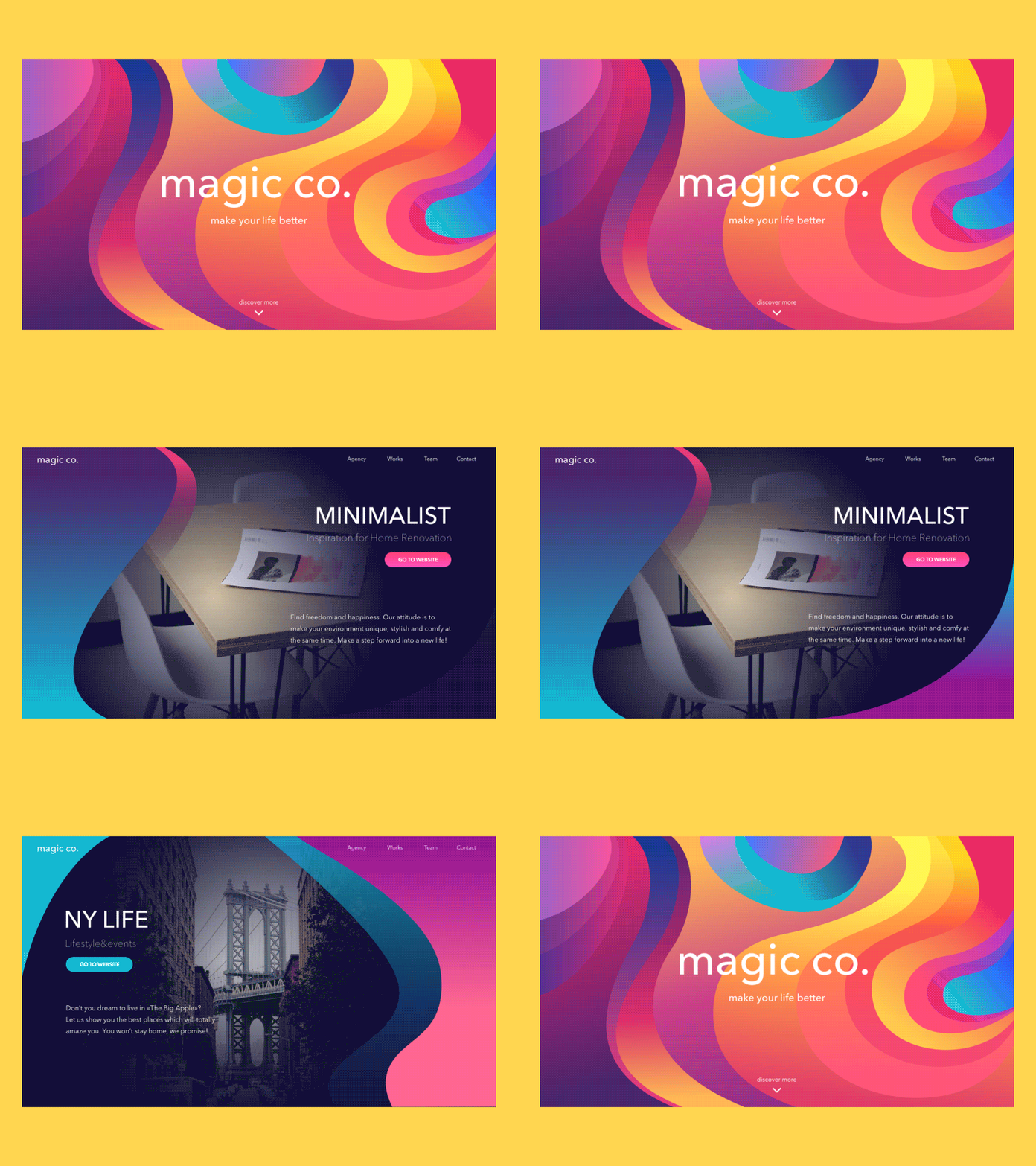


For a long time, designers have been used to the grids, but that has all changed. Or I would rather say, grids just got interesting!
As important as the grid is, it can also be restrictive and rigid, limiting creative options for designers. In an attempt to create digital experiences that break from tradition, UI designers have experimented with layout by ‘breaking the grid’. And it is now a trend!
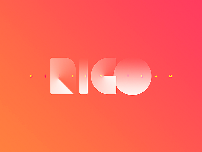

Whimsical illustrations!
Illustrations offer a sense of personality and character, which can otherwise be hard to achieve with traditional photography. It’s more personal and handcrafted. Illustrations are so trendy because designers get more control over the themes.
Also illustrations are quite versatile — line-based illustrations to rough-and-ready hand illustrations. They mingle perfectly with a sophisticated look or a fun & playful interface.
Few of my favourite websites with illustrations are —
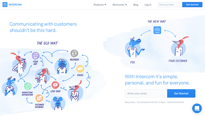
2. Dropbox

Shapes! Just shapes
I recently saw a revamp of Zendesk. All they have used in the revamp are different shapes. And it is truly a treat to see how the complete product is explained and weaved around just shapes!
Did I miss out some amazing UI trend of 2016? I might have.. There were soooooo many amazing trends. Do let me know in the comments section

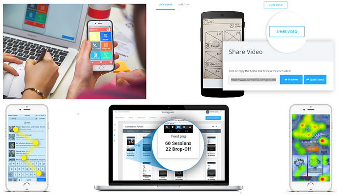
User testing is no more a fancy exercise the product manager demands for. It’s a given today. Nobody uses terms such as “intuitive designs”, designers today prove their work with user testing data. And the best part of this evolution is that user testing today isn’t expensive and time consuming.
With tools such as CanvasFlip (I don’t mean to be biased 🙆🏻 ) designers can validate their designs right from the start of the design project. Designers today spend lesser time arguing what the users will like, they just roll out the prototype to test with real users.

The biggest trend right now in UX world is the craze over chatbots and artificial intelligence. While bots are not a new thing, but companies are adopting to it in new and innovative ways. Clubbing it with artificial intelligence has shown tremendous potential.
Today everybody is building a chatbot, if you do not have it as of now, you are surely planning to build one in the near future. From pizza delivery websites to retail banking websites, everybody is obsessed with bots.
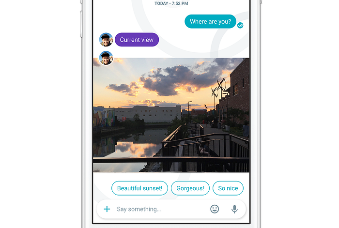
Bots have been around for a long time but the reason they are trending now is because of the advancement of artificial intelligence. Take Google Allo app for example.. This instant messaging app launched in late September this year is the best example of the combination.

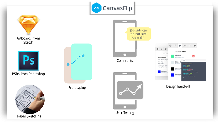
2016 saw some amazing tools to automate the workflow of designers and developers (Refer to this list). Remember the flow 5 years back? Numerous round revisions, lots of arguments and discussion.
CanvasFlip has been progressing on same lines. From designing to prototyping to user testing to design hand-off and collaboration throughout the project. Using the same tool from start to end, makes the workflow pain-free, seamless and time saving.

In 2016 the UX trend was mobile and it will continue to be that in 2017. “Most of the desktop websites will look like an app. This is something that Google search engine, already began this year by removing their ads from the right menu — and the industry follows. It’s important because any brand wants its users to use the same interface without the need to learn a new one each time they use a different device.” — Noam Alloush, founder of SITE123.


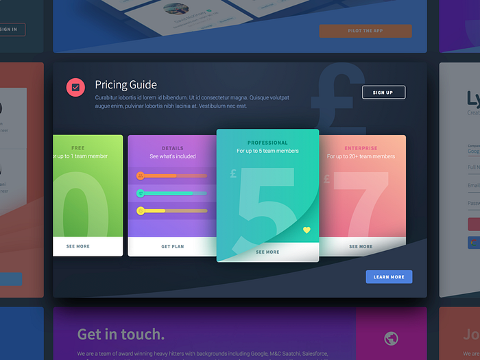
Cards, scrolling and parallax, aren’t a new breakthrough trend, but they’re a functional UI which have consistently gained prominence in web design in 2016. And hopefully it will continue to do the same in the upcoming year.
2016 also displayed a good adoption rate of the flipping card UX (tinder like UX). A lot of designers were against the adoption as it curbed the innovations. But the fact still remains that it was successful..

That’s a compendium of all important design happenings in 2016! Hope you had an amazing Christmas and wish you a wonderful new year ahead! :)
Hey buddy! Wouldn’t you share with your followers what you just read?


