
A Guide to Color and Conversion Rates
by Nick Babich
Color is one of the most powerful tools in the designer’s toolkit. It should be no surprise that different colors evoke different emotions and draw users attention. But if you ever tried to design a new project, you know how difficult is to decide on a color scheme that works well for it. To get you started, I’ve compiled a quick reference guide that covers the basics colors theory and how they relate to UX design.
Color Theory
Color theory actually covers a number of things, but at the very basic level it’s the interaction of colors in a design through complementation, contrast and vibrancy:
- Complementation refers to the way we see colors in terms of their relationships with other colors. There are two common uses of complementation: the triadic and compound color scheme that we’ll discuss below.
- Contrast reduces eyestrain and focuses user attention by clearly dividing elements on a screen. A high contrast between elements makes text easily readable, and guides your reader’s attention.
- Vibrancy is an emotional implications of color. This topic was fully covered in article Create Emotion With Color In UX Design.
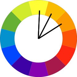
Color Wheel
A color wheel or color circle is an illustrative organization of color hues around a circle. Every shade of color has a set opposite and you can use the color wheel to find each specific color’s opposite.

This color wheel also shows the primary colors, secondary colors, and the tertiary colors. Primary colors (red, yellow, and blue) can be mixed to create secondary colors (orange, green, and purple). White can be added to a color to create tints, and black can be added to create shades.
Create an Effective Color Scheme
Here are 3 of the commonly accepted structures for a good color scheme: triadic, compound, and analogous:
Triadic. The triadic is the most basic and balanced of the three structures. It composed of 3 colors on separate ends of the color spectrum. There is a very easy way to create a triadic color scheme: take a color wheel, choose your base color and draw an equilateral triangle from this point. The three points of the triangle will form your tri-color scheme.

By using an equilateral triangle, you can ensure the colors have equal vibrancy and compliment each other properly.
Compound. Colors that are opposite each other on the wheel are complementary. They contrast strongly, and they can be used to attract the viewer’s attention.

For example, red’s complement is green. Take a look at the missed call notification example in Apple iOS. The complementary color scheme immediately focus user attention on important event.

Analogous. Colors that are next to each other in the wheel are analogous. They can be used to create a sense of harmony and continuity in a design. An analogous color scheme is based on a careful selection of colors in the same area of the color spectrum.
A gesture-driven task manager app Clear use analogous colors to visually prioritize important tasks and highlight the most critical ones (the topmost items will be the boldest in color, while items lower on the list will be lighter and more subtle).

The best way to learn to create beautiful color schemes is to practice. You can use automated tools to do this at first. A tool developed by Adobe, Color CC is aimed at providing an intuitive way to create a color palette. Tool has a very intuitive interface, so every color on the palette can be individually modified and a final palette can be saved with a few simple clicks.

Colors In Text
When you’re using colors in text, be aware that placing two colors with low value contrast next to each other can make your copy very difficult to read (no matter whether they are complementary or analogous colors). This is especially true on mobile screens, where users are more likely to be outdoors and have glare on a screen.
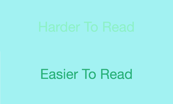
WC3’s Web Content Accessibility Guidelines are a good place to start. They set minimum standards for contrast so that users with moderately low vision can read your text. According to the WC3, the contrast ratio between a color and its background ranges from 1–21 based on its luminance, or intensity of light emitted. The W3C recommends the following contrast ratios for body text and image text:
- Small text should have a contrast ratio of at least 4.5:1 against its background.
- Large text (at 14 pt bold/18 pt regular and up) should have a contrast ratio of at least 3:1 against its background.

Once you’ve made your color choice, it’s absolutely necessary to test it out with real users on most devices. If any of the test show a problem with reading your copy, then you can be sure that your users’ll have exactly the same problem.
The Impact of Color on Conversion Rates
Color theory in UI design is more than just a visual decoration, it can have game-changing effects on a conversion rate. Let’s take an element that has a direct connection with conversion—call to action button. A call-to-action button is a collection of 4 things: placement, shape, copy and color. If these 4 aspects are in line with each other, you’ll have a great call-to-action button. Button color is one of the longest standing debates in the world of conversion and optimization. There are plenty of A/B test results that show how a change in the color of a CTA button made a drastic impact on signups. For example, HubSpot shared a famous button color test:

Even though they originally predicted the green button would perform better, the red button resulted in 21% more clicks.
However, it’s impossible to generalize these results to all situations. There is simply no a magical color that guarantees great conversion for all possible situations. However, you one aspect of your color can increase chances for good conversion—color contrast.
If you want users to click something, make it stand out.
If your site or app uses a lot of blue, users probably won’t notice a blue button right away, just like a light button won’t stand out against a light background. Users much more likely to click a CTA button that strongly contrasted with the background.

Conclusion
What we’ve just discussed are just the fundamentals of how color theory can enhance your UI design, but no matter what colors you choose, always remember to test your design decisions.
Thank you!
Originally published at babich.biz

