A guide to making Returning Users feel at home
and the 3 things you should know before designing for them.

When you’re designing for infrequent e-commerce experiences (like health insurance), you often wish your users weren’t coming back to the funnel. Ideally, all our users would convert the first time they come to our site but since life isn’t a Disney movie, it can often take a few site-visits to make a big decision. As a product designer, it’s my job to problem-solve while putting the needs of the user and business at the forefront.
Many “traditional” e-commerce experiences like Etsy, Shopify, Sephora, or Nike rely on making their experience sticky so users keep coming back and in return continue to spend their dollars to make purchases. In contrast, products that are considered infrequent (or overwhelming) purchases like insurance, eye-wear, mattresses, and the likes aim to disrupt that cycle.
It’s important to avoid creating large dichotomies between the two user segments in order to have a cohesive experience. Mixpanel states that for a “business to be successful, both new and returning users are needed.” For many companies, the stickiness of a user can help them generate more sales, while for companies that sell infrequent products it can create positive reviews and recommendations to other users. In both ways, returning users are important.
First and foremost, try to walk a few miles in these users’ shoes, understand their motivations, and their intent. What are the key differences between a new visitor and a returning visitor?
For new visitors, it’s valuable to acknowledge that unless the company you work for is trading very low-value products — people usually don’t buy things the first time. The likelihood of new visitors still researching and comparing their options is very high — what we would call a “window shop” in the physically present shopping experience. Make no mistake, the first time the user visits your website is still a pivotal experience because a great user experience will hold their attention long enough for them to mentally “bookmark” your site. Although, hopefully, you’ll do one better and provide a “save” CTA so they can bookmark their options easily.
For products like health insurance, when a user comes back to the flow it is an ideal time to engage with the user by guiding them. If they did not buy healthcare the first time they visited your site, how can you reassure them the second time around? What could you have missed? How can you help educate them better?
1. Rewarding user behavior 🎁
One of the big ways that designing for healthcare and insurance is different from consumer products like travel, beauty, wellness, or home goods, is that there is no obvious monetary way of incentivizing users. There are no ways to add promo codes, free shipping, points schemes, sign-up bonuses, or referral programs. However, motivating returning users to stick with you is an integral part of the user experience, especially when you cannot offer freebies. Knowing why the user might have dropped off your funnel in their previous visits can be a hint of what you can do differently when they give you another chance.
Building virtual relationships: A good digital window shopping experience will show the user a small sample variety of what the product offers while always giving them the option to talk to an agent (or salesperson, team member, store associate, etc). This allows the user to engage with a real person if they have any questions or concerns along the way. You could go one step further and cater to inquisitive users by showcasing featured articles that educate users or user testimonials that further encourage users to continue using the product.
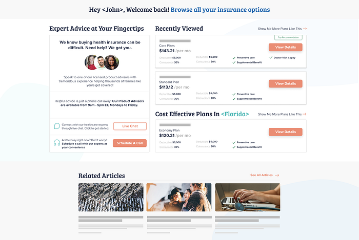
Return & Recall:
While discussing the shopping experience of Real Estate, Sahil Sapra stated “they should always feel connected with your website and don’t have to start their search from scratch” — this thinking can be applied to most e-commerce user experiences. Using terminology like “Hey <name>” or “Recently Viewed” “Recommended for people in <users state>” can act as subtle reminders to the user that you empathize with their needs. While new users might appreciate entry points like “start here” or “most popular”, returning users are more knowledgeable about your website and want to be appreciated.
Create familiarity with your user by remembering who they are and letting them know that you do.
2. Designing for performance 💯
A key aspect of thoughtful design is cultivating deep empathy for the users. This means having an interface architecture that focuses on all aspects of user touchpoints on and off the screen.
Bounce rate: A study by Google showed a decrease in searches by users who experienced delays in sites, proving that users come back to faster sites. The impact of a poor experience like this can lead to losing returning users. While the user might not remember your exact URL or value prop, they will instinctively remember how it felt to browse at a slow pace which will prevent them from coming back, even if you’ve improved the speed of your experience.
Keywords Search: From a user standpoint, when they search for a specific word, they want to see it reflected on the site they end up on. If your user searches “lost job get insurance,” they want to see a landing page that clearly conveys their motivation. Take a quick look at how your users utilize keywords to land in your funnel. Showing the user your unique selling point is helpful but your main objective should be to solve the consumer's needs. Improving your keyword search metrics can also improve your website traffic which in return gives you more refined data to learn from.
3. Communication is key 🔑
Every user communicates differently which can frequently change based on their situation, returning users are more likely to take the leap and engage because they are often also higher intent users. Providing them with different ways to communicate (phone call, email, live chat, scheduling a call, social media links) is a good way to build transparency with them.
This allows them to “choose their own adventure.” For example, a user that is below 40 years old might opt for live chat whereas a 60+-year-old user might opt for a phone call. On our Growth team at Healthcare.com, we call this our “call me maybe” experience and constantly find ways to better understand our data.
PR Newswire found that texting or live chat is the most preferred way of communication by users and scores a higher satisfaction rate. If you cannot appoint a team of people to talk to users, opting for the bots in your flow can be a good alternative. Sorting out user-disputes over live chat is also a good way to avoid public disputes over social media which can impact user reviews.
When starting on the journey of learning how to design for returning users, I started by first understanding the psychology of ‘how to make your website sticky and memorable.’ In doing so, I was able to unlearn the expected patterns for traditional e-commerce purchases and develop user strategies and hypotheses based on new learnings and data. By having all the information and knowing the different outcomes, we were able to make educated guesses that help make our users feel more at home.
If you have designed for returning users on your team, what have been some of your biggest learnings? I would love to hear about them down below. 👇🏽


