A mobile app design journey- UI/UX Case study on Baby feed App
- The Intro

Last year we were blessed with a baby girl. Parenting an eight-month-old baby girl gave us a myriad of challenges, out of which choosing the appropriate diet for my little girl was the prime one. The first six months were easy-peasy as the baby relied only on Mother’s milk. Post the sixth month, we had to feed her with solids, which gave us the true test of choosing the right food with the right quantity at the right time, and top of everything not to annoy her taste buds with repeated menus
2.The Challenge
Always packed food comes to our mind, as the easiest option which professes to have all the nutrients and branded as the complete food, but we both are worried about health issues associated with the packed food and deprecated it. As we both grew up having homemade food, packed food was always a concern. We both didn’t have a healthy perception about packed food which heightened the worries. Now the only option left was to prepare homemade recipes for our baby. As it was our first baby we had to get a myriad of guidance from our family. We were incessantly in touch with her mother, elder sister, and other friends to get insights about the baby diet. Self-made recipes lead to worries about the precise quantity, quality and cooking method etc. After switching to homemade recipes we even noticed that the cost of homemade recipes is comparatively higher than packed food, which also takes much pain to prepare them. Water feeding was another matter of concern, We weren’t sure about the exact quantity of water and the frequency of water feed. All these hurdles made me think, “Are we the only parents who are going through this or all new parents face these challenges”? This inordinate curiosity was my catalyst to conduct detailed research to fathom out this problem and think about a handy solution for these issues
3. The Research
Primary Research: To understand the challenges in-depth, I started fastidiously observing my wife on how she is planning, preparing and feeding the baby. This exercise was a real eye-opener for me. I passively observed her feeding methods and literally eavesdropped into her baby feed-related conversations. I would say observing silently your target customer / Target user is the most effective mode of any primary research.
Now to strengthen my primary research, I surveyed new parents who have babies below 3 years . Close to 35 mothers responded to the survey and the results complimented my first research method of — passive observation. Also, the survey result facilitated me to get a 360-degree picture of this whole problem.
General Inferences
- Most of the parents reach out to their mother for getting guidance on baby feeding
- Most of them believed homemade food is healthier
- The biggest worry was finding tasty recipes which the babies would love and not get bored. Another concern was about the nutritional content of homemade food
- To add to my excitement, the survey result showed almost 80% of parents would love to use a Mobile App which can guide them on baby feeding.
Secondary Research: Carried out extensive study from the internet on the existing study and papers published on this topic. Insights derived fostered in framing the proposed solution.
After the research: I know it’s an instinct for a techie to build an app to solve any problem, which I believe is erroneous, because you can’t solve all conundrums with an app, to be frank even before any investigation on this problem, My mind was preset to build an app to solve this issue, but I wasn’t convinced on my decision, as I have noticed many vegetating apps in the apple & play store, as the target users didn’t bother to use them. But now this survey result revitalised the app idea, gave confidence to further work on this app, as this involves a behavioural change in the user, the app’s adoption will take ample time. Deterring wasn’t an option, so determined to take this baby step towards this change, because no problems get solved with a magic wand, it’s all about incessant recuperation through iterations, So I decided to start my iteration with a mini Baby Diet app which will guide Mothers to feed their babies healthy with homemade recipes. I kept the brand name simple — “Baby Feed” app
4. Empathy Map
I am a big fan of this simple tool, which gives impetus for a product designer/manager to completely understand the target user of the product, This exercise helped me to presume from the end user’s view and build the app to solve their predominant issues. The survey results facilitated me in filling the empathy map canvas
5. User Persona
Now to bring all my research and empathy map to life, I worked on prospective users who will use this Babyfeed app. I focused only on new mothers as my target user group. Studies assert that if you can think of seven different user personas who will use your app. The app is 90% complete. Here I will discuss two typical user personas. I gave the persona a legitimate name, designation, an attitude which in turn assists me, foresee how this person will use the “Baby Feed” app or what all these persons will wish from this app. Always tried to think of multi-faceted personas, to make the app comprehensive
6. UX Journey
After all the user analysis and market research, I started work on the Mobile App itself. I began with the UX journey of a user, the impetus I started with the UX journey is it gives me a portrait of the app. During UX journey mapping, focused mainly on the structure and navigation of the app. This exercise helped me in expediting the further steps of app building
7. Site Map
To add more clarity for the interaction between each page of the mobile app, I prepared a mobile site map. I feel a site map will engender more success in any app-building process
8. Feature listing and MVP
While further thinking through the app, a plethora of features and feature ideas were gushing to my mind, So I compiled a feature list of items under each of the main modules from Site Map. I started thinking out of the box and ended up having an extensive list of features, I just stayed calm and recorded down all these features.
Now the biggest challenge was to prioritise them and decide which all to go in the first launch or as part of the most viable product. ( MVP) . To do this, I again went back to the User itself, Deep dived into my research results and started to pick and choose the salient features which can be the genuine painkillers for any Mothers, parked all nice to have items ( Vitamins). Focused only on painkillers. Comparing features to “Painkillers” and “Vitamins” is an easy way to decide on MVP, special courtesy to Nir Eyal and his book “How to build habit-forming products, a must-read for all product enthusiastic folks out there. Find below my feature list and highlighted features for MVP
9. Rough Sketches
I believe in old school habits, prefer to start the foundation of an idea with a pencil, paper and eraser, and will make sure to use the eraser more than the pencil. With all the background study and research on my mind, sketched my ideas into a paper and always made sure to use the eraser more often to avoid superfluous elements in the sketch.
10. Wireframe
Wireframing is one of my fave parts in the entire product design, the couple of aspects which I used to do before getting into wire-frame is to study existing apps which are similar so that I don’t have to reinvent the wheel, then I spent plenty of time in my UX journey, sitemap and pencil sketches to build the wireframes correct. From the beginning of my career, I have been a big fan of the tool- Balsamiq which I extensively use for all my wireframing needs. I believe wireframes play a vital role in the success of the app because, as Steve Job mentioned, the design isn’t about the look, it’s about how it works.
11. Inspiration board
Before touching the final design tool, it’s time to inspire. Yes, and to get inspired there’s no other better application than “Pinterest”. It’s a one-stop-shop for all your idea inspiration. I Created board, followed other boards and filled my thoughts with ideas and colours. Referred to many boards on Pinterest related to babies, kids, how to, guidance etc.
12. The Design
Now it’s time to add colour and life to the app. After a great deal of exploration, I decided to go with the colour theme Yellow and white for the app. The colour yellow stands for “Freshness”, “Happiness” and is often associated with food and is highly used in children’s products. After the colour selection, substantial time was spent on the planning the user experience part of it, where each & every minute decision matters like font size, font type, button size, button placement, content placement etc. I will try to explain my section-wise design journey so that you can vicariously relish the design part
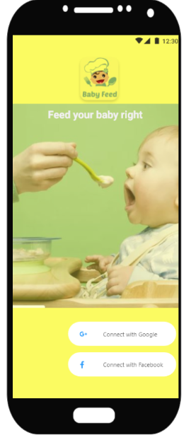
Login and Onboarding
I tried to keep the login page as simple as possible, emulating all the successful mobile apps. Here users can view the brand and get an idea of what the product does. Just kept Google and FB Sign-in for the nonce.
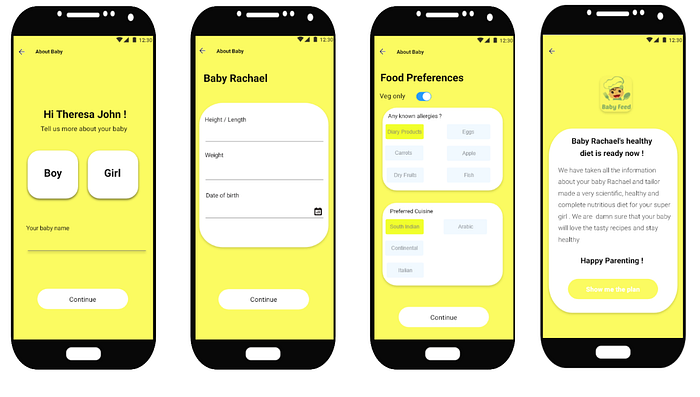
Onboarding is a one-time activity to familiarise the app with the baby and the baby’s food preference. Once onboarded will display a cheerful, positive note to the mother, which engenders confidence on the app
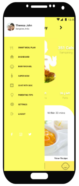
Dashboard and Live Feed
The dashboard will act as the landing page for the app, it will give mothers the latest status of their baby’s nutrition level. Every time it will show the calories intake and balance to be taken for the day, also users can navigate back to previous days from the top date navigation tool. The baby’s silhouette represents the food intake visually, ideally, by the end of the day, the silhouette should be filled to make sure the baby has complete nutrition for the day. It gets filled as the baby gets fed with the app’s guidance.
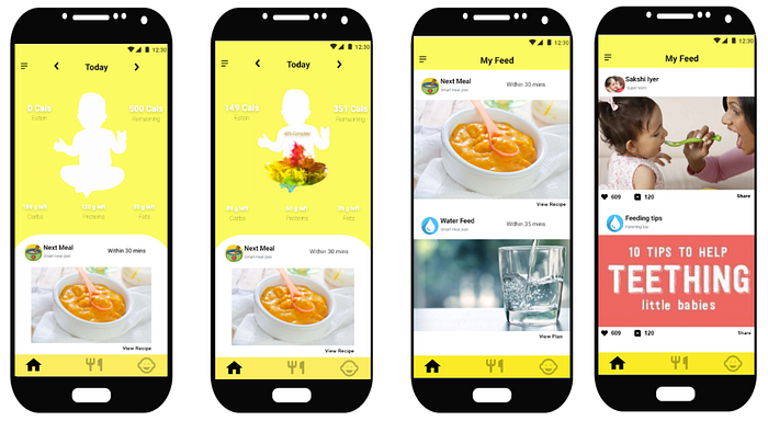
Live feed, inspired by the social media sites, makes it familiar to use and gives all the latest updates on the next meal, following water feed, etc. Also, the feed will contain posts from the “Supermom “ channel, a social media platform inside the app where mothers can post pics and share baby feeding-related content. The feed is a generic platform to update all related channels inside this app.
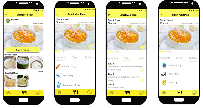
Smart meal plan
This is the primary functionality of the app, where mothers get guidance on the next meal and its recipe, it also shows details about upcoming meals and completed ones, On clicking the “next meal, complete step by step details of preparation is provided, along with the option to view the preparation video. The smart meal plan provides the nutritional content of the recipe as well
13. Usability testing
I would say this is the most salient step in the entire app crafting process, but unfortunately, the one executed in a perfunctory manner. In my case, I had my niche target audience at my home itself. Made my wife use the Adobe XD prototype and worked on all the first-hand feedback she provided. As most of the folks out there, even I lacked a substantial target audience and resources to carry out an extensive usability testing, it’s an open confession. But I strongly believe, only with extensive usability testing, any app/idea will be a success because at the end of the day we are not the consumers of the app. K testing your app and iterate it with all the feedback, that’s the only way to recuperate. I give my word before this app hits Google play store / App store, I will make sure the app goes through a minimum of ten rounds of usability testing with at least fifty mothers
14. Hook Model
This is a popular model, discussed in Nir Eyal’s book “How to build habit-forming products”. The author asserts that, if you want to build a habit-forming app, you need to contain a hook model in it. Baby Feed app was crafted keeping this “hook model” in mind

15. Mind Map
Few of my projects, I used to maintain a mind map. This tool made my life easy by capturing everything that came to my mind from the beginning of a project in a structured manner. I used it as a mind recorder and later as a checklist to make sure that I have consumed all my important ideas
16. My learning
Every app building process is a new experience with a myriad of learning and takeaways, I would like to share a few of my takeaways from this Baby Diet app journey
- Customer research and user persona is super important if the target audience is a niche
- To make a mother use the baby feeding app demands various behavioural changes. Any app which requires behavioural change involves an extensive study on human behaviour and concurrently the app should have engaging hooks
- Did extensive study and research on baby feeding patterns, food, brands, costs
- Adobe XD is super cool, learned the basics long way to go and explore the tool
- A mobile app isn’t a solution for all the problems in the world, try to build one wherever applicable, incessantly focus on usability testing and iteration
- Make sure your product is so simple that users already know that they have used it before. Apps which requires zero user training succeed than an app with user manuals
17. The Future
- Run the prototype through more extensive usability testing, incorporating all the relevant feedback
- Build the basic MVP app, Conduct usability testing with the target audience
- Improve the UX journey through testing
- With the usage, add more hook features Like- Chat, Supermom leaderboard, Voice assistance, AR
- Deep research on UX and CX
- Think of a comprehensive business model
18. Tools used
- Survey — Google Forms
- Word Processing — Google Doc
- User journey / UI Flow / MVP- Feature listing — Draw.io
- Wireframe — Balsamiq
- User Persona — xtensio.com
- Design — Adobe XD
- Mind map — Freemind
Thanks for reading! Special thanks to my dear wife, family and friends who supported me while working on this case study

