A Primer to Web Accessibility for Designers
Quick wins to make your designs more inclusive

What is Accessibility?
When was the last time you visited a website and got frustrated because you had trouble using it? Maybe the site was using Web GL technology that your browser didn’t support, you couldn’t read it’s text due to it being so small, or the mobile experience simply wouldn’t load on your iPhone. If you think back to these annoying experiences where you functionally could not navigate a site, chances are you’ve experienced inaccessibility in one form or another.

This is not to say that all frustrating experiences are inaccessible, but there are definitely overlaps between bad UX and inaccessibility. An easy way to think of this is that a bad experience for the general public is usually much worse for a disabled or impaired individual.
If you find yourself squinting to read small text on a site, for example, chances are a visually impaired person wouldn’t be able to read it at all. If you make this small text size larger, you’d be improving the experience and accessibility for all users. This ease of use, specifically considering impaired or disabled individuals, is the foundation for creating accessible designs.
Accessible design is how easily people can use your website. Specifically, it focuses on people that have disabilities that impede their vision, hearing, and movement. As designers, we should strive to create inclusive websites that are easy to navigate and easy to understand for everyone.
Why you should care
It’s easy to think of accessibility as a ‘nice to have’ when designing, but this is counterproductive to creating a site with great UX. Having it top of mind while designing will improve the UX of your site for not only disabled individuals but for the general public as well. It will also save potential headaches in the future from lawsuits and angry customers. (Just ask Target)
The Guidelines
To address the concern for accessible website design, the World Wide Web Consortium developed a series of accessibility standards. This document, known as the Web Content Accessibility Guidelines, (WCAG) breaks down accessibility into 4 main principles. To understand these principles, ask yourself a series of questions when designing:
- Perceivable: Can I consume content on my site in different ways? (Having closed captions for a video, for example)
- Operable: Can the site function without confusion and without the use of a mouse or complex interactions?
- Understandable: Can a user understand how the user interface of the site functions and the information on the site?
- Robust: Can different assistive devices (screen readers, for example) understand the website?

Each of these different principles have a success rating of either A, AA, or AAA. An A rating is the minimum requirement for having an accessible site and AAA is the gold standard of accessibility.
Although it can be intimidating, it is much easier to start designing accessible sites than you may think. Below are a few actionable changes that you can make today to start enhancing the accessibility of your designs.
Typography
Hierarchy
Type hierarchy for your site is very important — it allows people the opportunity to parse through information fast. Accessible sites are no different. When designing a page, you should start with an <h1> and each subsequent type style should nest below the <h1>. Also, each nested section of your site should start with a consistent type style (typically an <h2>).
It is not only important that the typography of your site is visually and functionally correct but the copy should also be descriptive. This is good practice for SEO and it also improves the experience for people who have difficulty remembering or have visual impairments.
Visual Presentation of Text
Ever look at a large block of text and avoid reading it at all costs? This is because large blocks of text are difficult to read, hard to remain focused on, and tiring to consume.
Text blocks with narrow widths are easier to read for all people, especially those with reading or vision impairments. Because of this, the WCAG recommends keeping a line of text’s character count below 80 characters. (For reference, Medium has approximately an 80 character count line width on desktop size.)
A few other considerations that the WCAG notes are that you should avoid using justified text and users should be able to zoom into your site 200% without having to scroll horizontally.
Color Contrast
The color contrast between a text’s foreground color and background color can have dramatic repercussions on the legibility of your site. The WCAG states that your text should have at least a 4:5:1 contrast ratio to achieve an AA rating and a 7:1 contrast ratio to achieve an AAA rating.

If you have no idea what these numbers mean, that’s perfectly ok. Luckily, there are some great Sketch Plugins and Chrome Extensions that can help you test the contrast ratio of your text and tell you if your designs have failed or passed.
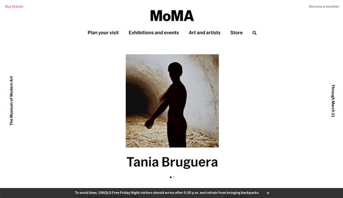
It’s also important to give the user the ability to adjust the background and foreground color of text. MOMA’s site does a great job giving users the ability to change the default and high-contrast text by clicking a link in the footer.
Assets
Alt text & ARIA Labels
It’s easy to throw a one-word description alt-text on an image and call it a day but this is not best practice for creating accessible sites. You should be able to visualize an image through the use of alt-texts. This is because visually impaired individuals rely on screen readers to dictate the alt text of images to them.
Pause the next time you consider leaving your alt-text as ‘screenshot-12.2.17’ and take some time to pull out important information from the image. Google gives a great example of good and bad alt-text scenarios here.
Additionally, ARIA Labels (Accessible Rich Internet Applications) should indicate ‘landmarks’ on your site such as navigation, forms, or sections. This makes it easier for screen readers to parse through information and can also define if extraneous information should hide for screen readers.
Although alt-text and ARIA labels can be sometimes thought of as development responsibilities, it’s important to keep them in mind as you design and work with developers to get them correct.
Avoid Text as Images

You should avoid creating images with text at all costs. Instead, you should use live text to position text elements on images and use CSS to style it. It is also important to keep this in mind for text elements that can be decorative graphics like quote marks for pull quotes.
Content
Write as simple as possible
Copywriting is fundamental to the user experience of sites. Although designers are not always responsible for it, we should work with copywriters when possible to help create a better end product.
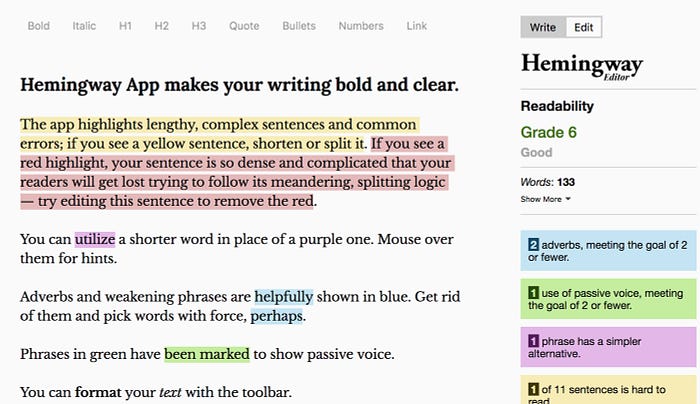
When thinking of copywriting through the lens of accessibility, you should avoid using jargon and unusual words as much as possible. You should especially not try to ‘write smart’ by using complicated words. The WCAG explicitly states that you should aim to write at a ‘lower secondary education level.’ To achieve this, I usually use tools like the Hemingway App to determine the reading level of my writing. This tool also provides recommendations to simplify your writing as much as possible.
UI Elements
Consistent Navigation and UI Elements

It’s always bad when users have to guess to figure out how to navigate your site. In short, accessible design (and good design in general) is predictable. There should be no guessing to how elements behave or how the UI will look like on different pages. Navigational elements should appear in the same order and place on your site and functional elements should behave the same from page to page.
Design Clear Focus States
Some people cannot use a mouse to navigate your site. Instead, individuals with limited movement navigate sites by tabbing on the keyboard. This is why focus states are important. They allow users to determine where they are on a page without guessing and without the use of a mouse or trackpad. Input fields, buttons, and other interactive elements on your site should have clearly defined focus states.
Design Helpful Error States
Error states should not only be clearly designed, but there should also be contextual information that informs a user what went wrong and how they can fix the error state. The WCAG states that any way to prevent user error through reversible submissions and a confirmation screen is a best practice when submitting information through a form.
Interactions
Avoid Flashing UI Animations
To prevent triggering seizures for people who are susceptible, you should avoid creating UI animations that flash 3 or more times a second. It may be best to avoid flashing animations altogether when possible.
Simple Gestures
Content shouldn’t hide behind intricate gestures or interactions. People with limited movement should be able to access all content on your site.
Conclusion
Accessibility is a team effort between designers, developers, copywriters, and content creators. To create an accessible end product, everyone must work together and create with these guidelines in mind.
Creating accessible sites can be intimidating, yet adhering to these constraints creates better sites for all users. This is only a few of the many ways that you can start creating accessible designs but for more information about web accessibility, check out the WCAG documents, WUHCAG’s checklist, and Automattic’s inclusivity checklist
Nicholas Kramer is a designer currently working at Barrel in New York City. He solves design problems for businesses by helping them simplify ideas and communicate their value to customers.

