A Step-by-Step Guide To Using Design Tokens in InVision DSM

One of the most frustrating experiences for designers and developers is how much time is spent keeping code in sync with current designs. InVision Design System Manager (DSM) tries to solve this problem by putting the power of design tokens in the hands of designers and developers. Design tokens act as variables that store your styles so that your colour, text, and other style attributes will always be up-to-date. To put DSM’s design tokens to the test, Martin (developer) and I (designer) designed and built two prototype web apps of our favourite to-do list framework, One Big Thing.
One Big Thing aka ‘1–3–5’
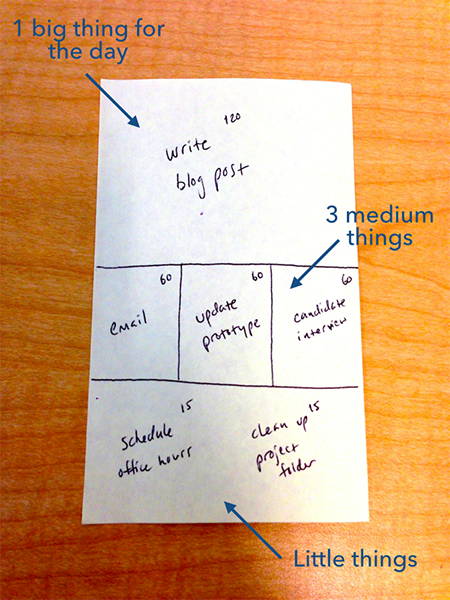
In case you’re wondering why this to-do list looks funny, it’s because we modelled it after a framework called One Big Thing, aka ‘1–3–5’. If that name sounds familiar it’s probably because you follow the authors of ‘Sprint’ or ‘Make Time’. One of them invented it. In this to-do framework, a piece of paper is divided into three sections. The first section should contain your largest and most important to-do item, or your ‘big thing’. The second section is further divided into three boxes which contain your three medium things. Finally, the last section is for your small things (5 is recommended but I often do more).
The Prototype
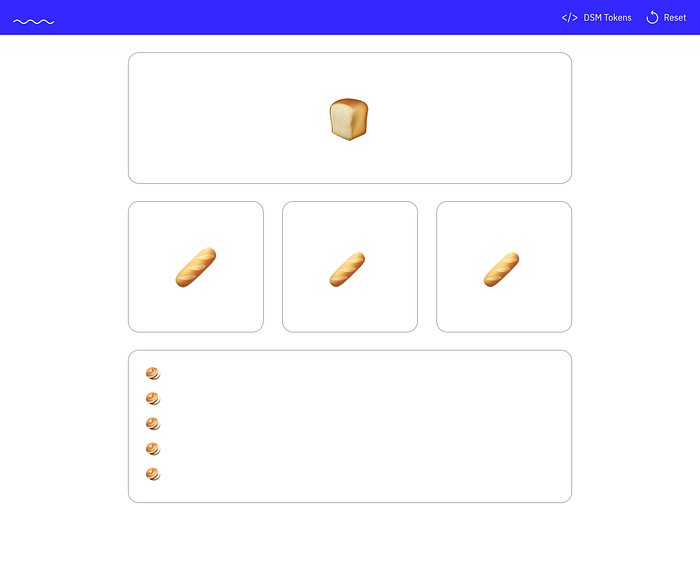
Here’s a working version of our simple prototype that you can follow along with. We actually ended up building two prototypes. The one we’re discussing here, and another more advanced prototype that includes the use of an enterprise-level component library (Alibaba’s ANT design component library for Vue, for those interested). Both designs are similar and look something like this.
Look At Our App, Now Back At Me, Now Back At Our App
Want to see something cool? This to-do list application uses 7 design tokens to define all of the colours in the application. Once a colour is changed for any of those tokens in DSM the moment I refresh the page the change will be reflected LIVE. IN. THE. BROWSER. That means no hand-off. No hunting down individual hex codes. No begging developers to change the shade of blue on a button. A designer can make a change, push that change to DSM, and it will be reflected live in the browser. Check it out below 👇
So What Even is a Design Token?
Design tokens are the visual design atoms of the design system — specifically, design tokens are named entities that store visual design attributes. They are used in place of hard-coded values, such as hex values for colour or pixel values for spacing, in order to maintain a scalable and consistent visual system for development. Imagine a world where you can change a colour in a sketch file, and then all a developer needs to do is sync the changes made to that file. This is especially great for designers who don’t code or don’t use a git/github workflow making it easier to sync up on changes.

Design tokens are versatile and can be used for any number of things including:
- Colour Palettes (DSM supported)
- Font Families (DSM supported)
- Icons (DSM supported)
- Borders
- Breakpoints
- Z-index
- Sizes
- Spacing
Here are some examples of where we’re using them:

The Tools You’ll Need
Here’s what you’ll need to get started building an app like we did:
- VueJS (or your front-end framework of choice)
- Craft by InVision
- InVision Design System Manager
DSM Need to Know
To use DSM, just download Craft and send your developer this API link. You can read everything else there is to know about DSM on the website.
Here’s some important things to know before you start using DSM:
The Sample Library 📚
- If you have an InVision account then you have access to DSM. It comes with a sample library that you can browse through on the web and in Craft. Additionally, you can download the source Sketch file and see how they set things up. This is your best friend when it comes to learning the ins and outs of DSM.
DSM’s Design Tokens 🌈
- Right now DSM only supports colours, text styles, and icons.
DSM API 👾
- This resource is the only documentation out there for DSM’s API. It’s important to know that you can use your design tokens without it, but this just adds a little automation to the process if you want to be fancy.
A Step-by-Step Guide to Setting Up Your Design Tokens in DSM
1. Login to the InVision web app. Navigate to DSM. Click the ‘New Library’ button.
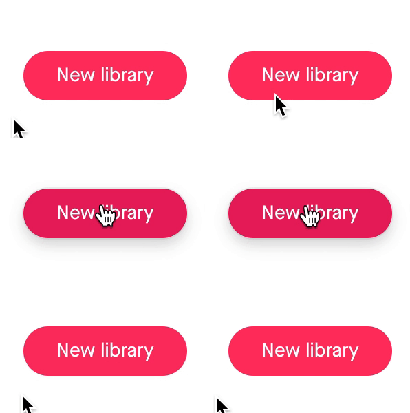
2. Fill out the New Library Form and click ‘Create’

3. Click the DSM icon in Sketch with your file open.

4. Click ‘View’ in the new library snackbar OR click the dropdown in the top left to manually sync your new library.

5. Select the objects in Sketch that contains the colour(s) you want to add to your library and click the ‘+’ icon in the bottom right corner of the ‘Colours’ folder in the DSM overlay. Then confirm your selection from the ‘colours from selected layers’.

6. Click on the ‘Untitled Color’ label under each colour swatch and rename your colours to whatever you want your token names to be.

7. Next, open your ‘text styles’ folder on the DSM overlay and click the ‘+’ icon in the bottom right of the DSM overlay to select the text styles you want to add to DSM.

8. Optional: Rename your text styles by clicking the label underneath each card. Text styles inherit their names from Sketch by default.
9. Open the web view of your DSM library

10. Click the ‘</>’ icon in the top app bar and select ‘Design Tokens’ in the dropdown.
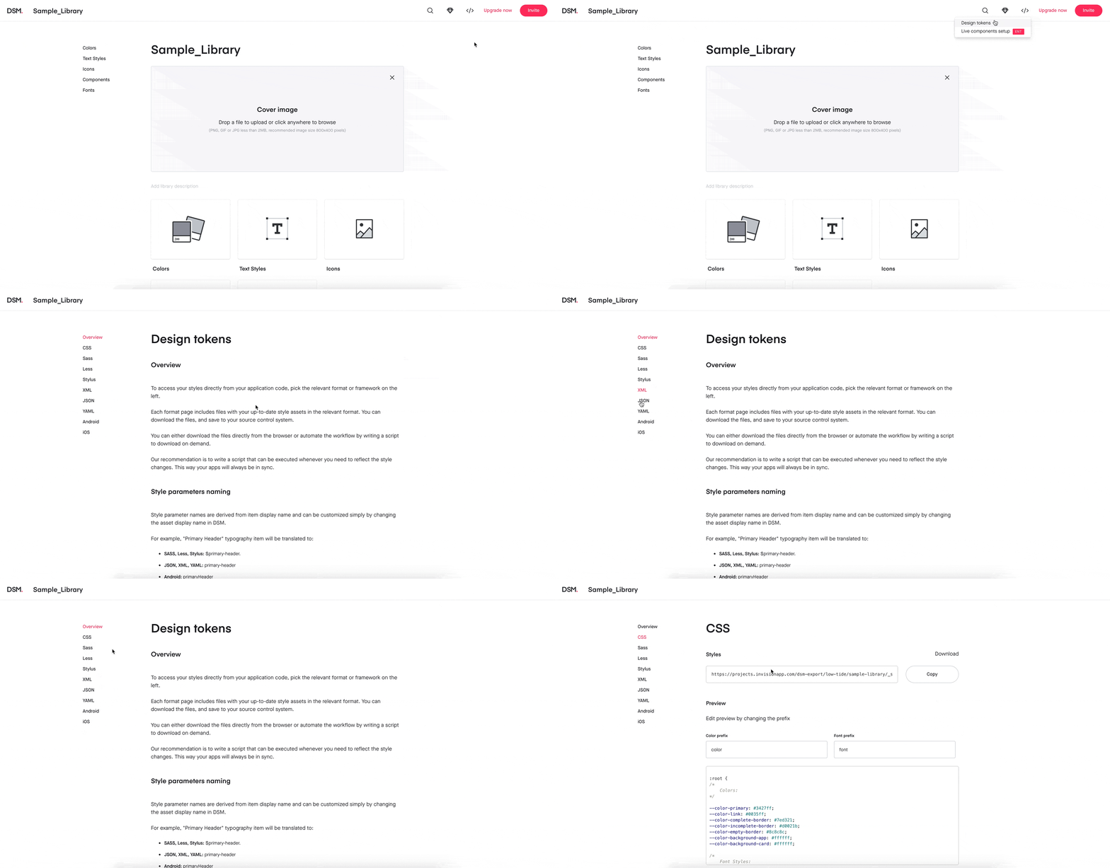
11. Select your preferred format for ingesting your design tokens on the left.
12. Either click the ‘download’ button to download a file containing your design tokens and their style values or copy the ‘Styles’ link and send them to your developer. Alternatively, from the primary web view click the ‘invite’ button and follow on-screen instructions to invite your developer to your library and they can complete steps 16–18 by themselves.
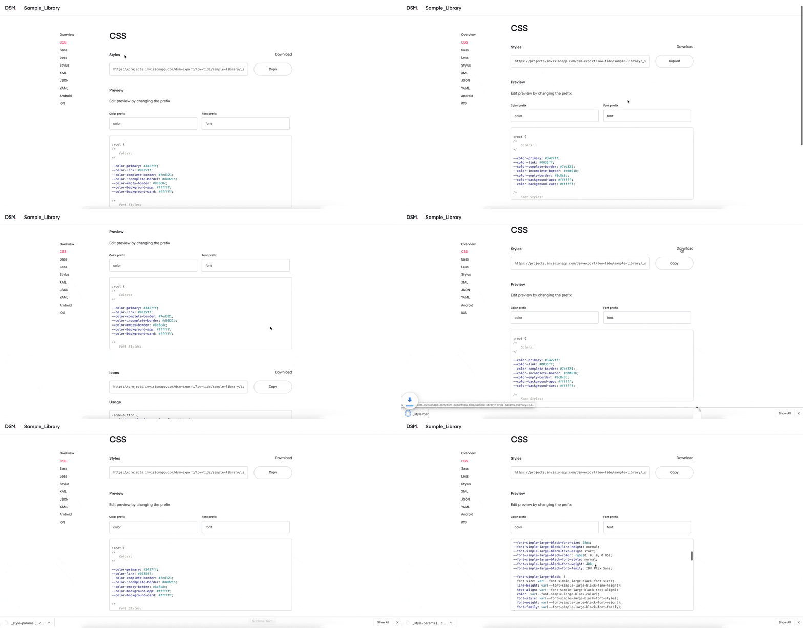
The Tokens Are IN The Computer?
Thinking in terms of design tokens can help inform front-end development, especially in relation to component structure and CSS. If design tokens are the individual atoms of our application, components are our molecules. We’ll mix and match design tokens to create reusable components — which we’ll piece together to create a scalable user interface. Here’s a link to the source code for this live demo.
In our case, our design tokens mapped to ten front-end variables:
- -color-background-app
- -base-font-size
- -base-font-color
- -header-font-size
- -header-font-color
- -color-background-app
- -color-background-card
- -color-empty-border
- -color-incomplete-border
- -color-complete-border
Now, we add a tag to pull in the CSS file that DSM auto-generates (and hosts) for us, and in the case of a modern JavaScript app, we add the tag to our index.html:
html
<link rel=”stylesheet” href=” [https://projects.invisionapp.com/dsm-export/low-tide/low-tide/_style-params.css?key=B1nQrj-AN](https://projects.invisionapp.com/dsm-export/low-tide/low-tide/_style-params.css?key=B1nQrj-AN) “>
If you visit that URL directly, you’ll see that DSM’s stylesheet simply sets CSS variables on the :root of our application — it’s up to us to consume those variables.
Three of our variables map 1:1 to design tokens returned to us by DSM. Let’s wire those up first in our top-level App component:
css
:root {
 — header-font-size: var( — font-header-font-size);
 — header-font-color: var( — font-header-color);
 background-color: var( — color-background-app);
}
Not quite as simple are our --base-font-size and --base-font-color variables. Our design tokens are set up to return three font sizes - small, medium, and large, with each font size mapping to a viewport size (desktop, tablet, and mobile, respectively). We'll be setting our variables dynamically, using media queries to switch which DSM variable we assign to our in-app CSS variable:
css
/* App.vue */
:root {
 …
 — base-font-size: var( — font-small-font-size);
 — base-font-color: var( — font-small-color);
}@media only screen and (min-width: 600px) {
 :root {
 — base-font-size: var( — font-medium-font-size);
 — base-font-color: var( — font-medium-color);
 }
}@media only screen and (min-width: 932px) {
 :root {
 — base-font-size: var( — font-large-font-size);
 — base-font-color: var( — font-large-color);
 }
}
Now, in our components, we can simply assign styles using the CSS variables above, the values of which will update according to the size of our user’s viewport. We can also tap into the remaining DSM variables we aren’t yet using, like --color-background-card or --color-empty-border. Here's an example, in TodoItem.vue:
css
.todo-card {
 font-size: var( — base-font-size);
 color: var( — base-font-color);
 border: solid 1px var( — color-empty-border);
 min-height: var( — base-height);
 background-color: var( — color-background-card);
 …
}
A word to the wise — before jumping into code, make sure you’ve thought about the structure and nomenclature of your design tokens. Naming conventions matter — you’ll save time and energy by defining your design tokens (and their names) early on. Ask yourself: are your design tokens clearly-defined atoms or bloated molecules? Will you be able to reuse them across various components? Draw out a visual hierarchy showing the progression of grouping individual design tokens into components, then into full-featured user interfaces.
Conclusion
Design tokens work, they’re damn cool, and they solve a big problem. Using DSM’s Design Tokens in a relatively simple product development environment works really well. Using DSM’s Design Tokens with a pre-existing component library is also cool but a lot more work, as you’ll have to tailor your tokens (and naming conventions) to the component library, so if you’re trying to be efficient, DSM might not play nicely with your component library right away, and this might add quite a bit of work (it did for us). That said, I would consider using DSM to manage styles using their Design Tokens with future collaborators on smaller projects.
At the end of the day, DSM did allow us to solve our original problem — the endless back-and-forth between designer and developer to update our code every time a design token changes. This affords designers the same flexibility that a developer has in a “dev” environment., allowing for quick, easy exploration of design token updates, and the ability to roll those out without any code changes or expensive deployments. Regardless of whether or not you’re using design systems in your current design process, design tokens are awesome and I would encourage you to try them out on one of your future projects.
About the Authors
Ryan Neufeld is a Product Designer that loves to explore the human experience. He fell in love with User Experience (UX) design in graduate school at the University of Waterloo. Today he leads, manages, and builds design teams that tackle big challenges, like design systems, and develops delightful solutions.
Martin Laws is a UX developer, consultant, teacher, stand-up comedian, and most importantly my friend. I first met Martin over coffee at Starbucks when I was looking to hire a UX developer on my growing design team at Index Exchange. It was the start of a long and enduring friendship. Currently, he’s running his own consultancy called Low Tide Consulting and lives the dream with his dog Maya.
Resources
- My Sketch File —https://drive.google.com/file/d/1Hq7OQ18EQremtXgSILJAz78TfhPvUV0p/view?usp=sharing
- Prototype — https://dsm-todos.netlify.com
- GitHub Repo — https://github.com/consultlowtide/dsm-todos
- DSM Web — https://consultlowtide.ca/dsm-todos-ant/
- ANT Design Vue (Component Library) — https://github.com/vueComponent/ant-design-vue/
- DSM Web Documentary — https://www.invisionapp.com/design-system-manager/expert-advice/
- Netlify — https://app.netlify.com/sites/dsm-todos/deploys


