
A UX Case Study on Swiggy genie
Here is the detailed case study of reducing the user flow of the most popular feature of swiggy which is swiggy genie.
As the pandemic made the whole world shut and food industry is the most affected one. The coronavirus spread throughout India, made the food industries to rethink their business models. The people stayed indoors and stopped following the traditional method of getting daily products/groceries from stores by making a list. Due to which the need for home delivery of products and services grew exponentially. Many food delivery apps tried to leverage this opportunity to open the doors of delivering the daily product and services using the same delivery infrastructure that they have been using for the delivery of food for the customers that scaled uphill due to this pandemic.
“A real businessman is who smells an opportunity in every crisis.”
Swiggy and Zomato have quickly started the feature of delivering the groceries and other essentials to the user at their doorstep. Swiggy has redefined it in a more classy way of introducing “Swiggy Genie” to help people in getting essentials picked up & dropped off without stepping outside.
We are a team of four who have worked on this project.
What is Swiggy Genie?
The idea of “Swiggy Genie” is to deliver anything at the doorstep of the user in the hyperlocal delivery space. They called it “Genie” because of the stories we heard from our childhood Genie is a wish-granting saviour.
The “Swiggy Genie” is classified, into two major categories:
- Pickup & Drop — Users can get anything transferred from point A to point B, without leaving their home.
- Buy from any store — Users can make a custom list of items that are delivered & purchased by a Swiggy delivery partner for them.
Sounds simple, what’s the problem?
The flow of “Swiggy Genie” is a bit complicated in understanding, When I and the team deep-dived into understanding what exactly “Swiggy Genie” does also we have seen some tutorials of how to use “Swiggy Genie” on youtube. At first, we were a bit embarrassed about why there are tutorials for using the “Swiggy Genie”! Is it that complex as if you are using “Adobe After Effects”? Then we have started questioning how complicated the flow is and how we can reduce the flow that makes it easier for the user to understand. As “Swiggy Genie” is new and has its challenges in understanding the process, unlike the food delivery one where the user can directly make an order from the catalogue.
Hence we took a challenge to simplify and reduce the user flow of the “Swiggy Genie” and making it easy, smooth, and fast for the checkout process.
Do check out the Behance Project that we made for the redesign of Swiggy genie.
( Now that you are on it, please give it a like 👍 )
Research Methods
The Survey
We prepared a survey with google forms and distributed them among multiple groups. The purpose behind this survey was to understand the user behaviour of using the online platforms in ordering the groceries and the pain points they have faced while making an order. Working on real-world data helps understand the user needs and also their behaviour.
We have put the questions in such a way where we can differentiate the user based on their behaviour and the style of living.

We have identified through our survey that
- 70% of the people make a rough list that gets updated and later order all items at once.
- The complicated process of using “Swiggy Genie” made it difficult for users to understand and can even frustrate him/her and may lead them to use other platforms like Dunzo, Big Basket, etc.
- Redundant and repetitive screens make the flow of both the categories a bit lengthy and complicated.
Problem Statement
After conducting a survey, We have identified that both the cases are pick & drop services at the core, the differentiating idea between the two of these cases are as follows :
- Pick & Drop service charges only Delivery cost & no other amount gets charged while on the other hand, Buy from any store option charges some extra amount other than the delivery charges.
- Pick & drop feature is for a single item while on the other hand, Buy from any store needs a proper list as it majorly consists of household items.
Competitive Analysis
That’s where we have identified the pain points of using the “Swiggy Genie”! The main competitor for Swiggy is Dunzo, which is also into a hyperlocal delivery service.
At first, we have made a simple user flow of Dunzo what exactly, The process they follow in providing the services to the user.

We have made a comparison matrix of what features both Dunzo and Swiggy provide.

Brainstorming
After defining the problem statement and doing the competitive analysis, we have asked
“How might we?”
- How might we reduce the number of screens in the current user flow?
- How might we optimize the current user flow?
- How might we combine the two prominent features of the “Swiggy Genie” so that the user can complete the task in just a few steps?

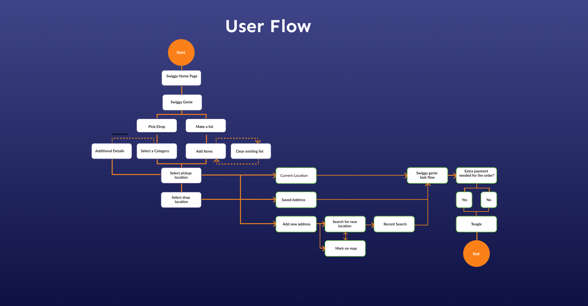
User flow
After discovering all the insights and collecting the pain points from the user research and user interview, we brainstormed to a conclusion to optimize the current user flow of the “Swiggy Genie”! We then focused on reducing the number of screens by combining the two categories provided by the “Swiggy Genie” into one which, altogether makes the process easier and lets the user complete the task in just a few steps.
Initial Sketches
After getting some insights from our survey and problem statement, we have started with the initial sketching where we have got some more insights into how we can change the look and feel of the application making it simple for the user to understand.

Final Designs
Here is the comparison of the proposed new screens with the existing screens.
Home Screen
- Existing Screen
The current screen consists of two different sections on the Swiggy Genie sub home screen. The actual process starts after clicking on either of the tasks.

- Proposed New Screen
The new Swiggy landing has been introduced. The new “Swiggy Genie” screen combines the two tasks into one hence making it easier for the user to get the tasks done in fewer steps. In this way, we combined the flow and made it into a single screen.
ALL AT ONE PLACE.
SIMPLE.
EASY.
Users can navigate to the different tasks within the home screen by using the toggle button at the centre.

Location Map Screen
- Existing Screens
In the previous “Swiggy Genie” flow, the user needs to go through several steps in selecting the address or the saved ones to proceed further, which is making it complicated and having the same repetitive process.

- Proposed New Screen
Tap on the added pickup/drop address button and then set a new location or select from a saved address without any hustle.
Let’s do it ultra-fast.
A two-step process:
- Either select from the saved or current address.
- Locate it on the map by just dragging the map to the desired location.

Task Manage
- Existing Screen
The two categories diverge right at the swiggy genie sub home screen and never converge though it has a lot of similar screens. Having separated flows makes it a complex and lengthy process to follow in getting any particular task done.

- Proposed New Screen
Converging them into a single screen and making the flow smooth to the user.
1. The sub-home “Swiggy Genie” space was optimized to give room to “make a list” option where the user can enter the custom items as they used to do it in the previous flow.
2. Adding the feature of making a draft of custom items so that they can update it as per their requirements just giving the sense of using the traditional method of writing down the products on a paper but now in a digital way.
3. And the pick and drop screen is also converged into the same screen where the user can choose the option for which he/she wants to set up a task. The pick and drop menu options are shown as soon the option gets activated where the user can select the task according to their requirements.
Below is the detailed task flow of each of the categories.


Checkout Screens
- Proposed New screen
A clean minimal final screen, which also takes care of whether the task needs extra payment like getting the important courier or just is it just a book that you forgot at your friend’s place!
Just as simple as that.

Conclusion
So that was the redesign we have done on swiggy genie. Hope you found it interesting and useful. Thanks to the team who have been the best all the time
Special mention to Harshit Daga, Pankhuri Verma, Ramya Verma the best team to work with and thanks to Akash Solanki for all the guidance and support.
Do clap 👏 if you like this case study and if you are a photography lover do check out my Instagram page.
You can give 50 claps 👏 on an article. Just hold the clap button for a few seconds and boom.
Thank You 😀
