Accessible Design: The 3 Most Critical Optimizations

What is accessible design?
As designers study accessible design they will likely find out, more accessible design is synonymous with better design. It’s natural to see how given the common definitions of accessible.
Accessible (adj.): (a) capable of being reached (b) easy to speak to or deal with
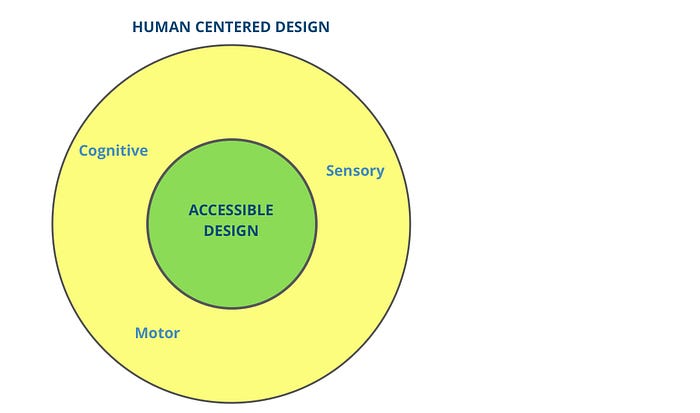
Accessible design practices are an inherently stronger subset of human centered design (HCD) practices. They can be thought of as HCD practices with a focus on the most common human challenges to access. As the saying goes, every challenge is an opportunity — accessible design practice is always an opportunity to make products and services better for everyone.

Yet in tech and innovation communities, common flash judgements of design quality are rarely based on accessibility. Many executives and key decision makers place disproportionate focus on esthetics and screen stickiness.
Why doesn’t accessibility gets its due attention and respect?
Why does the accessibility of a product always seem to be an after-thought associated with product features that don’t work? Perhaps because judging product accessibility can be tough; it requires multiple lenses and deep user empathy. Beyond this, non-designers may be slow to prioritize accessible design for several reasons:
- Accessible design has a tight association with serving disability communities. If these audiences aren’t a company’s primary user base, leadership may dismiss the value or find the benefits hard to relate to.
- The approach may seem daunting for broad application; each accessible design fix is catered to specific types of content and different user contexts.
- The term may sound too simple — or too obvious to inspire.
To overcome these challenges with selling accessible design practices, I enjoy using common situational examples that anyone can relate to. What follows are three of the most common accessibility challenges, my favorite situational examples to illustrate them, and solutions to address them. Depending on your site/product content, you may want to prioritize one above another.
#1 Color Contrast to Improve Visibility
I list color contrast first because vision is one of the most commonly relied upon senses for navigating any personal computer or phone. To compound an already prevalent visual reliance, deteriorating vision “is among the most common problems adults develop between ages 41 to 60.” For readers under 60 years old, it’s likely this importance is less intuitive, but that doesn’t mean it’s less important.
The Web Content Accessibility Guidelines (WCAG) suggest a 4.5:1 color contrast ratio for text and at least 3:1 ratios for non-text objects and their backgrounds. This is because lower color contrast can be difficult to read for the massive population of visually impaired people — about 10% of all Americans.
Not really relating? Have you ever had an annoying glare on your screen? Imagine being near a window at a time of day with too much direct sunlight for your screen. High color contrast helps you see more clearly in these situations too. Following high color contrast guidelines also makes documents much clearer when printed out. Even if you have strong vision, you’ve probably seen those nearly illegible print-outs due to low color contrast.
#2 Closed Captions to Communicate Beyond Audio
Closed captioning deserves consideration because hearing, like vision, is one of the most common senses to deteriorate with age. Further, audio deserves special attention because audible noises are one of the most non-discrete forms of communication. Consuming audio can be too embarrassing to bother with in various situations.
15% of American adults report some level of difficulty with hearing.
On a phone call with Jack McElaney, accessibility expert and VP of Sales at MicroAssist.com, Jack noted that one of the most obvious shortfalls people often make is failing to provide simple closed captions for videos. Of course closed captions are better for people with hearing impairments, but text is also a more accurate and sometimes deeper form of communication. Ever watch a lyric video on Youtube to catch the details?
Closed captions help us understand messages delivered in thick accents or in challenging contextual situations. Closed captions can help when you are in a quiet, open space like the library but don’t want to make distracting noise with your speakers. Or maybe you work in an open-floorpan office and prefer to watch some videos discretely. I forgot my headphones at home soon after speaking with Jack and was reminded immediately of how important captions can be.
Without headphones, I was forced to bounce from video content I genuinely wanted to consume.
However, closed captioning is a very content-specific solution. It makes most sense to apply if your website/product relies on any audio/video recordings. Regardless, closed captioning tools are so easily available that this makes for an easy improvement and possibly the lowest hanging fruit where it does apply. Youtube offers AI-generated captions for free, and I recently tested Rev’s captioning service that captions any video for $1 per minute. Not a bad price for improving your content.
#3 Keyboard Navigation to Minimize Motor Skill Burden
Of course basic human movement can deteriorate with age too, but how do motor skills limit a computer user’s accessibility? The answer is that today virtually every website is accessible via the cursor, however appropriate keyboard strokes can be much faster and more accurate than a mouse or trackpad.
Have you ever tried to use a computer mouse or trackpad on a bumpy train? It maybe okay for one or two clicks, but it quickly gets very annoying and may become wrought with erroneous mis-steps that require deleting or back-tracking.
The typical cursor experience is closer to drawing with a pen than typing on a keyboard.
For people with less than perfect motor skills, this difficulty comes into play more than you might imagine.
Another important point to make about motor skills is that because of the speed and precision a thoughtful keyboard experience can offer (when appropriately calibrated), power users tend to use them the most. Certainly not the audience you want to be slowing down.
Take-aways
Given the broad range of digital products you may be working on, diverse types of content, and other contextual user needs, it can be very difficult to evaluate a product’s accessibility needs.
There are mountains of more thorough guidelines out there (WCAG is the bible of accessible web standards) but I hope this is a helpful starting point which also helps convey the great value that accessible design can add to your product. Ultimately, accessible design is better design for everyone and a relatable story never hurts to get stakeholder buy-in.
Did I leave something out? I love feedback. Truly.
Thanks for reading 🙌 . Claps are good and comments great!

