Adaptive vs responsive web design
A quick footnote for beginners
Really important to note that this is my first attempt at learning how to design and develop the front end code my own website. It would be great to get any tips from anymore with more experience.
It’s well known that designing with multiple screen sizes in mind is a key factor in the delivery of a website. Mobile devices can’t be ignored as more and more people rely on them to access the web. With this in mind, it becomes an interesting challenge to scale your website through adaptive or responsive web design but which one is more suitable for you?
Adaptive vs responsive web design
I figured the best place to start was to get to know more about adaptive and responsive web design after all these are the two techniques used to implement websites throughout screen design.
- Adaptive web design uses distinct layouts for multiple screen sizes, the layout largely depends on the screen size being used so with each of these sizes in mind a layout would have to be designed for it.
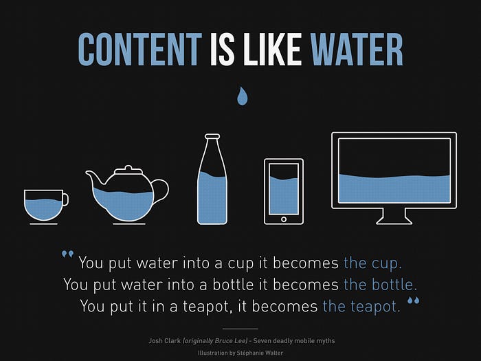
- Response web design adapts to the size of the screen no matter what the target device screen size is. The layout is ‘fluid’ and uses CSS media to change styles, this ‘fluid’ grid enables the page to resize its width and height to adapt to different screen sizes and show correctly.

It’s great to know all of this but what still… where do I start?
The important difference to note between the two different methods is that adaptive screen size is a lot less flexible than responsive screen design. Adaptive needs you to design for each screen size individually and, as I’ve come to learn, that’s pretty hard when you don’t have access to bigger screens.
I’m currently designing my own website and it was coming along pretty well on my small mac screen until I checked it out on a larger desktop today…

Compared to…

At first, I was not entirely sure what had happened but after some quick reading and look into my design I figured it out. I had been designing the grid to be adaptive for smaller screens and had not considered a screen larger than my own. The site was not able to resize anything apart from the background being stretched out and some items being given a fluid setting my chance. Rookie mistake I guess.
So my advice would be that…
Responsive design takes a lot more effort to implement but in the long run, it will need less maintaining as it will respond to new screen sizes as they are released, giving your site a longer lease of life. It will also be more useful to you when you come to designing for screen sizes you do not have access to.
Let’s keep talking
Any advice should be taken with a pinch of salt… I’m looking for advice from any of you for designing for screens bigger than my own. Any help or tips would be greatly appreciated!
It’s great to keep the conversation going, getting to know other peoples thoughts, views and learning as much as possible so feel free to get in touch!☺️


