
Any good design requires imagination and special skills from its creator. At the agency, we are constantly looking for new solutions and approaches to how we can enhance the design. To do this through dynamics is a very suitable option. Indeed, today, dynamic layouts are one of the strongest trends in web design. If you follow this trend, your target audience will appreciate it and be more involved. You will also accelerate its conversion from the stage of a regular visitor to the stage of a regular customer. There are some simple ways to add dynamics to static and boring design layouts, which we talk about today.
“Lift” some of the website elements
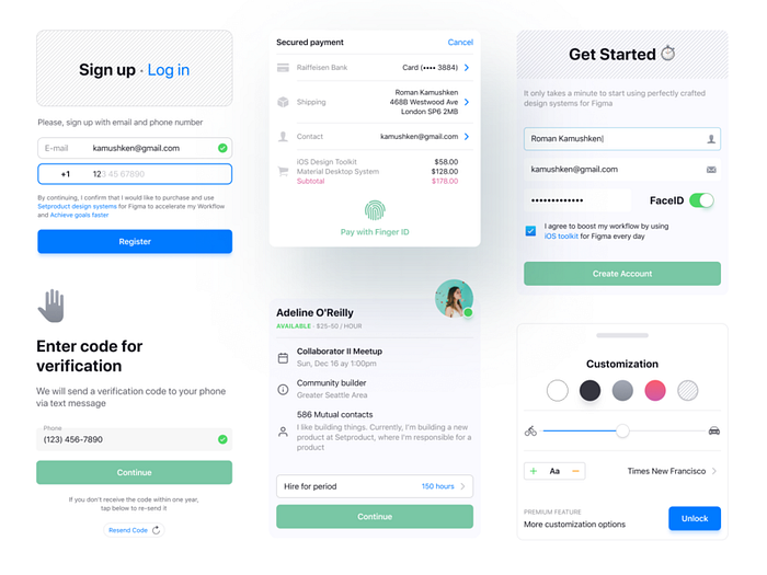
If you use a lot of blocks, fields and other elements of the same type, several of them can be “lifted” with the help of a shadow. This technique is useful both for massive elements, such as cards and for small UI components, such as menu sections in the navigation. It feels like pop-ups and dynamic windows. A little more and they will soar in the air.

Display color accents
Modern design wants to push the user to make the choice that the business needs. Increase engagement on the page or in the app. This is mainly done by highlighting or prioritizing the right area, block, button or any other detail. You can design using additional accents, as well as contrasting one of the repeating objects in the group. A column in the table, a window, a line to fill in — all that is important to you and where you need to draw attention.
A shadow play adds smooth dynamics to any layout without using real animation.
Add some third-party elements to the background
Animated elements on the background — circles, stripes and other visual garbage — are an integral part of the design craft, especially if you expect to receive recognition from experts or popularity in social networks. You can choose any unusual geometry and shape, giving the design its meaning. At the same time, the tip also works for the benefit of the user experience — this is an unusual interaction that will be remembered and make staying on the site interesting and not boring.
With the help of such visuals, you can differentiate other objects on the layout, instead of drawing clear frames.
Also, the trend is full-screen animations or even videos, which are usually located on the first page of the site. Their feature is that they occupy absolutely the entire background space, which means that they get all the customer attention. Browsing the site’s pages turns into a kind of interactive, allowing you to closely interact with the user and show him the maximum of useful information.

Pay more attention to text fields
Try to structure text information using the broken layout method by randomly arranging blocks throughout the page. This approach creates a dynamic effect and captures more attention from the site visitor. It fuels interest and allows you to go beyond the usual perception of content. The same applies to a design with a lot of text fields to fill in — you just need some kind of variety among a bunch of strings. Select one of the inputs as active — this will help to demonstrate the focus or state of validation when you have already entered something. Show creativity by reproducing real situations that the user will encounter. Such dynamics can also be applied to especially important fields requiring additional attention.
Play with a shadow
Space physics must be considered in every design work. The shadows from the UI visuals again returned to the trends and completely rethought. Today it is possible to make them more realistic and organically and naturally introduce them into the design. Subordinate logic to the blur and transparency of each shadow — and you get a powerful accent for your layout. This applies not only to windows, pop-ups, and buttons. Highlight with shadow whatever you need. Typography looks especially cool with the shadow effect. Just remember the realism, which is so necessary to achieve.
Apply the parallax effect
Parallax on a site is a change in the object position towards the background and the user. This can be done by overlaying and controlling motion relative to the cursor location. Layers create the illusion of depth and perspective. This technique jumps head and shoulders higher than just a shadow play, but it also requires more effort in development. However, your result is a dynamic and very engaging site.
Parallax can be displayed:
- while scrolling
- while hovering over separate blocks or buttons
- while hovering over images
But you should remember that overloading with such elements will have a bad effect on the site SEO, so let your parallax only be where it really is needed, do not try to build the entire site on it.
Users who are spoiled for variety usually avoid boring sites. Take care of the dynamics of your design, it will serve you as an investment in business and further relevance in the market. Trendy layouts take time and professional development tools. Entrust this task only to experts — ask us your most urgent question right now.
If you like this blog, visit our website too. And have positive vibes :)

