Adding a Location feature to Shazam
For this Ironhack UI project, we were given two and a half weeks to clone a popular app, plus add a random feature.

My mission in this bootcamp sprint was to add an ‘interest matching’ feature to Shazam. There were a few firsts during this project — I would be working individually for the first time, and focusing on UI (instead of UX) for the first time as well.
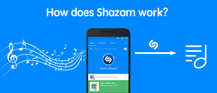
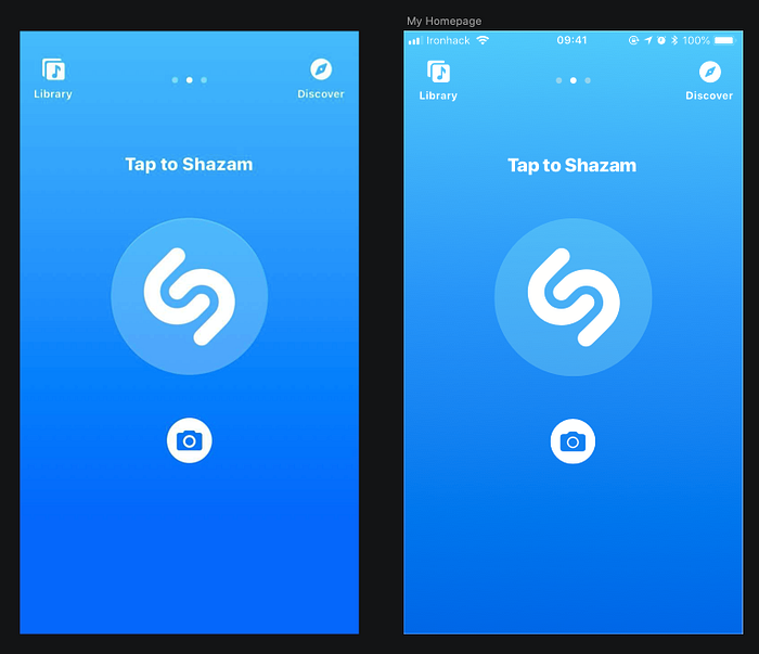
What is Shazam?
Have you been hibernating since 1999?
Shazam will identify any song in seconds. Discover artists, lyrics, videos & playlists, all for free. Over 1 billion installs and counting.
Empathize
The ‘interest matching’ prompt was intentionally vague and flexible, so the design journey kicked off with an exercise in empathizing with the user and discovering their needs.

Secondary research provided by GWI-BI illuminated the basic outline of Shazam users. The most pertinent pieces of information to the project are the age range and statement ‘I am constantly connected online’.
I conducted some observational research at a local cafe and noticed trends regarding the type of person Shazaming, and what social interactions occurred surrounding the event. Most typically, a 20–30 year old customer would get up from their table, phone in hand, and walk closer to the music speaker in order to successfully Shazam a song. This physical action makes it clear to the barista and surrounding patrons what activity is taking place. If the cafe is not too busy, the staff engages the customer in a conversation about the artist playing. Most often the customer was a native English speaker.
Define
Based on this first and second-hand research, I developed a user persona.
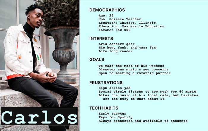
When considering the observational research and imagining Carlos’ daily journey, I noticed some pain points.
Carlos’ unique music taste made it difficult to find new friends or businesses that play what he likes to listen to.
The cafe was often busy, so conversation with staff was impossible.
Ideate
My ‘client’, Shazam, made it clear that bringing together users based on their shared music interests was the goal of the project. Framing this desire in the form of a Job Story was a way to balance stakeholder and user needs.
When I discover a song through Shazam, I want to be notified of where else that artist is frequently played, so I can hang out at music hotspots that share my taste.
Prototype
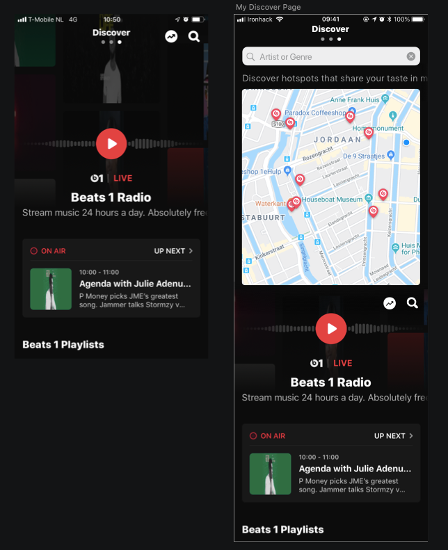
So, what does my solution look like? I envisioned a feature that identifies music ‘hotspots’ (public businesses with a high rate of Shazam incidents) on a map, and allows the user to search for an artist or genre and see where it has been Shazammed in the past.
It was time to consider how to integrate the feature into the existing Shazam flow. Shazam has a minimal, three screen layout; a Home screen, a Library of your Shazams, and a Discover page. You can see how I mapped out the flow in the image below. Not breaking this simple navigation was a priority. After getting some user input, I determined that placing the feature in the ‘Discover’ page was the most natural fit.

On to Atomic Design! A major focus of the project was to implement Atomic Design into my work flow. By breaking down the existing app screens into their smallest pieces, and then building back up to cards and templates, a highly accurate clone of the app was born.
At this point, the path forward was very clear. I jumped in to high fidelity screens.
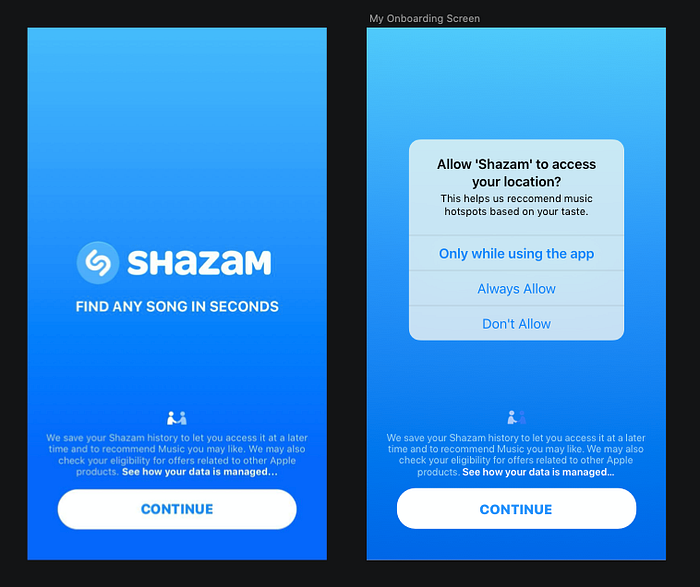
Below is the first instance of an adjustment to the original flow. The interest matching feature requires the app to access user’s location data, thus permission is now required.
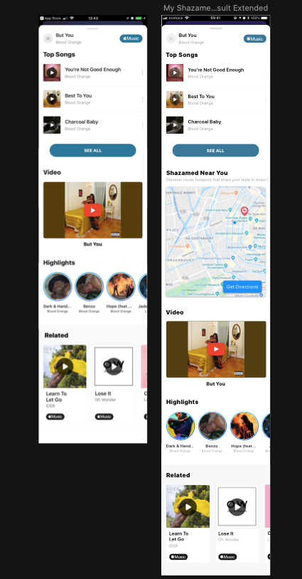
Below, you can see how the new feature was fit into the existing layout. A Google Maps result showing your location is immediately available on the Discover page, with music hotspots marked clearly.
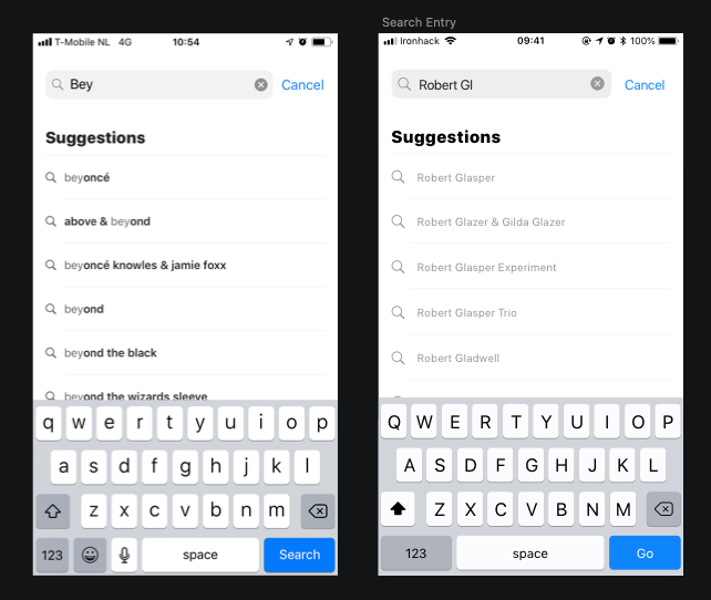
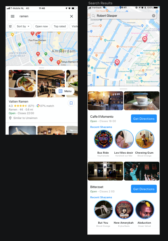
In this Happy Flow, the user wants to search out a cafe that plays Robert Glasper music. Below, you can see how a traditional Google Search result was modified to fit nicely inside the Shazam ecosphere. You can see two hotspots clearly marked where Robert Glasper has been Shazamed in the past. From this screen, it is possible to get directions and also check out other recent Shazams at the hotspots.
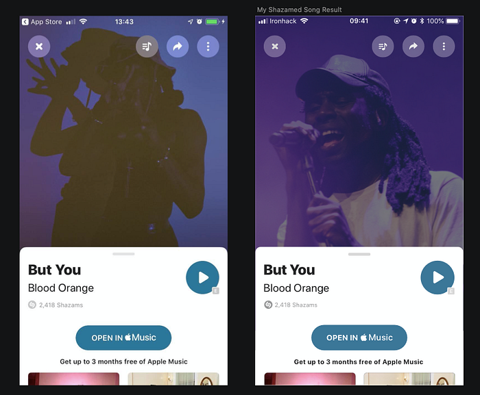
Was I satisfied here? No, of course not! Being my own boss on this project meant implementing the feature in a second place on the app. In the screens below, you can see a successful result after the user has Shazammed a song. When this screen is scrolled up, it transforms through an animation and offers more information about the artist. This was a good moment to offer the user information on where the song artist was getting Shazammed near their location.
Next Steps
If a second sprint was available for this feature, time would be well spent on usability testing.
The feature could also be expanded further along the ‘interest matching’ path — with users ‘crossing paths’ with each other and getting notifications that someone with shared musical taste was in their vicinity. Users would each have a profile, and the ability to chat with each other after a music-match was made.
Learnings
Team of One — This was the first project during the course where I worked alone. While this overall made project management very straightforward, I did lose some version control while working. Without the added step of uploading the latest Sketch files to a shared drive, I ended up with many fewer saved versions.
Scope creep — When I first began brainstorming solutions, I wanted to help users ‘cross paths’ with each other when they had shared music taste. (I mention this in Next Steps.) My first lo-fi wireframes included this concept, but I quickly realized I was basically building a dating app inside Shazam! That just wasn’t going to work for the scope of this assignment.
Transitioning between Sketch and Adobe xD — For the first time in this project, I made my prototype in Adobe Xd. Transitioning between Sketch and Adobe required some extra work, and I noticed a few missing pieces when connecting screens — so of course this caused some back and forth between the programs. Next time, I know to fully finalize in Sketch before moving the file into Xd
Atomic Design — Big fan! Structuring the work so you work from atoms up to templates was a good method for me. My mind was able to concentrate on details first, and then build up towards the final goal.

