Airbnb “Experiences”: A Usability testing
The UX behind staying and living like a local
In and around me, I have seen three kind of travellers in terms of planning their stay.
- The ones who rent luxurious hotels and resorts for their holiday. These are the travellers who are quite particular about consistent standards of service and locations (maybe easy access from the airports or mid-city).
- The ones who are lured from hotels to local homes because they want to live like a local and they see a clear dollars and cent advantage. And most importantly — live the native experiences of the place
- The ones who don’t plan the stay at all. They are the thrill seekers — They like to visit the place and then explore options for a stay.
I, and friends & family around me, are of the second type. And we are precisely the consumers of Airbnb. Over the years, I have done this in quite other interesting ways, but my current go-to is Airbnb! It’s amazing, but I did come across few challenges while booking “experiences” on the Airbnb app. So, I just decided to put on my UX researcher hat, hit open CanvasFlip and plan out a usability test to see if anyone else faces the same issues as I did.
Objective of the test
Identify the pain point in booking a specific “experience” through Airbnb’s mobile app and testing out a design recommendation against it.
Understanding Airbnb, as a company
(and motive behind “Experiences”)
Founded in August of 2008 and based in San Francisco, California, Airbnb is a marketplace for people to list, discover, and book unique accommodations around the world.
But, Airbnb is now moving way beyond its home-sharing roots. At the company’s annual Airbnb Open conference, held this November in Los Angeles, they made the big announcement : Users can now book “Experiences” that range from multi day surfing expeditions to afternoon hops around a farmer’s market. This seems to be an attempt for Airbnb to expand beyond the rental listing space. I must say — It’s a genius move :)
My user testing process
To empathise, I defined the persona of a typical user of Airbnb, created user stories and tried to understand the motive of the company. Then I made a list of task scenarios, and picked the one scenario that clearly defined the situation, had motivation and defined the outcome.
Next, create the prototype, share with users and once all the data is in the account, analyse the UX insights.

Typical Airbnb users
Prior to conducting usability tests, I developed a user persona to better understand the target users of Airbnb’s mobile app. This process helped me get into the mindset of the users, thinking in terms of their contexts, needs, and goals
So meet Ron!

Task Scenario
I write my task scenarios based on the format — When ______, I want to _________, so I can _________. I am totally inspired by “Replacing The User Story With The Job Story” by Alan Klement.
Scenario : Let’s say you just landed in Seattle for a couple of weeks. You have heard a lot about the underwater dome in Seattle, where you can enjoy breakfast with the fishes. And you want to book the experience for tomorrow. What would you do now?

Prototype
You might want to experience the prototype I tested on. Open this prototype in a new tab to try it out.

Usability test
The challenge
The booking process of an experience is too long. This is not the biggest problem, the bigger problem is that users do not have a clue how long this problem would go on..
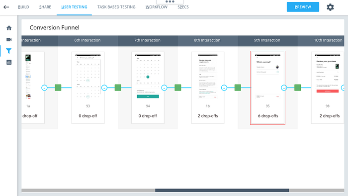
Here’s the booking flow :

One of the users left a comment on the prototype saying “This process is going on and on. I thought the previous screen would be the last..”

User research and data
The users of Airbnb already have a reference to booking on Airbnb — “homes”. Unfortunately, the booking experience on “Experiences” is a bit different.
If you haven’t checked out the booking process of “Homes”, here’s how they do it — After every step, the app tells you how many steps to go (3 steps to go, 2 steps to go and so on..), something like this :
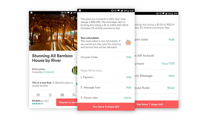
I believe, it is because of this that users are taken to surprise when booking for “Experience” does not follow a similar flow.
The 5th screen in the booking flow (the one after ACCEPT) has the maximum drop-off. I used CanvasFlip to get the conversion funnel of the prototype — The drop-off rate after the 5th screen is around 17%.
Design recommendation
Compared to the 5 step minimum booking process for “Experiences”, booking for “Home” shows all the steps on one page. And it keeps moving as you complete each level. A similar experience would ease the flow for the users.

Finally,
Thanks a lot for reading through this! Do let me know your reviews on the booking process of Airbnb. :)