Algebra of design: III. Design is
a construction
Design is a link between the goal and the choice. If the goal is not achieved, change the relationship in the design. In a good design, each element leads the user to his nearest goal, simultaneously helping you to achieve several of your goals.
History and terminology
In 1922, the Soviet artist and art historian Alexei Gan published an article-manifesto “Constructivism”. There he defined three fundamental terms: tektonika [tectonics], faktura[texture], and konstruktsiya [construction].
Alexei Gan defined the concept of konstruktsiya as:
The construction should be understood as a collective function of constructivism.
If tectonics includes ideological and formal connectivity and, as a result, gives the unity of plan, then the faktura the condition of the material, then the konstruktsiya opens the very process of formation.
The word “Construction” in English means the process of constructing a building or infrastructure. But in Russian, it will be closer to understand it in its general term — “the art and science to form objects, systems, or organizations”.
Konstruktsiya, it’s the term “Design” in the meaning “the accordance with the purpose of the created thing. Detection of structural and functional relationships that transform the system into a consistent whole”. See ibid:
“A design is a construction or activity specification or plan, or the result of that plan in the form of a prototype, finished product, or process”
Design is not styling, it’s a construction! Later in the article, we will use the word design in this meaning instead of konstruktsiya [construction] to make the term more familiar.
All these definitions are true and speak of the same, in slightly different words. In accordance with the concept of “Signs and properties”, we define the Design as follows:
The Design is the relationship of signs depending on their goals
The design is a purely logical thing that can be easily described, its manifestations are visible everywhere.
And where is algebra?
Using the example of a quadratic equation, we draw analogies
aX²+bX+c = Y
The goal is the value of the variable Y. You need to get it by working with the left side of the equation.
Tectonics is a complete formula. Immediately visible variables and parameters of the equation. You understand what influences and how to achieve the goal.
Design is an interrelation of variables and parameters contained in the equation. What and how affects the receipt of the variable Y (goal).
Parameters (constants) is a static part of the design (construction). This is a sign that cannot be changed throughout the existence of the construction.
The value of the variable X is a faktura. It may vary. The presence of X — design. Please note that it is important that the variable enters this equation as an entity. The design takes into account X and assigns it the appropriate place in the formula.
Faktura is the value of variables. Rather, the range in which we work with them. For positive X there will be one set of Y values, for complex ones there will be another. If we give X as a natural numbers, we’ll get the third. Each time the goal (the domain of Y) will change.
The design links faktura and tectonics, showing both of them
Or, to use the usual words:
The design is the link between the goal and the choice
If we take and write the original equation in another form:
aX²+(b-1)X+X+c = Y
Remains the same goal, the same faktura, but the design has changed. A familiar rule to programmers “There’s more than one way to do it” is absolutely correct. Moreover, it can be argued that
There are infinitely many ways to achieve a given goal
Classics of the genre
People don’t need 6 mm drills. They don’t even need 6 mm holes. And even the screws that are screwed in there, they also do not need. They need to hang a picture or a clock so that it hangs securely and does not fall. They want to admire the picture and see the exact time. To be punctual connoisseurs of beauty.
So the design is the relationship of the weight of the picture, the material of the screw and the wall, the diameter, and depth of the screw-hole-drill. This logical chain stitches all these elements, pinning signs, like beads on a thread. An experienced hanger of paintings will also take into account the thickness of the wall in the design so on the neighbor’s side does not get out anything.
By the way, change the parameters of the wall and the object — within certain limits (although, even for climbers it will work), the logic of the relationship of signs will remain the same.
The design (construction) can be a template
Template site, product, business (business model), the script interacting with the customer operator, pancake recipe or a drawing of the building.
Consider another example. Speed limit road sign in the photo to the left. All its elements are static. Form, text inscription, numbers. All are connected by being located in one place, on one side of the sign, in one font, and so on. The sign is designed specifically for the conditions in which it is applied. On this basis, you can create a series of signs with different values of speed and place them throughout the country.
Now, look at your car’s speedometer. There is also a speed data. But they change. This is the faktura. And the design keeps them in a logical connection with the surrounding dashboard. Do you understand that this is speed, not gasoline levels or tire pressure? If not, then maybe is it time to think about changing the brand of car?
Design and goals
The more static features are built into the design (constants in our equation), the fewer goals it is applicable for. And, conversely, the more flexible the design, the more changing signs in the process of use (faktura), the greater the number of goals the design allows achieving.
The construction should be designed so that at each moment the user interacts only with the part that allows you to achieve the goal. In other words, the construction should ensure the binding of faktura elements.
If design elements do not affect the achievement of goals, then they are redundant
Remove interface elements that in this step do not lead the user to the goal. Work only with useful information.
At the restaurant, you were served lunch, served soup and dessert at once. Dessert in this design is redundant. Now you eat soup. Sweet is served after him, then dessert will be appropriate. It must either be removed or determined for what purposes it is useful and considered along with the interface, process, etc., in the context of achieving the goals. Perhaps no one served to you and did not file. You yourself took in the dining room all the dishes on the tray right away and you are too lazy after the soup to go after the dessert. Compared to the restaurant, you have another goal — not to go to take dessert. This goal has no alternative solution in the form of a waiter.
Let’s take a reverse example from life. At the business-lunch brought all the dishes at once. But there were only forks. I had to start with the second dish. The lack of one element in the design (construction) of this situation makes it difficult to achieve the goal of “eating soup”. This is a vivid example of the disadvantage of the second type.
In general, if there is a lot of information and there are superfluous design elements, this is a drawback of the first type. If something is lacking to achieve the goal, it is a disadvantage of the second type.
If the goal is not achieved — change the relationship in the design
If desired, it was possible to drink soup over the edge, like tea from a bowl. But, fortunately, they brought spoons.
Therefore, we first define the goals: what we want to achieve. For the selected goals we build the design. Do not add too much, do not remove the necessary. We build the design according to the features that are important for achieving the goal.
Tectonics, design (construction) and faktura
Could there be tectonics without a design? Is it possible to show the user in the interface the necessary signs of the goal, if there are no elements in the construction under them? Of course not. But many tries.
And can there be a design without tectonics? Not. There will be an interconnection of signs allowing to achieve, possibly, a certain goal. It’s not at all true that this will be your goal. But the design will allow it to reach. For example, a microcosm can be examined with a microscope. And if the microscope is large and heavy, but you have nothing to explore, you can chop nuts.
The cipher is the design of symbols behind which the message may be hidden. Box with parts and screws in the closet — it is not clear from what they are and why they have not been thrown out yet, but the box unites them into one place. The categories “other” in the site rubrics contain a long tail of things that cannot be attributed, but they are brought together. An appendix or the third eyelid in a person is a rudiment, but it also served some purpose earlier. The earthquake in the world of ants is a step in the world of people.
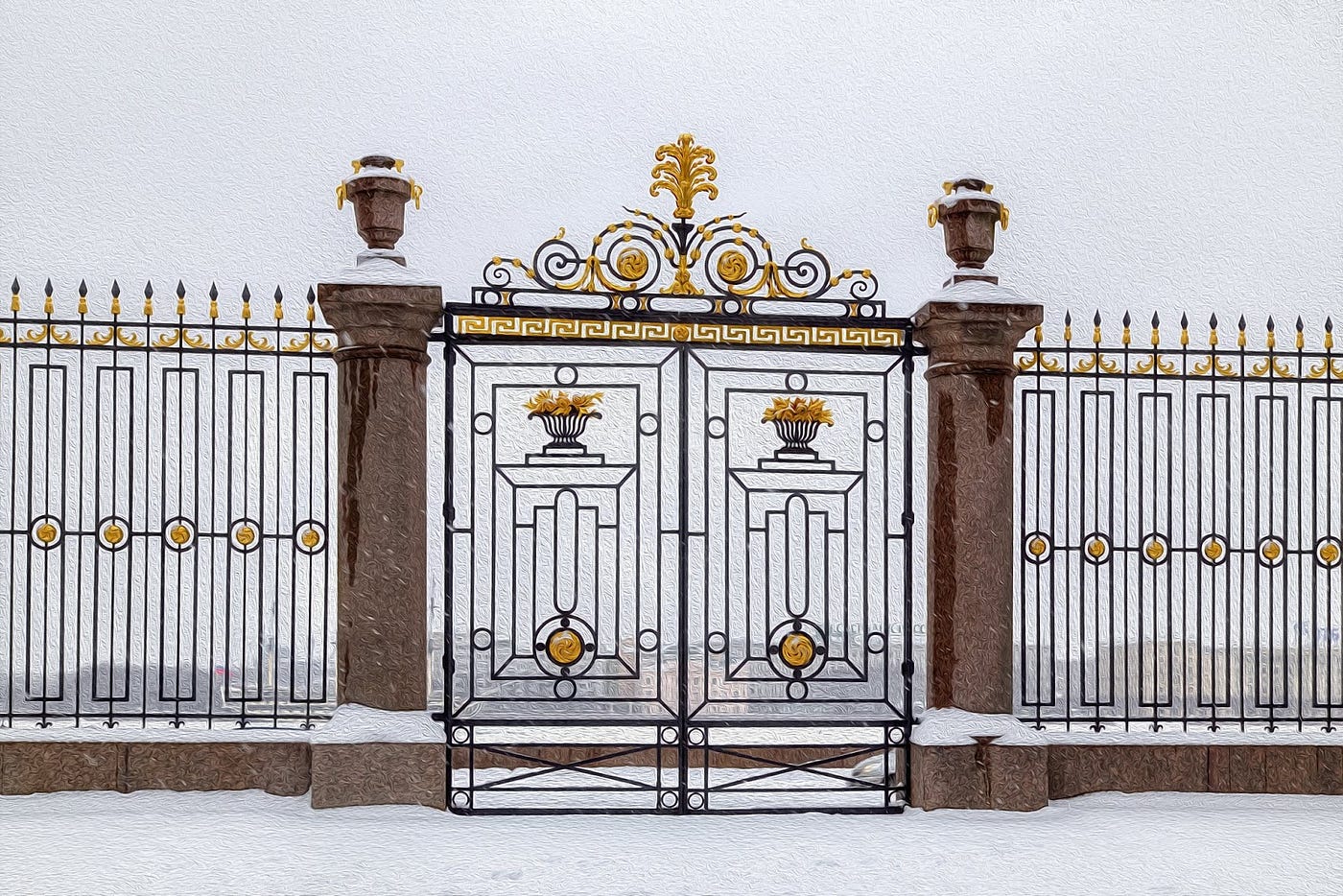
Moreover, goals can be from completely different areas. Applied, ethical, artistic, psychological — any. For example, the structural elements of buildings are folded into an elegant ornament. A pattern on the fence will give an elegant lattice of the Summer Garden in St. Petersburg.
There are no accidents
Can there be faktura without design? Yes, but without interrelation, it will be a set of unrelated signs and only. These are like symptoms that are unclear to which disease they belong. Or all variants of products in the online store assortment, including those that are not available.
Or maybe a design without faktura? Yes. These are templates for anything. Recipes, sequences of actions, rules, business models. They are aimed at some kind of result. Something will be on the way out, tectonics will appear (in the end, you will simply get tired of doing them). But in them, there is no faktura, intermediate states, dynamics. Remember instructions for shampoo: squeeze a small amount of shampoo on hand; wash 2–5 minutes; rinse with water; repeat.
Design the construction on the subscribe form

Take the registration form. Five fields, one button. All fields are required, and the password confirmation field must match the password field.
Let’s visualize the design of the elements. Each field is a blue dot. The coincidence of the two fields with passwords is the red line (causation). All fields required for clicking the registration button are shown with green lines. Pretty simple design, isn’t it?
And now let’s make it more connected. The block on the right shows the interaction of the structural elements. Redheads are goals for which you need to fill in a field. For example, the relationship between the source elements is shown (the nickname may coincide with the name). Let’s see what has changed and why.
For example, adding an implicit goal for the user, but useful to him. The site can understand what language the user prefers to communicate, based on the entered text content.
The more user goals you think up, the more connected design you will get
For example, if you have two fields — a name and a surname (and you justified for what), then after filling in one you can automatically change the language for entering the second, even if they are spread across the page.
The well-developed designed site, business or product will catch the slightest user action and adapt to it, changing the associated elements. And so that the user as quickly and efficiently reaches its goal, embedded in your design.
Well designed construction will give you a good plane, not five thousand pieces flying in one direction.
If you find it difficult to explain to the user why he should fill in one or another parameter about himself — think about it. You are on the slippery slope of creating of the disadvantage of the second type. The user will not understand how this action will lead to any of his goals.
In the case when there are too many justifications for why this should be done and all of them shown to the user hoping to make a “universal interface” — it will be incomprehensible to him exactly what will come out of the above after performing the action. And thus, you create a disadvantage of the first kind.
What is the difference between “design as a construction” and the usual “design”?
After reading the article above, many will ask the question: “Well, yes, everything is correctly described. I did not understand just what is the difference between what you told and classical design? ”. The differences are quite significant.

What is the basis?
Classic design is, first of all, the use of visual elements, even in accordance with the design system, an attempt to reach the user’s emotions, the using of empathy and other empirical, difficultly formalized techniques. The most advanced designers (here we mean both designers, and UX-specialists, and all those who lay the logic of working with users) use the Fitts law, gestalt, CJM and other things. In general, allowing fairly free to interpret their decisions and choices. All this leads to the memes “I am an artist, I see it so” and adjustments from the customer of the kind “play with fonts, add the red one”. There is no clear explanation for REASON and for PURPOSE. Why the design is made this way and not otherwise.
Our understanding of design includes design as a construction, tectonics and faktura as fundamental concepts. In addition, the design is based on the concept of signs and properties, and UX refactoring is used as a technique. These five aspects together provide a clear sequence of actions, allowing to justify the choice and bring the decision.
Chose the goals that the design should satisfy — ok, fix them with the customer. By the way, the choice of goals here is fully correlated with the choice of project goals, for which design is needed. After formulated goals — see at their signs. Identify tectonics — what of these signs you need to display to the user. Not everything that comes to mind or things which has competitors or referents, but those what will help to achieve the goal. For each page, each press, each button and its frame changing color, ask a question: will it help the user to achieve the goal? What useful information will he get?
Select the tectonics goals from the faktura. Separate what signs points to goals, and what helps the user to follow the path to that goal. And after this design one with another.
As you can see, there are no emotional moments or references to many years of experience in the industry.
Functionally or beautifully?
The second question, with which at first, I confess, was also very confused. Can it be done beautifully if the basis on a dry logical approach? Yes, it can. The Eiffel Tower in Paris and the Shukhov Tower in Moscow are a prime example.
First, do it functionally. And only then apply decorations and patterns. These are also signs. Only now these are not signs of user goals, but to your goals “make it beautiful” and “add emotion”. Whether it is designed for a portfolio or competitive work.
The trick is that the signs of one goal are not mixed up with others. Remember that several signs can correspond to one property and, on the contrary, one property can correspond to several signs. If you mix (make a lot of decorations without thinking about the meaning), you will get the disadvantage of the first type. If on the contrary, remove the needed — the disadvantage of the second type.
For example, underlined text generally denotes a link. Extra decorative elements, such as highlighting, flashing, colors of frame buttons, echoing functional ones, will distract the user. And, back, if for the beauty they removed the “extra elements”, made a “simple, clean” design in the hope of a stylish solution — they got a discouraged user who does not understand what to click and where to look for the necessary information.
The main thing to clearly separate the functional design from the stylistic. Then get a functional and beautiful solution.
From the functional and logical design, it can be made beautiful. But from the beautiful design is much harder to make it functional
A classic design is trying to achieve functionality by beauty. UX refactoring, using faktura and tectonics, binds them into a design as a construction, and first makes it functionally, and only then allows you to make it beautiful.
It is best of all when each element of a design is associated with one user’s immediate goal and with several of your goals. By performing an action with such an element, the user confidently walks along a pre-paved path, and you get several benefits at once at each step.
And which part of the design prevails in your works: design as construction, or design as art? Write in the comments.
Facebook: facebook.com/lessplusmore
Twitter: twitter.com/lessplusmore
And clap the article, if you like it!
Special thanks to Wova Roodnyy for ideas and consultations.


